In this module, we will discuss how to “mesh” two or more data sets together in order to answer a research question.
When doing quantitative research in the life and social sciences and working with data, it is often necessary to mesh two or more disparate sources of data together in order to study a research question. Even though both sets of data might ostensibly cover the same geographic locales (for example, like state-level data or county-level data), or the same data range (for example), some data might be missing in one data set for some locales or times, which presents some extra difficulties in trying to mesh the data sets together. Even if two or more data sets cover the same locales or times (for example), they may be sorted in different order, which means there isn’t a direct one-to-one crosswalk between the row of one data set and the row of another.
Other sources of difficulty in meshing together data sets might be that one data set might contain information for both locales and dates, but the other data sets of interest might just be for locales at specific dates, or by date at specific locales.
Some tips for the meshing process: always start by downloading and reading in each of the data sets separately. Do an initial exploratory analysis on each of the data sets, calculating averages, making simple plots, etc to ensure the data actually appear to be what you are expecting them to be. If the data sets are complicated, with a lot of fields, I find it helpful to preprocess each data set and produce a simpler preprocessed summary file that will make future analyses with the data easier and faster.
Example
In an example of this, we will mesh diabetes incidence data from the CDC between 2004 to 2013, with socioeconomic data from the US Census Bureau.
Diabetes data
Let’s begin with the diabetes incidence data. The CDC makes obesity prevalence and diabetes prevalence and incidence data at the county level available off of its County Data Indicators website. Navigating to the site, you should see something like this:
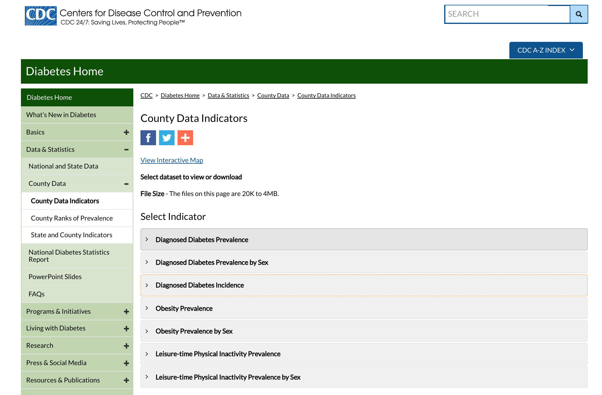
Click on the “Diagnosed Diabetes Incidence” tab to expand it:
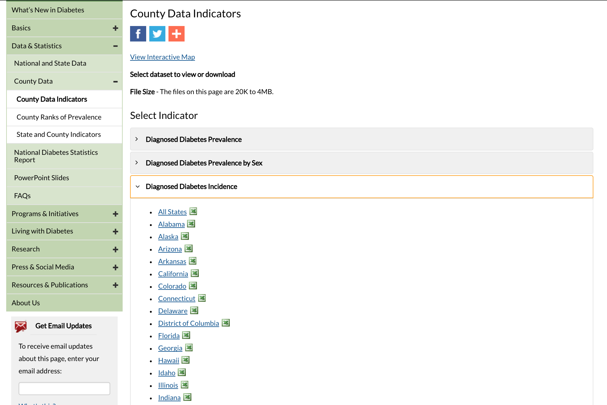
Click on “All States” to download the Excel file.
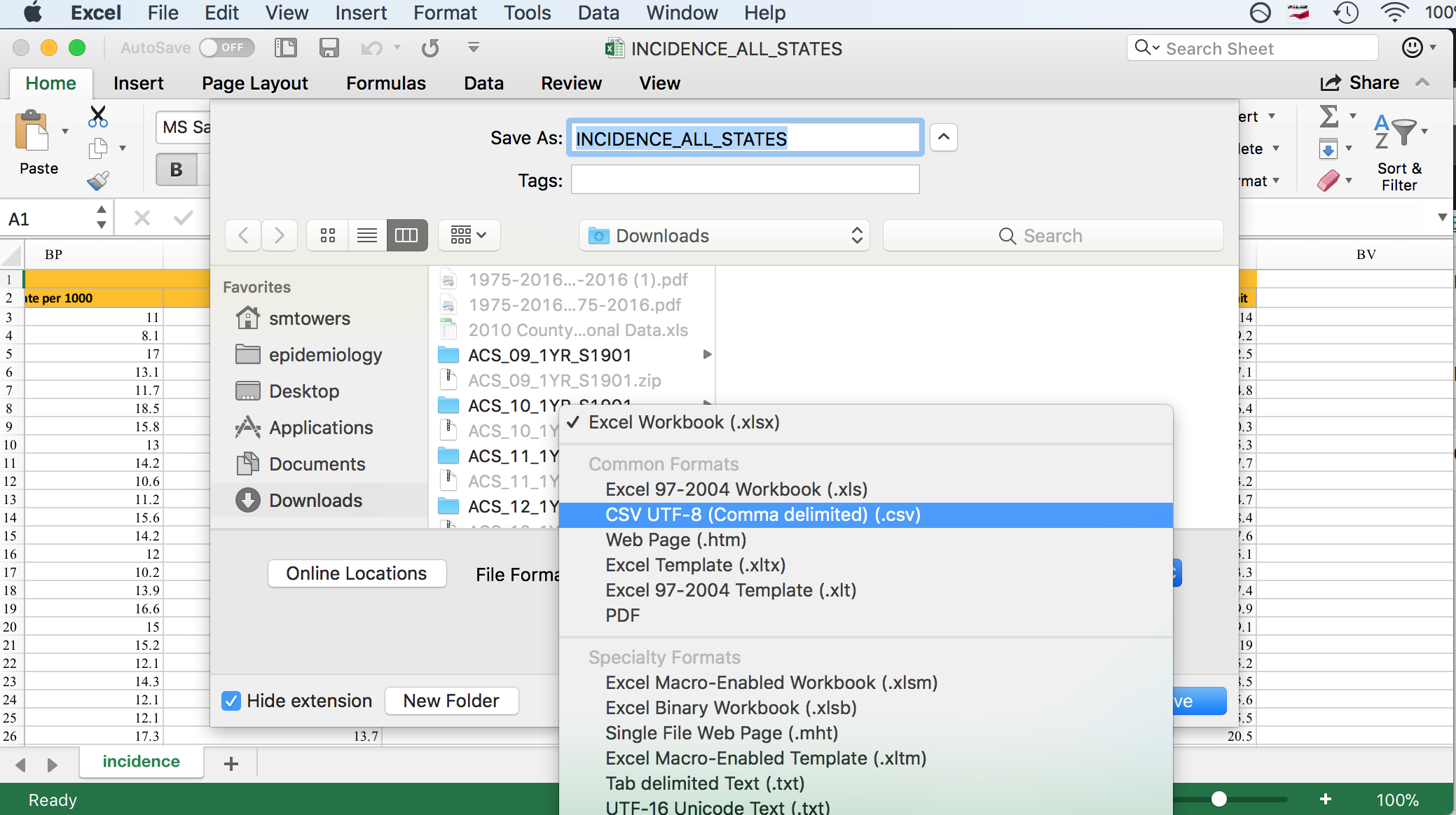
Some R packages exist for reading Excel files into R, but I have not had much luck with them because they always seem to require libraries that are defunct, or the packages have bugs, etc etc (in fact, the link above which describes the packages notes many of these problems). By far the best solution I have found, and that is also recommended in the link above, is to open the Excel file in Excel, and then under File->Save As, click on .csv format in the dropdown menu.
Before you close off the Excel file, take a note of its columns. The columns contain the state name, the county Federal Information Processing Standard (FIPS) unique identifier for each county, the county name, and then for years 2004 to 2013 the number of new diabetes cases diagnosed each year, the rate per 1,000 people, and the lower and upper range of the 95% confidence interval on the rate estimate. The CDC obtained this confidence interval from the number of observed cases and population size by using a function similar to binom.test() in R.
On my computer, saving the Excel file in csv format produced the file INCIDENCE_ALL_STATES.csv. Once you do this, you have to visually inspect the file in a text editor to see if the header line is split across multiple lines. In this case, it is split across two lines. To read this file into R, we thus need to skip the first line:
a = read.table("INCIDENCE_ALL_STATES.csv",sep=",",header=T,as.is=T,skip=1)
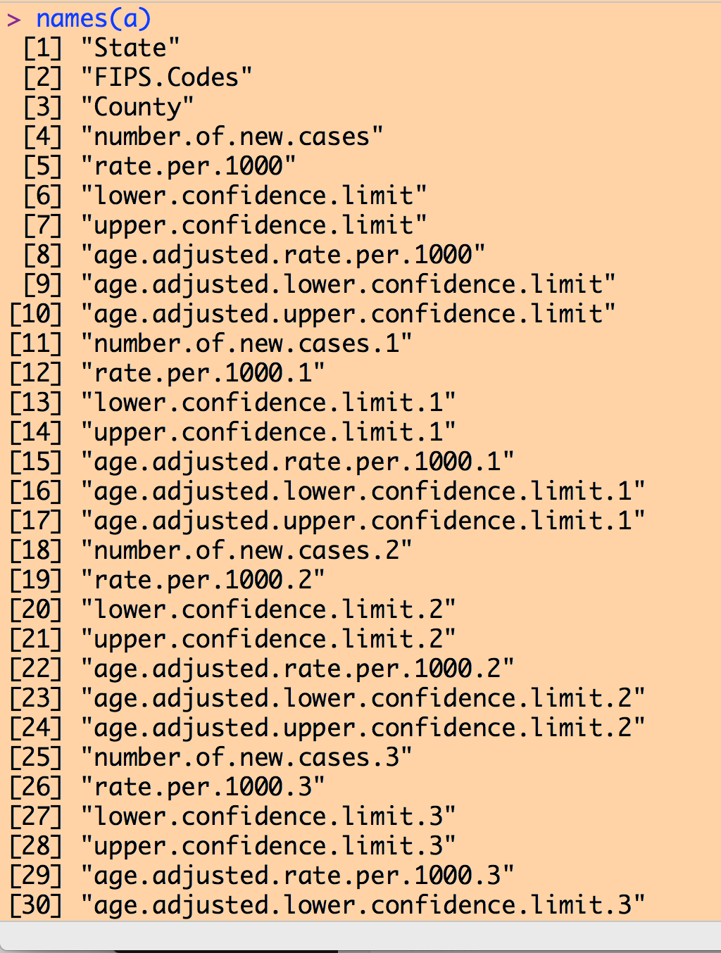
Examining the column names of our data frame yields a list like the following (I couldn’t fit the entire list on my screen to take a screen shot):
Note that there are a number of columns with the name like “rate.per.1000”. Recall from the inspection of the Excel file that the first such column in the 2004 data, then the next is the 2005 data, and so on to the 2013 data.
Try histogramming the rate for 2004
hist(a$rate.per.1000)
You will note that you get the error message “Error in hist.default(a$rate.per.1000) : ‘x’ must be numeric”. To view the data in that column, type
a$rate.per.1000
You’ll notice that R thinks the data consist of strings, rather than numeric. This is because for some counties, the data entry is “No Data”. In order to convert the strings to numeric, type
a$rate.per.1000 = as.numeric(a$rate.per.1000)
The entries with “No Data” will now be NA, and the other entries will be converted to numeric. If we take the mean, you’ll notice that it will be equal to “NA”… this is because we have to tell the mean() function in R to ignore the NA values, and only calculate the mean from the defined values, using the na.rm=T option.
mean(a$rate.per.1000,na.rm=T)
Now, if you type
hist(a$rate.per.1000,col=2,xlab="Rate of diabetes incidence per 1000 population",main="2004 county-level data")
you will get the histogram
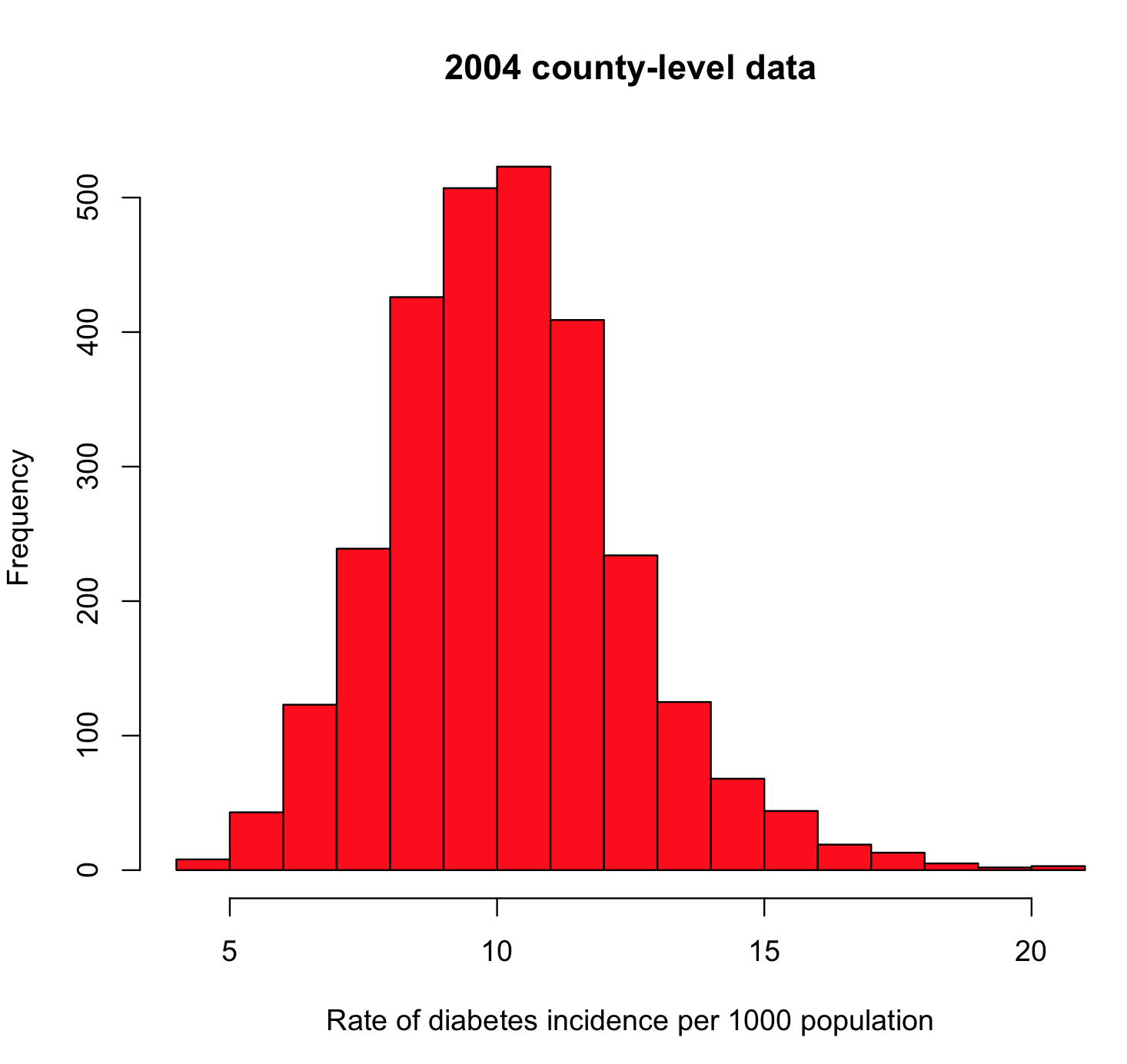
What you’re looking for here are any strange outliers (there don’t appear to be any). You also want to check if the data values are more or less what you expect. From the mean() of our values, we see the average incidence in 2004 is about 10/1000, or 1%. From the diabetes.org website, their latest report says that around 9% of Americans are living with diabetes (ie; the diabetes prevalence). It is roughly plausible that perhaps 1/10 people living with diabetes are newly diagnosed each year.
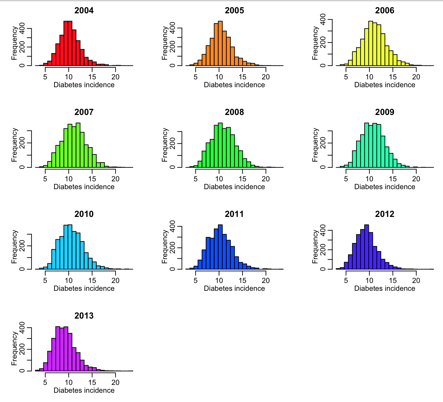
We need to do this type of exploratory analysis for all the columns of interest in the data file. In the R script, diabetes.R, I do this for the 2004 to 2013 data. The R script produces the following plot:
The R script also produces the following output:
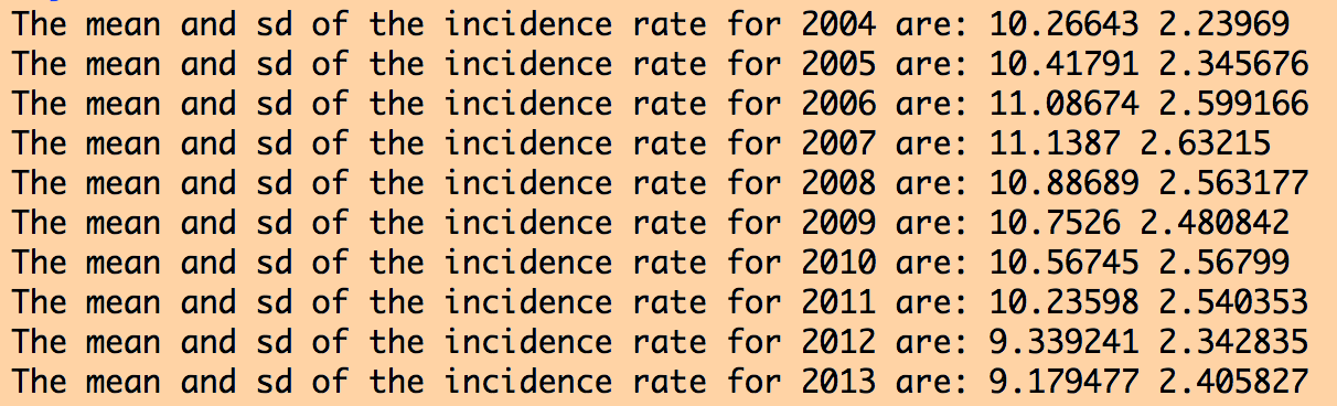
The data for all years look more or less similar, and reasonable. If the data had outliers, I would look at the counties for which there were outliers, and try to track down what the true value should be by doing an Internet search. Sometimes outliers are caused by mis-transcription of data. Sometimes they actually are true outliers (!)
The script puts the fips, year, and rate information into vectors, then creates a data table that is written out into a summary file preprocessed_diabetes_incidence_by_county_by_year_2004_to_2013.csv
Making such summary files is often useful in order to get the data in a nice format for further analyses.
Socio-economic data
The US Census Bureau American Fact Fiinder database has data on a wide variety of socio-economic demographics:
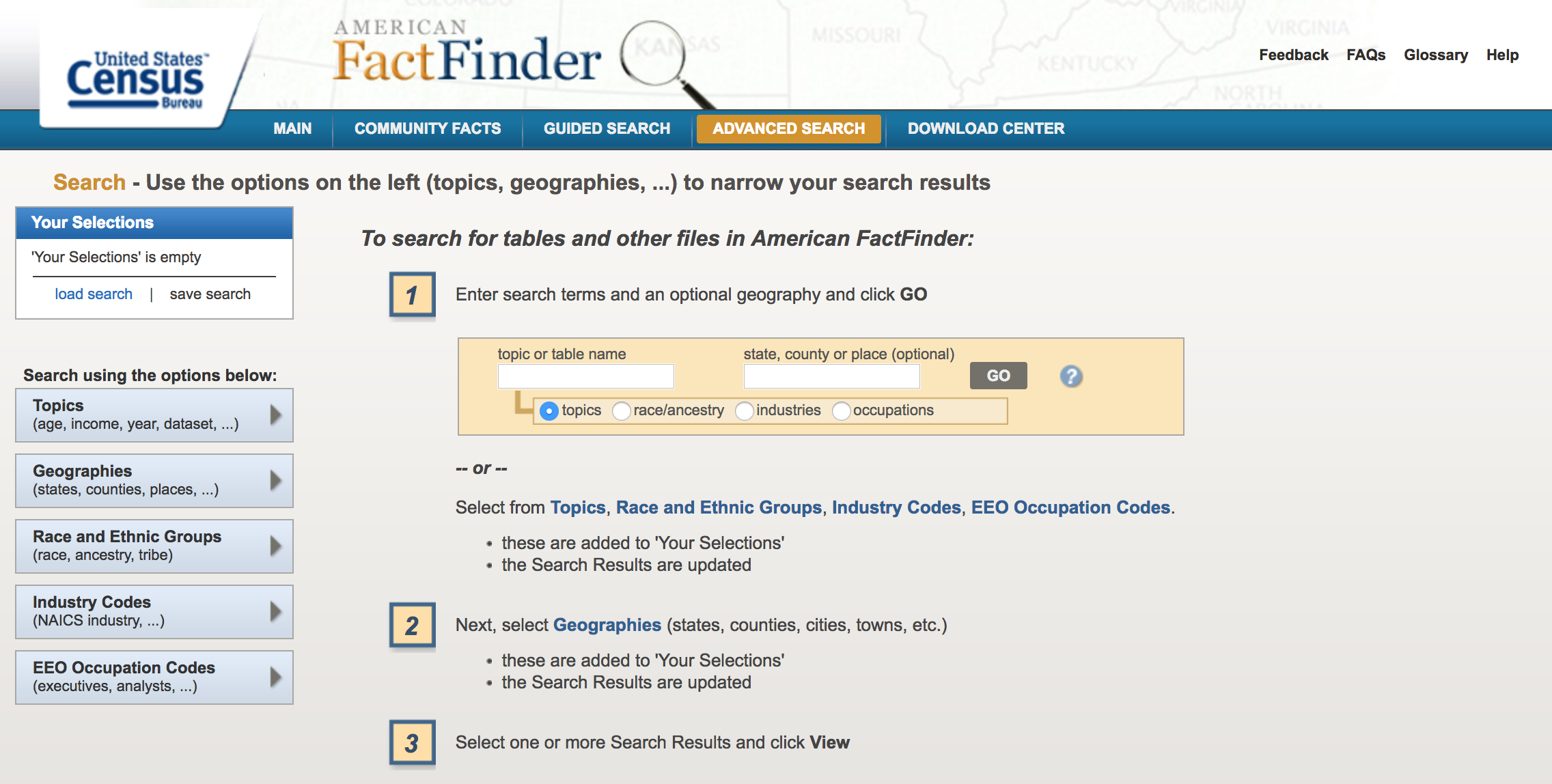
On the site, click on “Advanced Search->Show Me All”
Click on “Geographies”, and then “County”, “All Counties Within Unites States”, and then “ADD TO YOUR SELECTIONS”. You can then close out that selection window by clicking “Close X” at its top right corner:
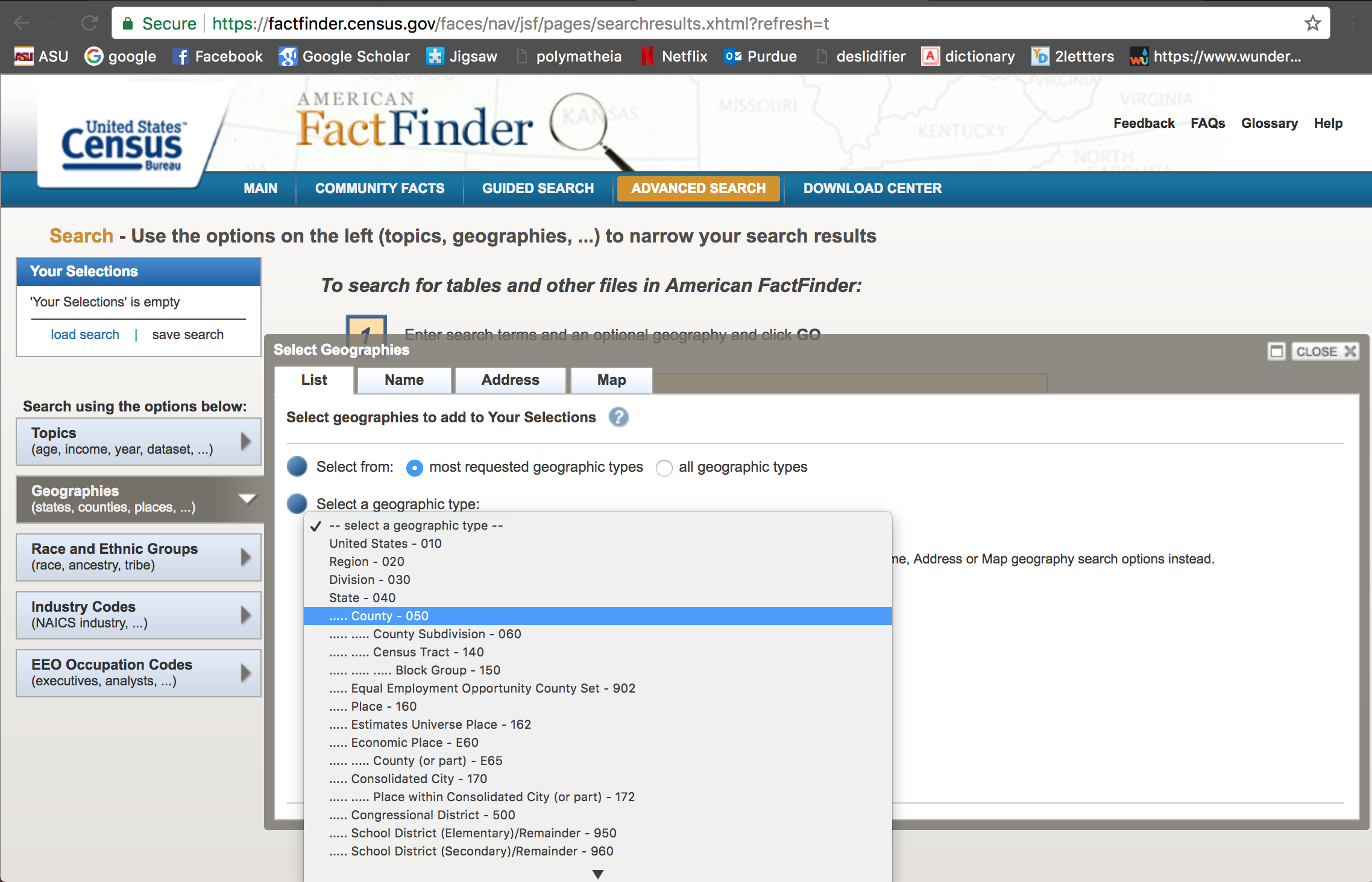
Notice that in the “Your Selections” box on the upper left hand corner it states that you are now searching for data by county.
Now, let’s look for data related to poverty by county. We are ultimately going to test whether or not there appears to be an association between poverty rates and diabetes incidence in the population. In the “Refine your search results” box, type “poverty” (without the quotes). The following list will come up: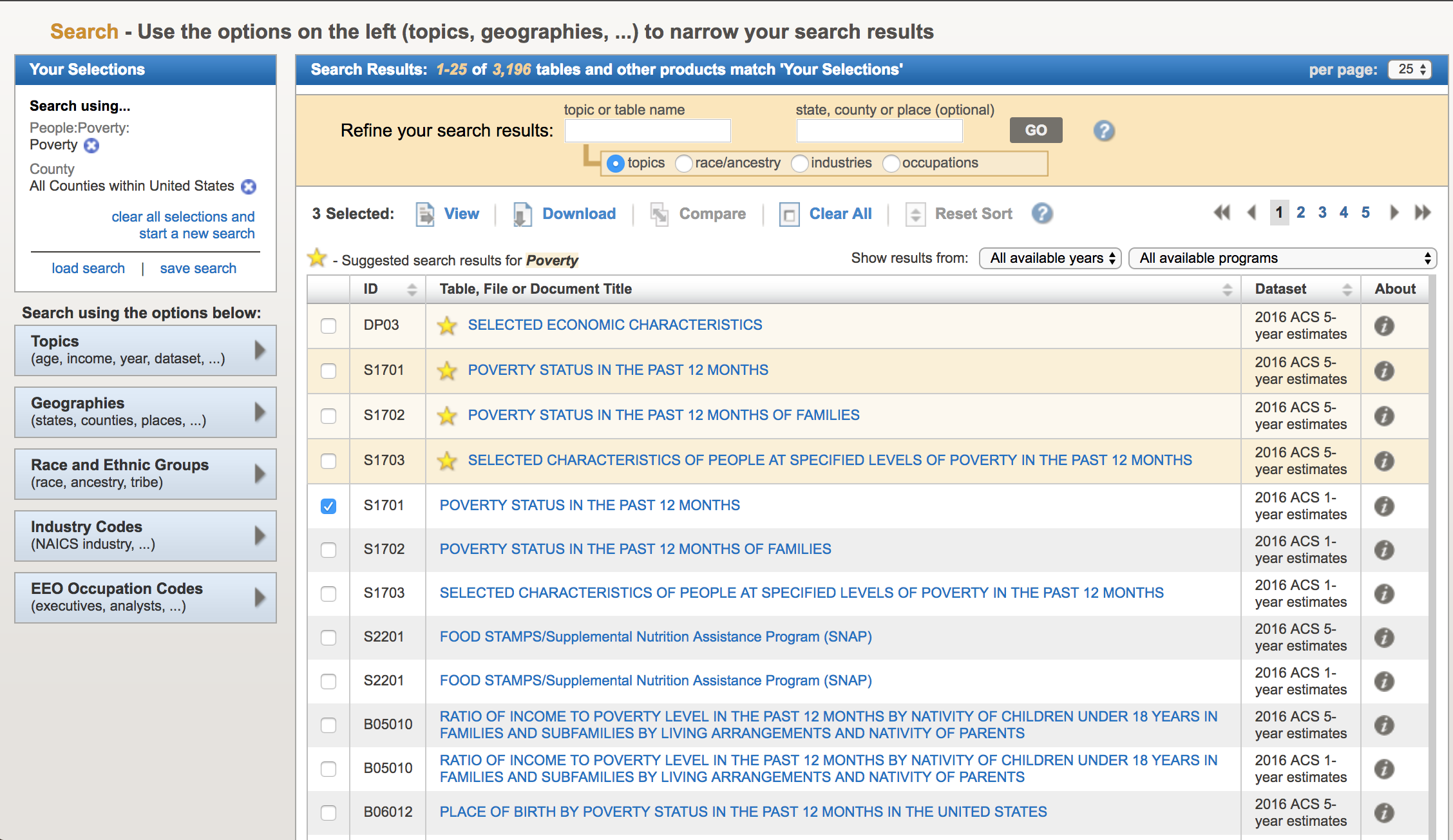 The acronym “ACS” refers to the US Census Bureau American Community Survey. They provide 5 year, 3 year, and 1 year running averages of various socioeconomic demographics. We want the one year averages. Click on sample S1701 “Poverty status in the last 12 months”. It brings up (note, that I can’t fit all the rows on the screen for the screen shot):
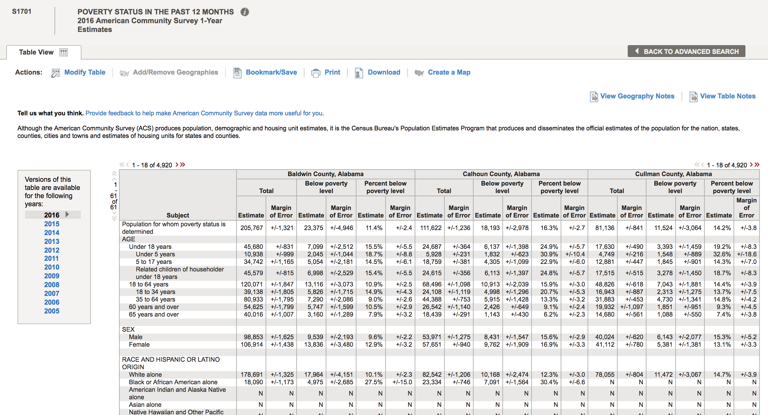
There are a lot of goodies in this table. Not only is there information on poverty rates, but also information by age, race and ethnicity, employment status, etc. To download the data for a specific year, click on the year to load the table. Let’s do 2013. Once the table shows, click on the “Download” tab at the upper center part of the screen, and click on “Use the data”, then “OK”
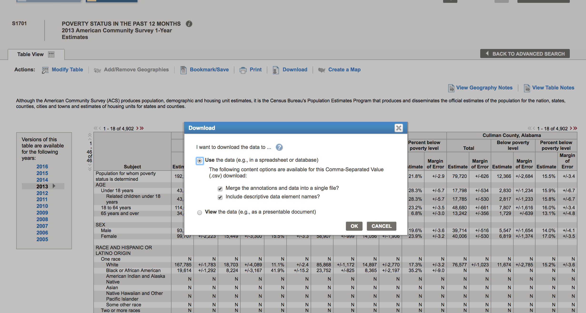
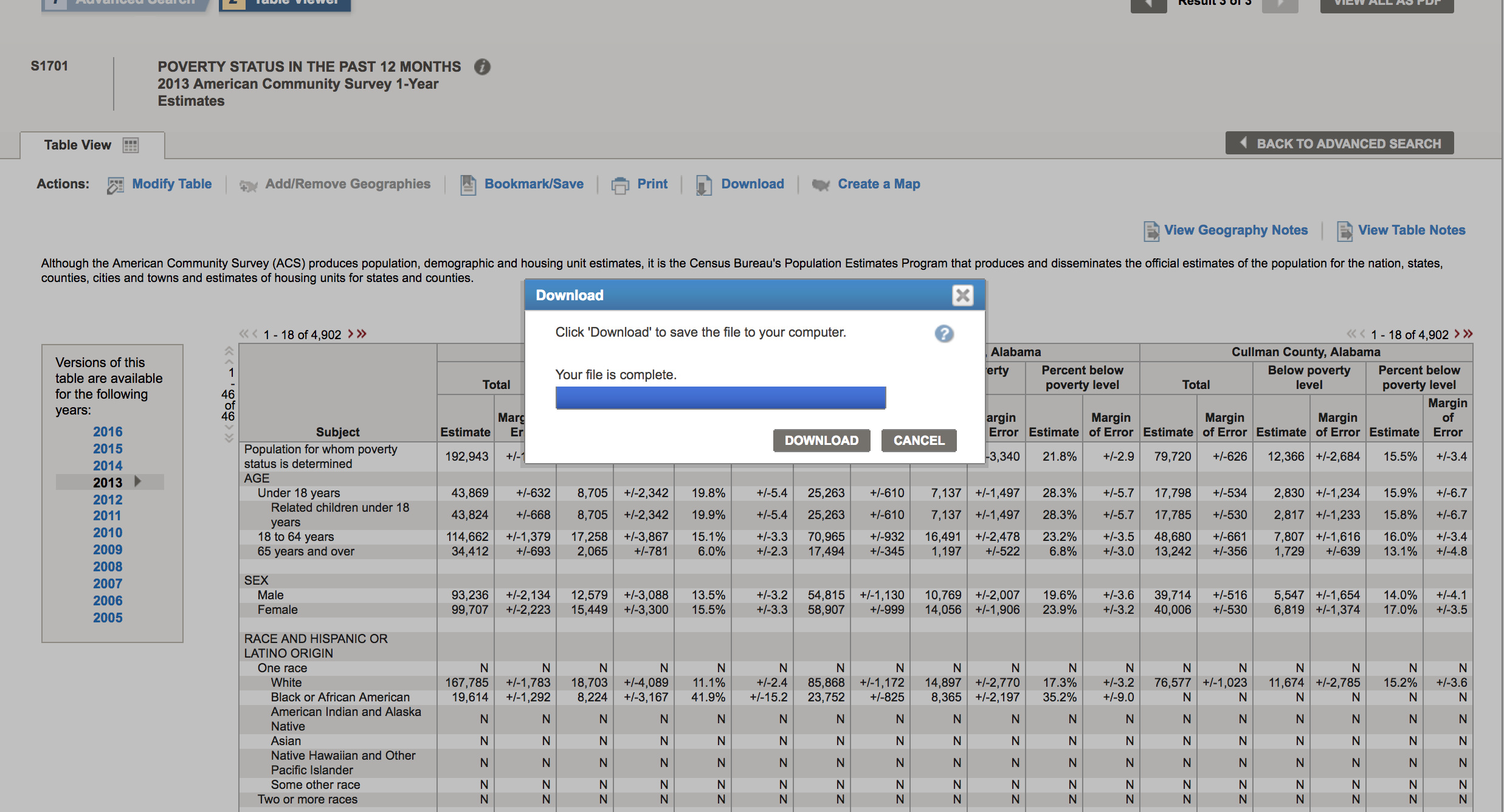
Now click “Download” to complete the download process to your computer:
This will download a compressed folder with the data. On my computer, this folder is called ACS_13_1YR_S1701. “S1701” is the name of the data set, “1YR” indicates that it is the one year averages, and “13” indicates that the data are for 2013.
Inside that folder, there are several files. ACS_13_1YR_S1701_with_ann.csv contains the data of interest, but if you look at it in a text editor, you will see the column names are rather inscrutable, and there appear to be two lines of header information. The file ACS_13_1YR_S1701_metadata.csv contains the information on what each of the columns means. Move these two files to your working directory.
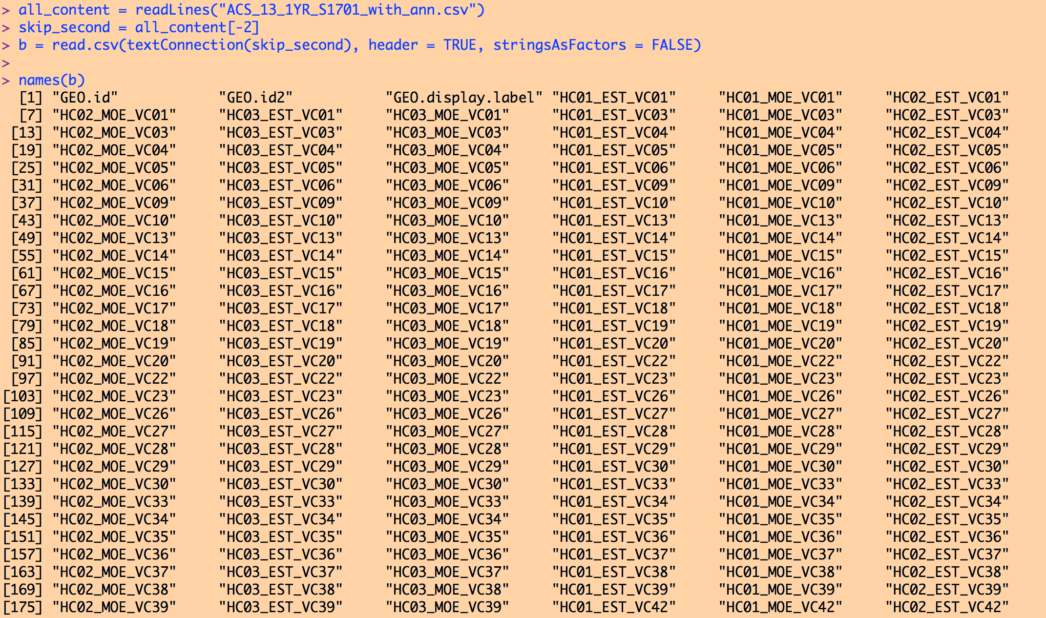
If you try to read ACS_13_1YR_S1701_with_ann.csv into R as is, R will complain that there are more columns than column names. Skipping the first row, like we did with the diabetes data set, won’t help. It is that second line of header information that is the problem. It contains extra commas in the quotes that mess R up when it tries to read in the data. We can proceed one of two ways… edit the file to comment that second line out with a # so that R ignores it, or, use the following code to make R skip that second line:
all_content = readLines("ACS_13_1YR_S1701_with_ann.csv")
skip_second = all_content[-2]
b = read.csv(textConnection(skip_second), header = TRUE, stringsAsFactors = FALSE)
Typing names(b) yields (note, I couldn’t fit the entire list on the screen to take the screen shot):
To reiterate, it is the ACS_13_1YR_S1701_metadata.csv file that describes what each of these many columns are. I usually open this with a text editor, and determine which column name is the information I’m interested in. For example, opening this in a text editor shows:
GEO.id,Id
GEO.id2,Id2
GEO.display-label,Geography
HC01_EST_VC01,Total; Estimate; Population for whom poverty status is determined
HC01_MOE_VC01,Total; Margin of Error; Population for whom poverty status is determined
HC02_EST_VC01,Below poverty level; Estimate; Population for whom poverty status is determined
HC02_MOE_VC01,Below poverty level; Margin of Error; Population for whom poverty status is determined
HC03_EST_VC01,Percent below poverty level; Estimate; Population for whom poverty status is determined
HC03_MOE_VC01,Percent below poverty level; Margin of Error; Population for whom poverty status is determined
I can see that the column I’m interested in is named HC03_EST_VC01. Note that you cannot assume that this column name will always correspond to the percentage of the population in poverty for all years in the S1701 series of ACS data. You have to check for each year!
The column GEO.id is the FIPS code for each county.
The following lines of code read in the data, make a summary data file that is less inscrutable than the original file, and histogram the poverty rates.
require("sfsmisc")
######################################################
# the second line in the ACS files often makes it problematic to read the
# file in with read.table or read.csv. The following three lines
# of code tell R to skip the second line when reading in the file
######################################################
all_content = readLines("ACS_13_1YR_S1701_with_ann.csv")
skip_second = all_content[-2]
b = read.csv(textConnection(skip_second), header = TRUE, stringsAsFactors = FALSE)
wfips = b$GEO.id2
wpoverty = b$HC03_EST_VC01
mult.fig(1)
hist(wpoverty,col="darkviolet",xlab="Poverty rate",main="2013 ACS poverty rate data")
vdat = data.frame(fips=wfips,poverty=wpoverty)
write.table(vdat,"preprocessed_poverty_rates_by_county_2013.csv",sep=",",row.names=F)
The output can be found in preproccesed_poverty_rates_by_county_2013.csv. The code produces the following plot:
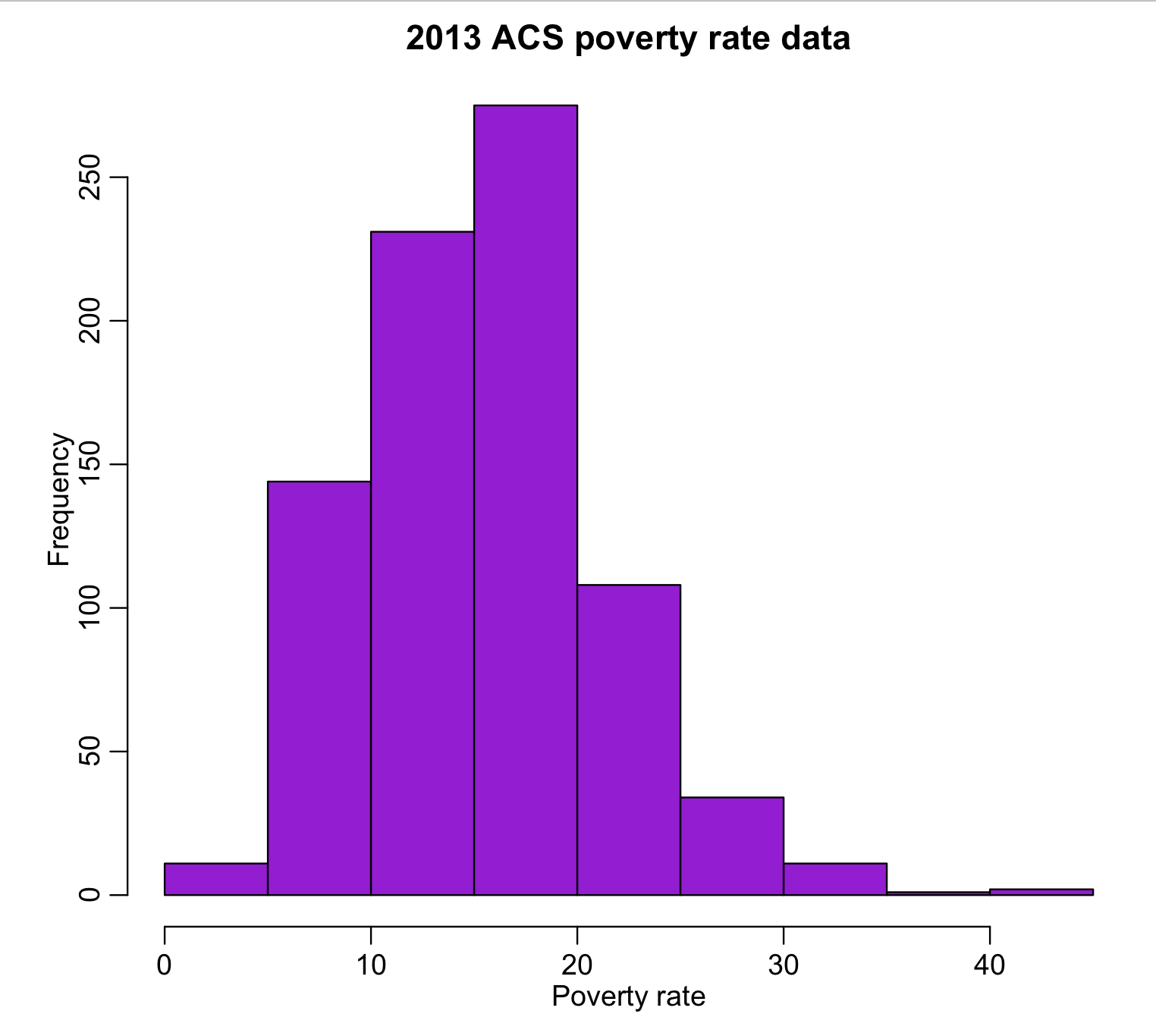
All of the values look reasonable, and there does not appear to be any unusual outliers.
Bringing it together
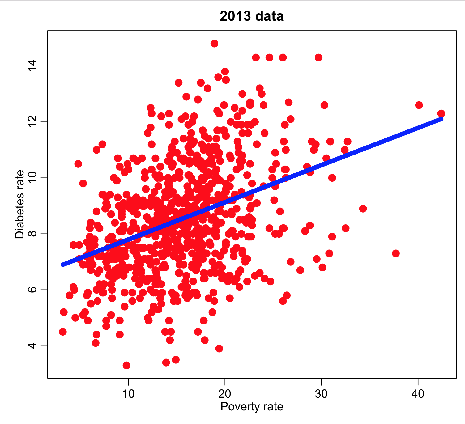
Now we would like to examine the diabetes incidence and poverty rate data to determine if they appear to be related.
Note that there are over 3,000 counties in the US, but there are not that many counties in either the diabetes or poverty data sets. The one year American Community Survey data is usually much more limited than the 5 year survey estimates due to the amount of work and expense needed to do annual surveys. Thus, it is usually larger counties that are represented in the one year averages of socioeconomic and demographic data from the census bureau. As far a health data are concerned, there is the potential that some county health authorities haven’t reported their data to the CDC, for whatever reason, or that the number of diabetes cases newly diagnosed was below 20 for that county and year… for reasons of confidentiality, the CDC will not report aggregated data with less than 20 counts.
The following lines of code read in the two data sets, and report on the number of counties in one, but not in the other. The X%in%Y operator in R determines which vector elements in X are in Y(and returns TRUE if it is). Taking !X%in%Y returns TRUE if a vector element in X is not in Y.
ddat=read.table("preprocessed_diabetes_incidence_by_county_by_year_2004_to_2013.csv",sep=",",header=T,as.is=T)
pdat=read.table("preprocessed_poverty_rates_by_county_2013.csv",sep=",",header=T,as.is=T)
ddat = subset(ddat,year==2013)
cat("The number of counties in the diabetes data set is",nrow(ddat),"\n")
cat("The number of counties in the poverty data set is",nrow(pdat),"\n")
i=which(!ddat$fips%in%pdat$fips)
j=which(!pdat$fips%in%ddat$fips)
cat("The number of counties in the diabetes data set not in the poverty set is:",length(i),"\n")
cat("The number of counties in the poverty data set not in the diabetes set is:",length(j),"\n")
We can subset the two data sets to ensure that they both contain information for the same set of counties:
ddat = subset(ddat,fips%in%pdat$fips)
pdat = subset(pdat,fips%in%ddat$fips)
cat("The number of counties in the diabetes data set is",nrow(ddat),"\n")
cat("The number of counties in the poverty data set is",nrow(pdat),"\n")
You will find that both data sets are now the same size (755 counties).
However, there is no guarantee that now the counties are in the same order for the two datasets. To get the one-to-one correspondence between the data sets, we can use the R match() function. match(ddat$fips,pdat$fips) returns the index of the row of pdat data frame with fips corresponding to every value of ddat$fips in turn.
We can thus create a new element of the ddat data frame called poverty, which is obtained from the pdat data frame with the corresponding fips to every fips in ddat:
ddat$poverty = pdat$poverty[match(ddat$fips,pdat$fips)]
and we can now plot the diabetes rate versus the poverty and overlay the regression line:
mult.fig(1)
plot(ddat$poverty,ddat$diabetes_rate,col="red",cex=2,xlab="Poverty rate",ylab="Diabetes rate",main="2013 data")
myfit = lm(ddat$diabetes~ddat$poverty)
lines(ddat$poverty,myfit$fit,col=4,lwd=6)
print(summary(myfit))