
In this module we will discuss how to choose ranges over which to sample parameters using the graphical Monte Carlo method for fitting the parameters of a mathematical model to data. We will also discuss the importance of using the Normal negative log-likelihood statistic (equivalent to Least Squares) when doing Least Squares fitting, rather than the Least Squares statistic itself.
In this past module, we discussed the graphical Monte Carlo method for fitting model parameters to data. In this module, we described how to estimate the one standard deviation uncertainties in model parameters using the “fmin+1/2” method, where fmin is the minimum value of the negative log likelihood.
Also in that module, we discussed that the Least Squares statistic (LS) is related to the Normal distribution negative log likelihood via
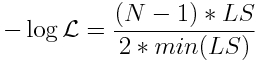
where min(LS) is the minimum value of the Least Squares statistic that you obtained from your many sampling iterations of the graphical Monte Carlo method.
When doing Least Squares fits with the graphical Monte Carlo method, to facilitate choosing the correct ranges used to Uniformly randomly sample the parameters and to estimate the parameter uncertainties, you should plot the Normal negative log-likelihood versus the model parameter hypotheses, rather than the Least Squares statistic.
Similarly, the negative log likelihood of the Pearson chi-squared weighted least squares statistic is
![]()
and if using that statistic, you should use this negative log-likelihood in your fits in order to assess the parameter uncertainty.
Choosing parameter ranges
Once you have your model, your data, and a negative log-likelihood statistic appropriate to the probability distribution underlying the stochasticity in the data, you need to write the R or Matlab (or whichever programming language of your choice) program to randomly sample parameter hypotheses, and compare the data to the model prediction, and calculate the negative log likelihood statistic. The program needs to do this sampling procedure many, many times, storing the parameter hypotheses and negative log-likelihoods in vectors.
For the initial range to sample the parameters, choose a fairly broad range that you are pretty sure, based on your knowledge of the biology and/or epidemiology associated with the model, includes the true value. Do enough iterations that you can assess more or less where the minimum is (I usually do 1,000 to 10,000 iterations in initial exploratory runs if I’m fitting for one or two parameters… you will need more iterations if you are fitting for more than two parameters at once). Then plot the results without any kind of limit on the range of the y-axis. Check to see if there appears to be an obvious minimum somewhere within the range sampled (and that the best-fit value does not appear to be at one side or the other of the sampled range). Using a broad range can also give you an indication if there are local and global minima in your likelihoods.
If the best-fit value of one of the parameters appears to be right at the edge of the sampling range, increase the sampling range and redo this first pass of fitting. Keep on doing that until it appears that the best-fit value is well within the sampled range.
Once you have the results from these initial broad ranges, when plotting the results restrict the range on the y axis by only plotting points with likelihood within 1000 of the minimum value of the likelihood. From these plots record the range in the parameter values of the points that satisfy this condition.
Now do another run of 1000 to 10,000 iterations (more if fitting for more than two parameters), sampling parameters within those new ranges (again, re-adjusting the range and iterating the process if necessary if the best-fit value of a parameter is at the left or right edge of the new sampled range).
Then plot the results, this time only plotting points with likelihood within 100 of the minimum value of the likelihood. Record the new range of parameters to sample, and run again.
Then plot the results of that new run, plotting points with likelihood within 15 of the minimum value of the likelihood and determine the new range of parameters to sample.
Then do a run with many more Monte Carlo iterations such that the final plot of the likelihood versus the sampled parameters is well populated (aim for hundreds of thousands to several million iterations… this can be achieved using high performance computing resources). Having many iterations allows precise determination of the best-fit values and one standard deviation uncertainties on your parameters (and 95% confidence interval).
Example: fitting to simulated deer wasting disease data
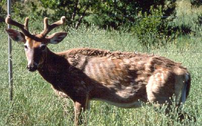
Chronic wasting disease (CWD) is a prion disease (akin to mad cow disease) that affects deer and elk species, first identified in US deer populations in the late 1960’s. The deer never recover from it, and eventually die. There has yet to be a documented case of CWD passing to humans who eat venison, but lab studies have shown that it can be passed to monkeys.
CWD is believed to be readily transmitted between deer through direct transmission, and through the environment. There is also a high rate of vertical transmission (transmission from mother to offspring). CWD has been rapidly spreading across North America.
In this exercise, we’ll assume that the dynamics of CWD spread are approximately described by an SI model, with births and deaths that occur with rate mu:
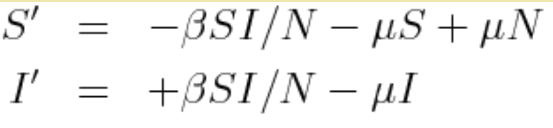
where N=S+I, and beta is the transmission rate.
Setting the time derivates equal to zero and solving for S yields that the possible equilibrium values of S* are S*=N (the disease free equilibrium) and S*=N*mu/beta (the endemic equilibrium). Note that we can express beta as beta=N*mu/S* = mu/(1-f) where f is the endemic equilibrium value of I
Let’s assume that officials randomly sample 100 deer each year out of a total population of 100,000, and test them for CWD (assume that the test doesn’t kill the deer) to estimate the prevalence of the disease in the deer population. The file cwd_deer_simulated.csv contains simulated prevalence data from such sampling studies carried out over many years.
The R script fit_si_deer_cwd_first_pass.R does a first pass fitting to this data, for the value of f=I*/N and the time of introduction, t0. The time of introduction clearly can’t be after the data begin to be recorded, so the script samples it from -50 years to year zero. We also don’t know what f is so we randomly uniformly sample it from 0 to 1. The script does 1000 iterations, sampling the parameters, calculating the model, then calculating the Binomial negative log-likelihood at each iteration, and produces the following plot:
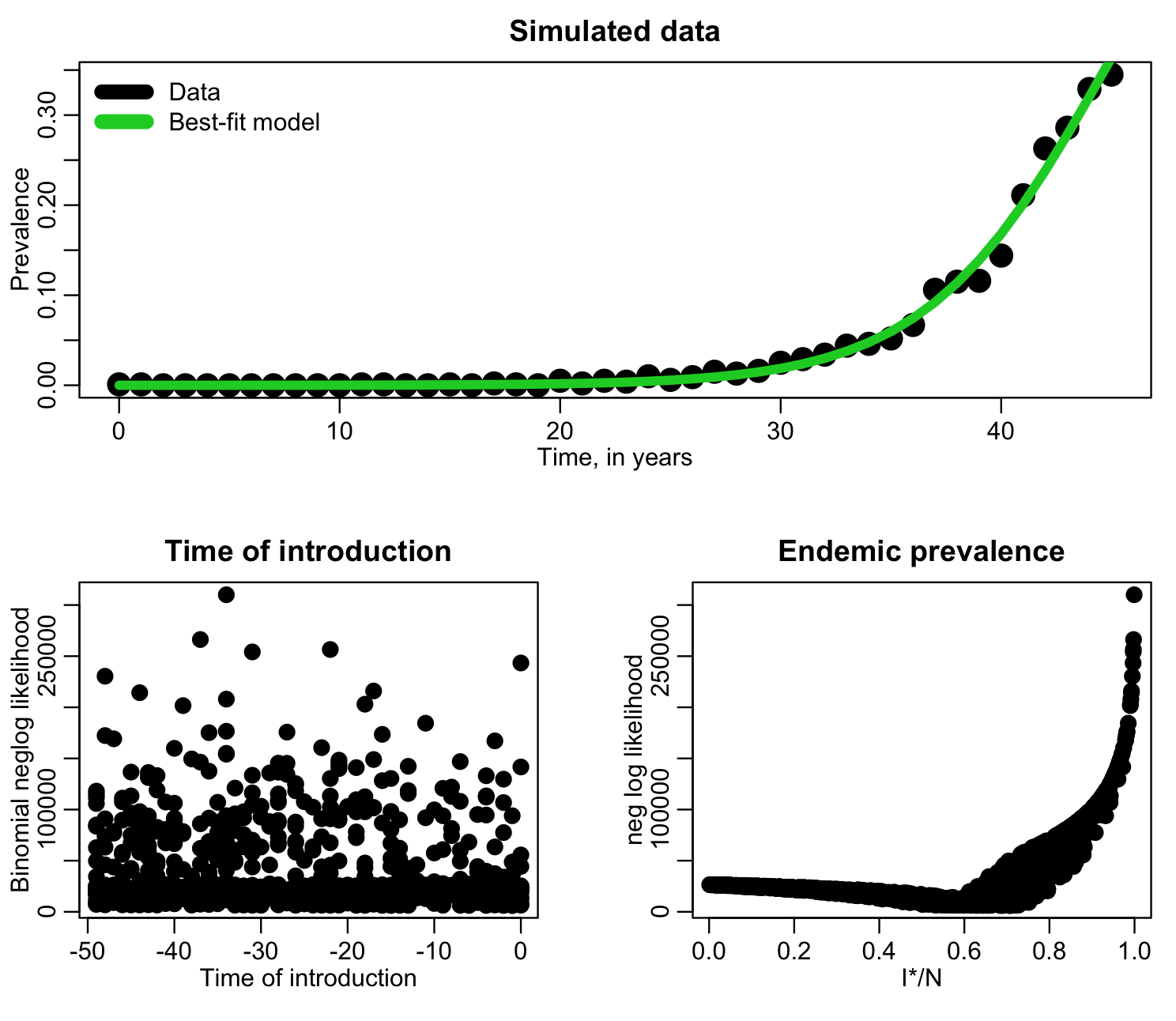
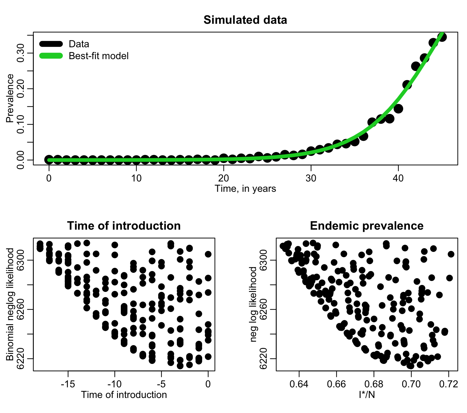
f=I*/N has a clear minimum, but the time of introduction is perhaps not so obvious. Let’s try zooming in, only plotting points with likelihood within 1000 of the minimum value:
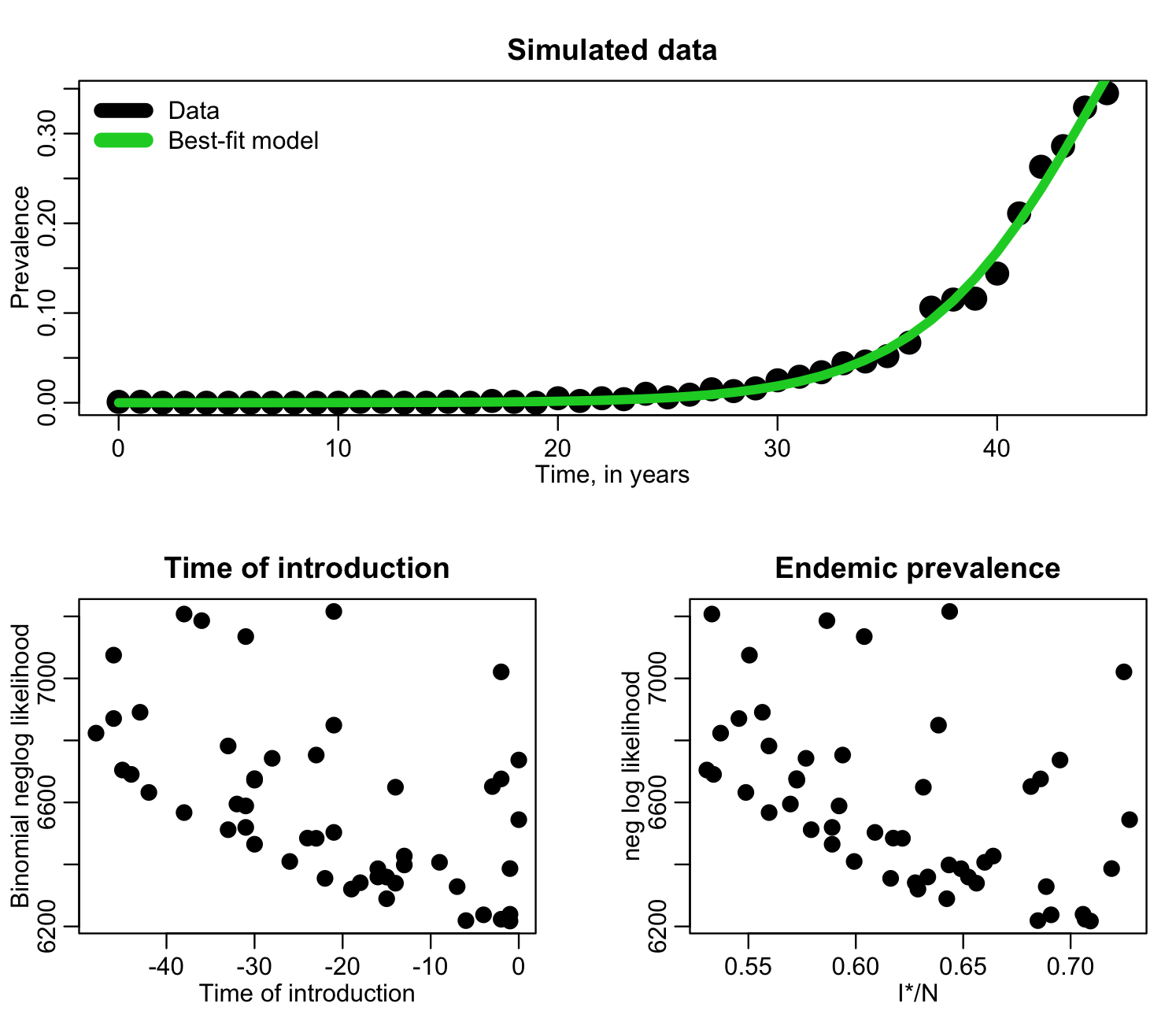
Here we can clearly see that the best-fit value of t0 is somewhere between -50 and zero (recall that it can’t be greater than zero because that is where the data begin). The best-fit value of I*/N appears to be around 0.70, but the parabola enveloping the likelihood in the vicinity of that minimum appears to be highly asymmetric. When choosing our new sampling ranges, we want to err on the side of caution, and sample past 0.73-ish to make sure we really have the minimum value of the likelihood within the new range.
In the file fit_si_deer_cwd_second_pass.R we do another 10,000 iterations of the Monte Carlo procedure, but this time, based on the above plot, sampling t0 from -50 to zero, and I*/N from 0.5 to 0.75. The script produces the following plot where it zooms in on points for which the likelihood is within 100 of the minimum value of the likelihood:
Based on these plots, it looks like in our next run, we should sample the time of introduction from -20 to zero, and sample I*/N from around 0.62 to 0.75. Going up to 0.75 may again be overly cautious in over-shooting the range to the right, but we’ll do another run, then adjust it again if we need to. The file fit_si_deer_cwd_third_pass.R does 10,000 more iterations of the Monte Carlo sampling, using these ranges, and produces the following plot only showing points that have likelihood within 15 of the minimum value:
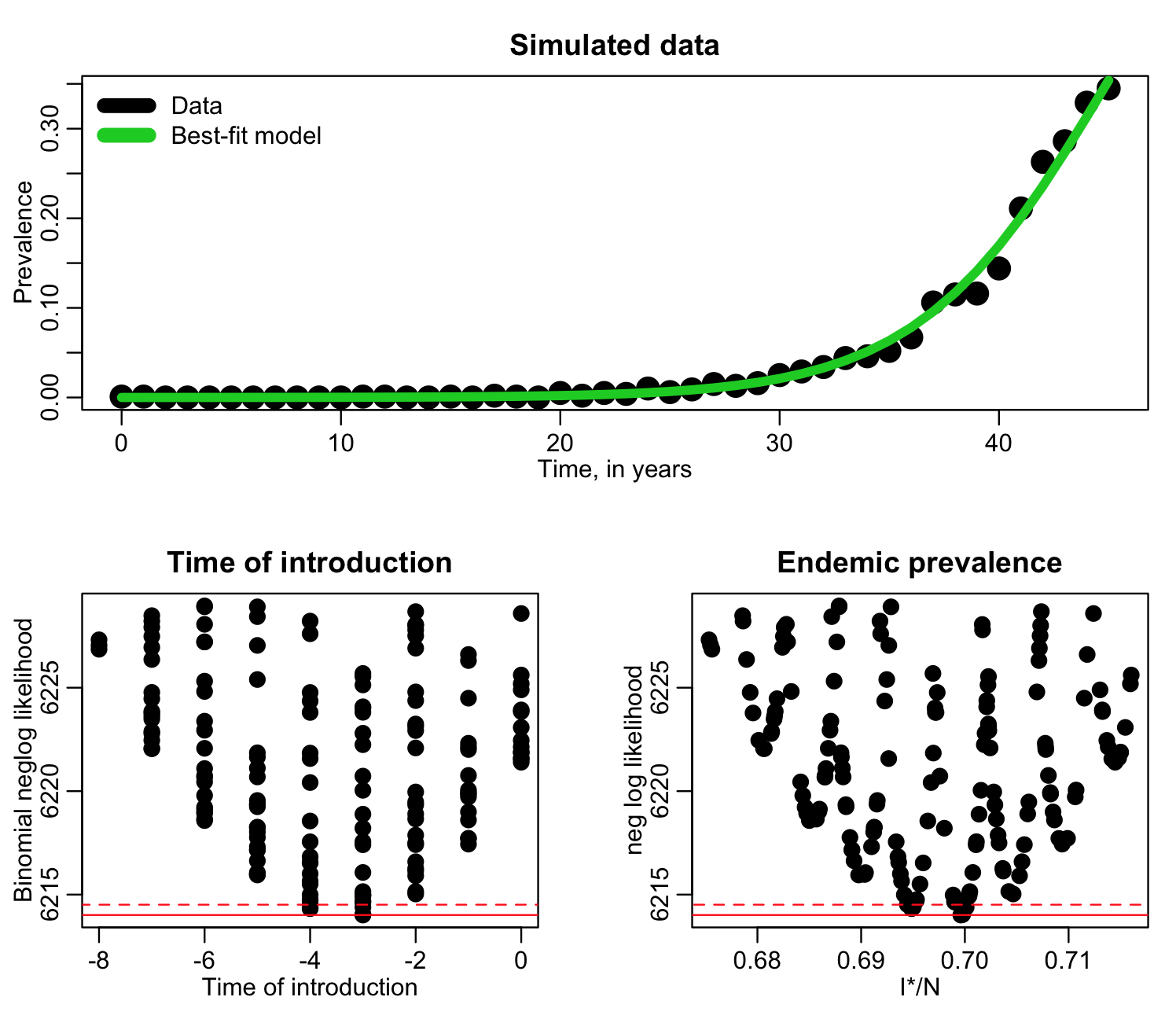
Now, in a final run, we can sample t0 from -8 to zero, and I*/N form 0.67 to 0.72. The R script fit_si_deer_cwd_fourth_pass.R does this, and produces the following plot:
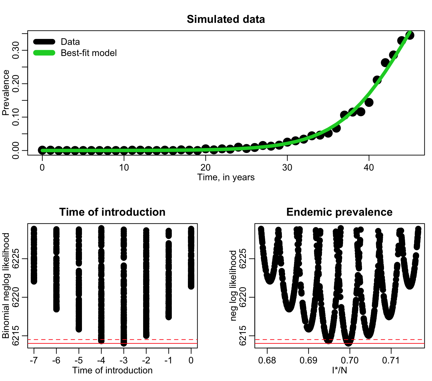
From this output we can estimate the best-fit, one standard deviation uncertainty (range of parameter values within fmin+1/2), and 95% confidence intervals (range of points within fmin+0.5*1.96^2).
Reducing the size of file output
Once you have narrowed in on the best parameter ranges with the above iterative method, there are still many parameter hypothesis combinations that fall within those ranges that yield large likelihoods nowhere near the minimum value (especially if you are fitting for several parameters at once). When running R scripts in batch to get well-populated likelihood-vs-parameter plots to ensure precise estimates of the best-fit parameters and uncertainties, this can lead to really large file output if you output every single set of sampled parameter hypotheses and likelihood.
To control the size of file output, what I’ll often do is only store parameter hypotheses and likelihoods for which the likelihood was within, say, 100 of the minimum likelihood found so far by that script.