
[Here we examine how various demographics might be related to voting patterns in the Republican and Democratic primaries that have taken place so far, and whether one or more candidates has broad popular appeal across demographics.]
(Spoiler alert: as of mid-April, 2016, Clinton appears to have the broadest appeal across many demographics. However, I do not mean this analysis to advocate one candidate or political party over another, I simply represent the data as it is.)
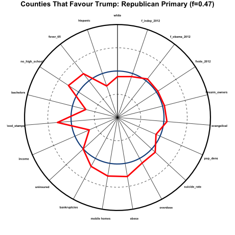
Based on the counties that have had primaries so far at the time of this writing in mid-April, 2016, we expressed the demographics of a particular county as a percentile related to all the other counties that have voted, and visualized the results in a format sometimes called a “spider-web graph”; the spokes of the circular graph correspond to various demographics and social indicators, and if a point lies on a spoke far from the center, it indicates that it lies at a higher percentile for the demographic that corresponds to that spoke.
So, for instance, if one of the spokes is “income”, the closer towards the center of the circle on that spoke, the lower the average household income compared to other counties, and the closer to the perimeter of the circle, the higher the average income. Here is what these spokes might look like for a bunch of different demographics and variables:
There is a lot of information on display all at once in the above plot! Let’s break it down a step at a time. The variables corresponding to each spoke are:
- fwhite: fraction of non-hispanic whites in the population
- fover_65: fraction of the population over the age of 65
- no_high_school: fraction of the population 25 years and over without a high school diploma
- bachelors: fraction of the population 25 years and over with at least a bachelors degree
- food stamps: fraction of family households receiving food stamp assistance
- uninsured: fraction of the population without health insurance
- bankruptcies: per-capita bankruptcy rates
- mobile homes: fraction of households that consist of mobile homes
- obese: fraction of the population that is obese
- overdose: per-capita death rates by drug overdoses
- suicide rate: per-capita age-adjusted suicide rate
- pop_dens: population density
- evangelical: fraction of population regularly attending an evangelical church
- firearm_owners: fraction of households that own firearms
- fvote_2012: fraction of adult population that voted in 2012 election
- f_obama_2012: fraction of votes that went to Obama
- f_independent_2012: fraction of votes that went to an independent candidate
The blue circle on the plot represents the median values for each of the demographics and variables for all counties that have voted in the primaries so far. The outer black circle represents the 100th percentile (basically, the county that has the highest value of that particular indicator along a spoke). The inner dashed line is the 25th percentile, and the outer dashed line is the 75th percentile.
Now, for a particular sub-group of counties (in the case in the figure, counties that favoured Trump over any other candidate by at least 5 points in the primary), we can show, with the red line, how the demographics in those counties compare to those of all other counties. You can see that, for example, the average median household income in counties that favoured Trump is much lower than that for all counties, because the red line dips sharply towards the center of the circle along the “income” spoke. And there is an unusually large fraction of people in those counties who do not have a high school diploma, because the red line deviates outwards along the “no_high_school” spoke.
Let’s look at this further, in more detail…
Demographics of counties that heavily favour Trump in the Republican primaries
Here we examine the average percentiles of counties that favoured Trump over any other candidate by at least 5 percentage points in the Republican primaries, which was 47% of all counties. This is what the demographics of those counties look like, where I have added a pink band to the plot above show the 25th to 75th percentiles for those counties:
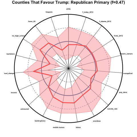
The counties that favour Trump over other candidates skew older and less hispanic, are more poorly educated, have a high fraction of families receiving food stamps, low income, a relatively large fraction of people living in mobile homes, and are generally in poorer health than average. These counties were about average in voter participation, the percentage that voted for Obama in 2012, and the percentage that voted for an independent presidential candidate in 2012.
Demographics of counties that heavily favour Cruz in the Republican primaries
Now let’s look at the same plot for counties that favoured Cruz by at least 5 percentage points in the Republican primaries. This was 21% of counties:
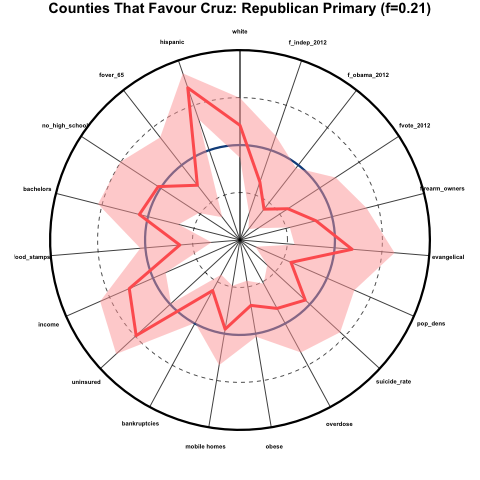
These counties skew far more hispanic, more white, somewhat younger, higher income, and generally have better health than average, despite the very high average of people without health insurance. The counties also skew very rural (low population density), had generally very low voter participation in 2012, and skewed very Republican in the 2012 election.
Demographics of counties that heavily favour Sanders in the Democratic primaries
Now let’s look at the counties that favoured Sanders over Clinton by at least 5 percentage points in the Democratic primaries that have occurred so far (21% of counties):
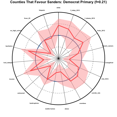
These counties skew very white, very educated, much less evangelical, high income, low percentage of uninsured, and good health (except for overdose and suicide rates, which are about average). There was a high degree of voter participation in these counties in 2012, and they skewed Democrat and heavily Independent rather than Republican.
Demographics of counties that heavily favour Clinton in the Democratic primaries
Now let’s look at the counties that favoured Clinton over Sanders by at least 5 percentage points so far (67% of counties):
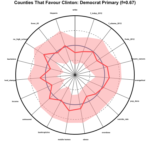
These counties skew perhaps somewhat less white than average, but for the most part are quite close the average for all other counties.
Which candidate has the broadest appeal?
As I discussed above, the candidate with the broadest appeal would be favoured by counties that are representative of the national averages in the various demographics. It would appear that, as of mid-April 2016, neither Trump nor Cruz achieves this, although Trump so far comes closer than Cruz to broader appeal; however Trump support appears to skew poorer, unhealthier, and less educated, and Cruz support appears to skew heavily rural, and evangelical.
Clinton appears to so far have far broader appeal over a wide array of demographics than Sanders (and indeed, over any other candidate).
Sources of data
- The Politico website makes available the county level election results for most of the primaries that have taken place. They are missing the county level results for Iowa and Alaska, and Kansas and Minnesota have results by district, not counties.
- All cause and cardiovascular death rates from 2010 to 2014 from the CDC.
- Household firearm ownership is estimated using the fraction of suicides that are committed by firearm; the suicide data by cause from 2010 to 2014 is obtained from the CDC.
- Education, racial and age demographics, household living arrangements, percentage without health insurance, and income are obtained from the 2014 Census Bureau American Community Survey 5 year averages.
- Land area of counties obtained from the 2015 Census Bureau Gazetteer files.
- Religion demographics from the 2010 Census religion study
- Drug overdose mortality from 1999 to 2014 from the CDC.
- Obesity and diabetes prevalence from the CDC.