
Category Archives: General
Protected: REgional Violence and Extremism Analytic Lens, Pacific Northwest (REVEAL:PNW)
Featured
2016 Primary Election: which demographics favour which candidates?
Reply
[Here we examine how various demographics might be related to voting patterns in the Republican and Democratic primaries that have taken place so far, and whether one or more candidates has broad popular appeal across demographics.]
(Spoiler alert: as of mid-April, 2016, Clinton appears to have the broadest appeal across many demographics. However, I do not mean this analysis to advocate one candidate or political party over another, I simply represent the data as it is.)
Based on the counties that have had primaries so far at the time of this writing in mid-April, 2016, we expressed the demographics of a particular county as a percentile related to all the other counties that have voted, and visualized the results in a format sometimes called a “spider-web graph”; the spokes of the circular graph correspond to various demographics and social indicators, and if a point lies on a spoke far from the center, it indicates that it lies at a higher percentile for the demographic that corresponds to that spoke.
So, for instance, if one of the spokes is “income”, the closer towards the center of the circle on that spoke, the lower the average household income compared to other counties, and the closer to the perimeter of the circle, the higher the average income. Here is what these spokes might look like for a bunch of different demographics and variables:
There is a lot of information on display all at once in the above plot! Let’s break it down a step at a time. The variables corresponding to each spoke are:
- fwhite: fraction of non-hispanic whites in the population
- fover_65: fraction of the population over the age of 65
- no_high_school: fraction of the population 25 years and over without a high school diploma
- bachelors: fraction of the population 25 years and over with at least a bachelors degree
- food stamps: fraction of family households receiving food stamp assistance
- uninsured: fraction of the population without health insurance
- bankruptcies: per-capita bankruptcy rates
- mobile homes: fraction of households that consist of mobile homes
- obese: fraction of the population that is obese
- overdose: per-capita death rates by drug overdoses
- suicide rate: per-capita age-adjusted suicide rate
- pop_dens: population density
- evangelical: fraction of population regularly attending an evangelical church
- firearm_owners: fraction of households that own firearms
- fvote_2012: fraction of adult population that voted in 2012 election
- f_obama_2012: fraction of votes that went to Obama
- f_independent_2012: fraction of votes that went to an independent candidate
The blue circle on the plot represents the median values for each of the demographics and variables for all counties that have voted in the primaries so far. The outer black circle represents the 100th percentile (basically, the county that has the highest value of that particular indicator along a spoke). The inner dashed line is the 25th percentile, and the outer dashed line is the 75th percentile.
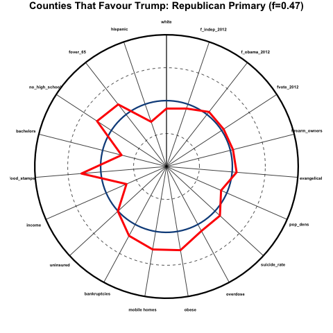
Now, for a particular sub-group of counties (in the case in the figure, counties that favoured Trump over any other candidate by at least 5 points in the primary), we can show, with the red line, how the demographics in those counties compare to those of all other counties. You can see that, for example, the average median household income in counties that favoured Trump is much lower than that for all counties, because the red line dips sharply towards the center of the circle along the “income” spoke. And there is an unusually large fraction of people in those counties who do not have a high school diploma, because the red line deviates outwards along the “no_high_school” spoke.
Let’s look at this further, in more detail…
Demographics of counties that heavily favour Trump in the Republican primaries
Here we examine the average percentiles of counties that favoured Trump over any other candidate by at least 5 percentage points in the Republican primaries, which was 47% of all counties. This is what the demographics of those counties look like, where I have added a pink band to the plot above show the 25th to 75th percentiles for those counties:
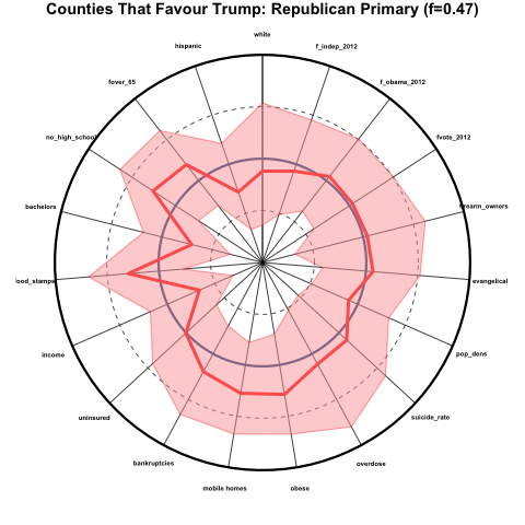
The counties that favour Trump over other candidates skew older and less hispanic, are more poorly educated, have a high fraction of families receiving food stamps, low income, a relatively large fraction of people living in mobile homes, and are generally in poorer health than average. These counties were about average in voter participation, the percentage that voted for Obama in 2012, and the percentage that voted for an independent presidential candidate in 2012.
Demographics of counties that heavily favour Cruz in the Republican primaries
Now let’s look at the same plot for counties that favoured Cruz by at least 5 percentage points in the Republican primaries. This was 21% of counties:
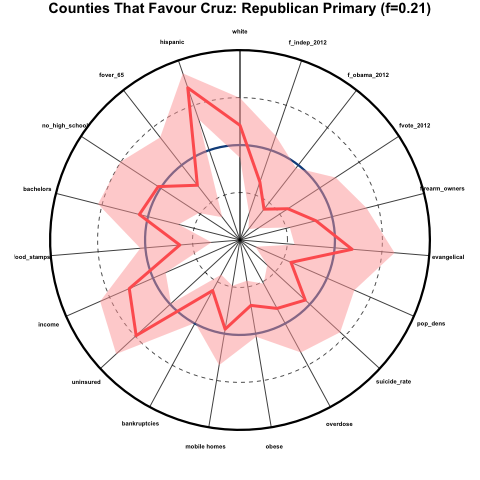
These counties skew far more hispanic, more white, somewhat younger, higher income, and generally have better health than average, despite the very high average of people without health insurance. The counties also skew very rural (low population density), had generally very low voter participation in 2012, and skewed very Republican in the 2012 election.
Demographics of counties that heavily favour Sanders in the Democratic primaries
Now let’s look at the counties that favoured Sanders over Clinton by at least 5 percentage points in the Democratic primaries that have occurred so far (21% of counties):
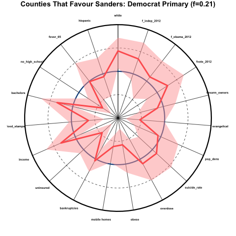
These counties skew very white, very educated, much less evangelical, high income, low percentage of uninsured, and good health (except for overdose and suicide rates, which are about average). There was a high degree of voter participation in these counties in 2012, and they skewed Democrat and heavily Independent rather than Republican.
Demographics of counties that heavily favour Clinton in the Democratic primaries
Now let’s look at the counties that favoured Clinton over Sanders by at least 5 percentage points so far (67% of counties):
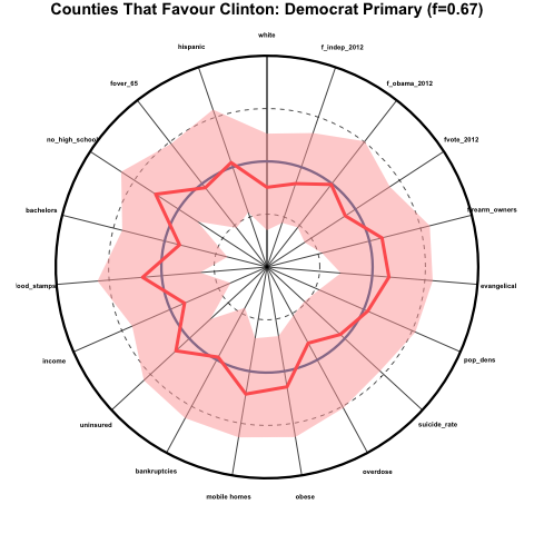
These counties skew perhaps somewhat less white than average, but for the most part are quite close the average for all other counties.
Which candidate has the broadest appeal?
As I discussed above, the candidate with the broadest appeal would be favoured by counties that are representative of the national averages in the various demographics. It would appear that, as of mid-April 2016, neither Trump nor Cruz achieves this, although Trump so far comes closer than Cruz to broader appeal; however Trump support appears to skew poorer, unhealthier, and less educated, and Cruz support appears to skew heavily rural, and evangelical.
Clinton appears to so far have far broader appeal over a wide array of demographics than Sanders (and indeed, over any other candidate).
Sources of data
- The Politico website makes available the county level election results for most of the primaries that have taken place. They are missing the county level results for Iowa and Alaska, and Kansas and Minnesota have results by district, not counties.
- All cause and cardiovascular death rates from 2010 to 2014 from the CDC.
- Household firearm ownership is estimated using the fraction of suicides that are committed by firearm; the suicide data by cause from 2010 to 2014 is obtained from the CDC.
- Education, racial and age demographics, household living arrangements, percentage without health insurance, and income are obtained from the 2014 Census Bureau American Community Survey 5 year averages.
- Land area of counties obtained from the 2015 Census Bureau Gazetteer files.
- Religion demographics from the 2010 Census religion study
- Drug overdose mortality from 1999 to 2014 from the CDC.
- Obesity and diabetes prevalence from the CDC.
How to be a good reviewer and a good reviewee
[In this module, we will discuss the steps involved in reviewing a paper in an academic journal]

Protected: Data sources for firearm violence, social science, and life science research
Does sunspot activity cause influenza pandemics? (spoiler alert: no)
There have been 8 apparent influenza pandemics (generally agreed upon in the literature to have occurred) since 1700, and a total of 16 apparent and potential pandemics. Influenza pandemics tend to have high mortality, which means that it would be awfully nice if we could predict when they will occur, such that we can prepare in advance.
It has been observed that 6 out of the 8 apparent influenza pandemics since 1700 (and 13 of the 16 total potential number) occurred within one year of when the number of sunspots was at a maximum or minimum (sunspot activity has an 11 year cycle, on average). Here’s a plot that shows the pattern (you can find the sunspot data from many different sites online… for instance, here):
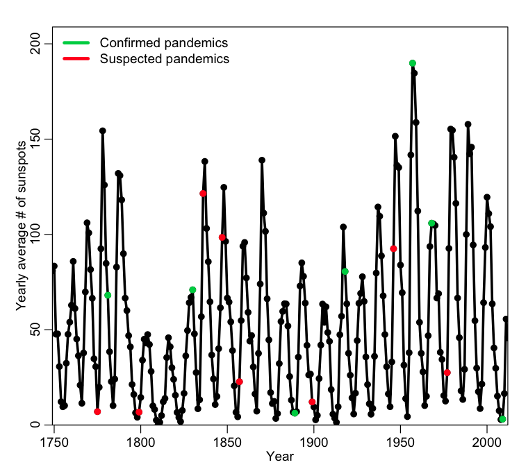
A total of 6 out of 8 (or 13 out of 16) perhaps seems like an awfully large fraction that occur near a high or low in sunspot activity! Indeed, there have been claims that sunspot activity can increase the chance of meteorites from outer space bringing in extraterrestrial influenza viruses (no, I’m not making that up… a 1990 paper claiming that actually appeared in Nature).

Since that initial paper, there have been several other analyses of the same data, some of which also conclude that yes, influenza pandemics appear to happen “around the time” of sunspot activity maxima and/or minima.
However, let’s take a closer look. There were 56 sunspot extrema in the past 264 years. The number of years within +/- one year of an extrema is thus 56*3=168. Thus, by mere random chance, we would expect that the a pandemic would fall “near” a max or min with probability p=168/264=0.64. The observed fraction of 0.75 (or 0.81 if you include potential pandemics too) is higher than this. But is it significantly higher? In R, the binom.test(k,n,p) function returns the confidence interval on the estimate of the probability of success if we observe k successes out of n trials. It also assesses the probability that this fraction is consistent with an assumed true probability of success, p (if the true value of p lies within the estimated confidence interval for the probability of success, there is no statistically significant evidence that they are different).
If we use binom.test(6,8,168/264), we find that the 95% confidence interval of the estimated p is [0.35,0.97]. If we include potential pandemics as well, and use binom.test(13,16,168/264), we get a confidence interval of [0.54,0.96]. The true value that we assume under our null hypothesis is p=168/264=0.64, which falls squarely within both confidence intervals. Thus, despite claims to the contrary in the literature, there is no statistically significant evidence that sunspot cycles have anything whatsoever to do with influenza pandemics.*
In addition to this simple Binomial probability analysis, I also took a look at the distribution of the number of sunspots in pandemic and non-pandemic years using the two sample Kolomogorov-Smirnov test…. there is no statistically significant difference between the distributions.
*The reason the various papers draw the opposite conclusion is due to faulty statistical analyses. Just like the old saying “all happy families are alike, but unhappy families are unhappy in their own way”, it is true that all good statistical analyses tend to be a lot alike, but faulty ones are usually faulty in their own unique way. In this case, in general, the various statistical analyses didn’t account properly for the small sample sizes, and/or used statistical tests or methods inappropriate for the data. It is well worth noting that just because something in the published literature made it past review doesn’t mean that it was a sound analysis without flaws.
Basics of LaTeX and BibTeX for students in mathematical biology/epidemiology
Most journals in the field of mathematical epidemiology/biology require that you submit manuscripts in LaTeX format.
LaTeX is a word processing language, in which you create a document that contains directives to the latex compiler to produce a final document. LaTeX provides many capabilities not available in Word; perhaps most important to mathematicians, LaTeX enables typesetting of complex equations that would be difficult, if not impossible in Word.
In addition, LaTeX has a reference management package called BibTeX that easily enables citation of references within your document.
In this module, we will discuss some simple examples of document formatting in LaTeX, and describe how to include figures and tables in the document, and cite references.
Good work habits towards being a more effective researcher
Over the years I have developed some habits as I work that help to make me more efficient as a researcher. Of students that I’ve seen struggle in their doctoral studies, they are always lacking several of the habits in this list. Of students who excel, they have all (or nearly all of these habits) either because they were mentored in them, or somehow figured it out themselves.
In assigned homework, students will be expected to conform to good coding and plotting practices, and to submit an annotated bibliography in bibtex format if literature searches are required.
Many of these habits overlap with the list of good work habits in jobs in the private sector. Start using these practices now, and reap many benefits as you go along 🙂
How to download an R script from the internet and run it
While you can input commands interactively into the R window, it is often more convenient to create a file (usually with a .R extension) that contains all the R code, and then ask R to run (aka: source) the commands in the file.
In the file short_test.R, I have put the R code to do a loop, and print out the numbers one through ten. To run this script, first you need to create a folder on your computer that we will refer to as your working directory… Have this folder off of your root directory (C: directory in windows, and off of your base user directory in other platforms), and call this folder short_test_dir
Now, in R, you can use the setwd() command to change to that working directory (which tells R that from now on you want it to look only in that directory for files)
For windows, type at the R command prompt
setwd("C:/short_test_dir")
and for Linux or Max OSX type
setwd("~/short_test_dir")
(the twiddle ~ means your home directory). If you get an error at this point, it is because you did not properly create the folder short_test_dir under your home folder (or the C: directory in Windows), or you made a spelling mistake, or you forgot one or both quotes.
Now, a problem with Windows is that .R and data files downloaded from the internet tend to be saved with a .txt extension, and it is annoying to constantly have to remove it. In addition, web browsers running on Windows seem to usually assume that any text file you are looking at on the internet must be HTML, so when downloading such files it puts HTML prefaces at the top, which prevent the files from being run in R. To get around these problems, it is usually easiest to download the files using the R function download.file().
Thus, for windows, at the R command line type
download.file("http://www.sherrytowers.com/short_test.R","short_test.R")
and for Linux and Mac OSX type
download.file("http://www.sherrytowers.com/short_test.R","short_test.R")
If you get an error at this point, you’ve made a spelling mistake in the URL, or in the local directory name. Or you’ve forgotten one or more quotes.
Now, to run the file, type at the R command prompt
source("short_test.R")
You should see the numbers 1 through 10 being printed to the screen.
If you are creating your own .R file, you need to make sure that (particularly for Windows) a .txt is not appended to the end of it.
Now, using a text editor like Notepad (Windows) or TextEdit (Mac OSX), or whatever text editor you feel comfortable with, change the short_test.R file to print the numbers 11 to 100, but in a line, with each number separated by a space (rather than in a column). Save the file, then make sure you can run the new file from the R command line.
You will be expected to have completed this exercise on your own before class, and to be adept at downloading, editing, and running R scripts.
How to write a good scientific paper (and get your work published as painlessly as possible)
As scientists, our main objective is not just to do well motivated and novel research, but also to publish that research in a timely fashion, and in a way that clearly communicates to an “educated layperson“ what is new and interesting about your research, while also providing enough detail in the paper such that an expert in your field can assess the soundness of your work. Remember that, first and foremost, your work needs to be novel with a well posed research question, and must be an interesting and well motivated addition to the body of published literature on the topic. If you don’t have the skills to produce a well written paper, even with a well posed research question you will have a difficult time getting your work published, and/or you will needlessly get bogged down in review.
- Learning to write (and read) a scientific paper
- Tips for making your paper easy for a reviewer to review
- Sections required in a scientific paper, and what they should contain.
- Developing skills to efficiently and quickly write up your work
- Who to include as co-authors
- Your responsibilities as a author/co-author
- Submitting your paper to a journal
- Responding to reviewer questions
- Rejection and Acceptance
Some handy scripts and graphs for archaeoastronomy
If you are looking at an archaeological site that you believe was a comprehensive ancient sky observatory, it may be possible to date the site from its alignments to celestial phenomenon. Note that you need a site with several likely sun/moon/star alignments to do this. On this page I provide some handy R and python scripts to calculate the rise/set azimuth (assuming a flat horizon) of the Sun, Moon, and stars for a given location at a given date.
Correcting calculated rise/set azimuths for the horizon
Once you have used pyephem or an R script to calculate the rise/set azimuths of stars, the Sun and the Moon at a particular date for a particular latitude, you need to correct the calculation for horizon features.
ASU AML 610: probability distributions important to modelling in the life and social sciences
[After reading this module, students should be familiar with probability distributions most important to modelling in the life and social sciences; Uniform, Normal, Poisson, Exponential, Gamma, Negative Binomial, and Binomial.]
Contents:
Introduction
Probability distributions in general
Probability density functions
Mean, variance, and moments of probability density functions
Mean, variance, and moments of a sample of random numbers
Uncertainty on sample mean and variance, and hypothesis testing
The Poisson distribution
The Exponential distribution
The memory-less property of the Exponential distribution
The relationship between the Exponential and Poisson distributions
The Gamma and Erlang distributions
The Negative Binomial distribution
The Binomial distribution
There are various probability distributions that are important to be familiar with if one wants to model the spread of disease or biological populations (especially with stochastic models). In addition, a good understanding of these various probability distributions is needed if one wants to fit model parameters to data, because the data always have underlying stochasticity, and that stochasticity feeds into uncertainties in the model parameters. It is important to understand what kind of probability distributions typically underlie the stochasticity in epidemic or biological data.
Continue reading
Good practices in producing plots
Years ago I once had a mentor tell me that one of the hallmarks of a well-written paper is the figures; a reader should be able to read the abstract and introduction, and then, without reading any further, flip to the figures and the figures should provide much of the evidence supporting the hypothesis of the paper. I’ve always kept this in mind in every paper I’ve since produced. In this module, I’ll discuss various things you should focus on in producing good, clear, attractive plots.
Good programming practices (in any language)
Easy readability, ease of editing, and ease of re-usability are things to strive for in code you write in any language. Achieving that comes with practice, and taking careful note of the hallmarks of tidy, readable, easily editable, and easily re-usable code written by other people.
While I’m certainly not perfect when it comes to utmost diligence in applying good programming practices, I do strive to make readable and re-useable code (if only because it makes my own life a lot easier when I return to code I wrote a year earlier, and I try to figure out what it was doing).
In the basics_programming.R script that I make use of some good programming practices that ensure easy readability. For instance, code blocks that get executed within an if/then statement, for loops, or while loops are indented by a few spaces (usually two or three… be consistent in the number of indent spaces you use). This makes it clear when reading the code which nested block of code you are looking at. I strongly advise you to not use tabs to indent code. To begin with, every piece of code I’ve ever had to modify that had tabs for indent also used spaces here and there for indentation, and it makes it a nightmare to edit and have the code remain easily readable. Also, if you have more than one or two nested blocks of code, using tabs moves the inner blocks too far over to make the code easily readable.
In the R script sir_agent_func.R I define a function. Notice in the script that instead of putting all the function arguments on one long line, I do it like this:
SIR_agent = function(N         # population size
                    ,I_0       # initial number infected
                    ,S_0       # initial number susceptible
                    ,gamma     # recovery rate in days^{-1}
                    ,R0        # reproduction number
                    ,tbeg      # begin time of simulation
                    ,tend      # end time of simulation
                    ,delta_t=0 # time step (if 0, then dynamic time step is  implemented)
                    ){
This line-by-line argument list makes it really easy to read the arguments (and allows inline descriptive comments). It also makes it really easy to edit, because if you want to delete an argument, it is simple as deleting that line. If you want to add an argument, add a line to the list.
Descriptive variable names are a good idea because they make it easier for someone else to follow your code, and/or make it easier to figure out what your own code did when you look at it 6 months after you wrote it.
Other good programming practices are to heavily comment code, with comment breaks that clearly delineate sections of code that do specific tasks (this makes code easy to read and follow). I like to put such comments “in lights” (ie; I put a long line of comment characters both above and below the comment block, to make it stand out in the code). If the comments are introducing a function, I will usually put two or three long lines of comment characters at the beginning of the comment block; it makes it clear and easy to see when paging through code where the functions are defined.
In-line comments are also very helpful to make it clear what particular lines of code are doing.
A good programming practice that makes code much easier to re-use is to never hard-code numbers in the program. For instance, at the top of the basics_programming.R script I create a vector that is n=1000 elements long. In the subsequent for loop, I don’t have
for (i in 1:1000){}
Instead I have
for (i in 1:n){}
This makes that code reusable as-is if I decide to use it to loop over the elements of a vector with a different length. All I have to do is change n to the length of the new vector. Another example of not hard-coding numbers is found in the code associated with the while loop example.
As an aside here, I should mention that in any programming language you should never hard-code the value of a constant like π (as was pointed out in basics.R, it is a built-in constant in R, so you don’t need to worry about this for R code). In other languages, you should encode pi as pi=acos(-1.0), rather than something like pi=3.14159. I once knew a physics research group that made the disastrous discovery that they had a typo in their hard-coded value of pi… they had to redo a whole bunch of work once the typo was discovered.
Notice in the script that I have a comment block at the top of basics_programming.R that explains what the script does, gives the date of creation and the name of the person who wrote the script (ie; me). It also gives the contact info for the author of the script, and copyrights the script. Every script or program you write should have that kind of boilerplate at the top (even if you think the program you are writing will only be used by you alone… you might unexpectedly end up sharing it with someone, and/or the boilerplate makes it clear that the program is *your* code, and that people just can’t pass it off as their own it if they come across it). It also helps you keep track of when you wrote the program.
Welcome to Polymatheia

I am a data scientist with a diverse background visual analytics, data mining, social media analytics, machine learning, high performance computing, and mathematical and computational dynamical modeling. As both an academic and a consultant, I have worked on a broad array of research topics in public health and the social sciences, including crime and violence risk analyses, spread of political and partisan sentiments in a society, disease modelling, and other topics in applied modelling in the social and life sciences, with over 360 publications on a wide variety of subjects. My unique trans-disciplinary skill set enables me to examine a wide range of research questions that are often of broad interest and importance to policy makers and the general public.
My work in the computational social sciences has been high impact, including an analysis of how media can incite panic in a population, and how contagion may play a role in the temporal patterns observed in mass killings in the US. The latter work has received extensive media coverage, including on BBC, CNN, NBC, CBS, FOX, NPR, Reuters, USA Today, Washington Post, Los Angeles Times, The Wall Street Journal, Huffington Post, Christian Science Monitor, Newsweek, The Atlantic, The Telegraph, The Guardian, Vox, and many other local, national, and international news agencies. The study was also profiled in Season 8, Episode 4 of Morgan Freeman’s Through the Wormhole documentary series on the Discovery Channel in 2017, “Is Gun Crime a Virus?”.
Several of my publications in computational epidemiology have also received widespread attention, including forecasts for the progression of the 2009 influenza pandemic, and the 2014 Ebola epidemic in West Africa. Both analyses correctly forecast the progression of the epidemics, and my forecast for the 2009 pandemic was discussed in a special US Senate meeting on October 23, 2009 H1N1 Flu: Monitoring the Nation’s response.
Through my consulting company, Towers Consulting LLC, I provide consulting services for industry, academia, and the public sector in quantitative and predictive analytics, modelling, statistics, and visual analytics. Notable past and current clients include the VACCINE Department of Homeland Security Center of Excellence, Cure Violence Global, the Carter Center, George Washington University, and Disney. Prospective clients can contact me at TowersConsultingLLC@gmail.com.
On this website I share information and computational tools related to a wide range of my research topics, including visual analytics, applied statistics, and mathematical and computational modelling methods. This website also includes material related to my lectures and seminars in statistical and computational methods in the life and social sciences.
My CV is available here.
Finding sources of data for computational, mathematical, or statistical modeling studies: free online data
[In this module we discuss methods for finding free sources of online data. We present examples of climate, population, and socio-economic data from a variety of online sources. Other sources of potentially useful data are also discussed. The data sources described here are by no means an exhaustive list of free online data that might be useful to use in a computational, statistical, or mathematical modeling study.] Continue reading
Finding sources of data: extracting data from the published literature
Connecting mathematical models to predicting reality usually involves comparing your model to data, and finding model parameters that make the model most closely match observations in data. And of course statistical models are wholly developed using sources of data.
Becoming adept at finding sources of data relevant to a model you are studying is a learned skill, but unfortunately one that isn’t taught in any textbook!
One thing to keep in mind is that any data that appears in a journal publication is fair game to use, even if it appears in graphical format only. If the data is in graphical format, there are free programs, such as DataThief, that can be used to extract the data into a numerical file.