Years ago I once had a mentor tell me that one of the hallmarks of a well-written paper is the figures; a reader should be able to read the abstract and introduction, and then, without reading any further, flip to the figures and the figures should provide much of the evidence supporting the hypothesis of the paper. I’ve always kept this in mind in every paper I’ve since produced. In this module, I’ll discuss various things you should focus on in producing good, clear, attractive plots.
Axes, labels, and thick lines
Good figures need to tell a story. This is true whether they are part of a paper, a poster, or a science fair exhibit. The most important part of a graph is of course its content, but you also have to think about how to best convey that content to your readership.
A good figure has both axes labelled, with units indicated. It should have a descriptive title. If more than one thing is being shown in a plot, a legend is necessary (don’t just rely on the caption!). The lines need to be thick enough that they are easily visible from four feet away if the figure is printed on 8.5″x11″ paper (and this is true even if they are meant for inclusion in a paper, rather than a poster or science fair exhbit). The axes should be scaled such that there is not an inappropriate amount of white space above or below the curves in the plot (an example of a plot with inappropriately scaled axes is below).
Below is a figure related to a modelling analysis that used a predator/prey model to examine the control of a corn pest (H.Zea) using a parasitic wasp (Trichogramma). Farmers put cards of wasp eggs in their fields on a weekly basis (because the wasps die in a few days without a nectar food source). The model shows the number of H.Zea larvae in the field with no control, and with weekly applications of Trichogramma. The inset plot shows the number of adults wasps in the field over time.
Do you think this plot does an adequate job of telling a story about the model predictions for the level of H.Zea control that can be achieved with weekly applications of Trichogramma?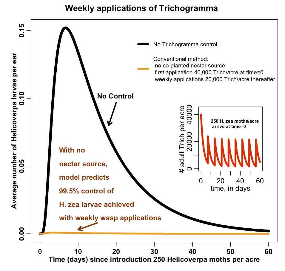
In the file some_plotting_tricks.R I show how to add arrows and text to a plot, along with one way to do an inset figure. The file produces the plot: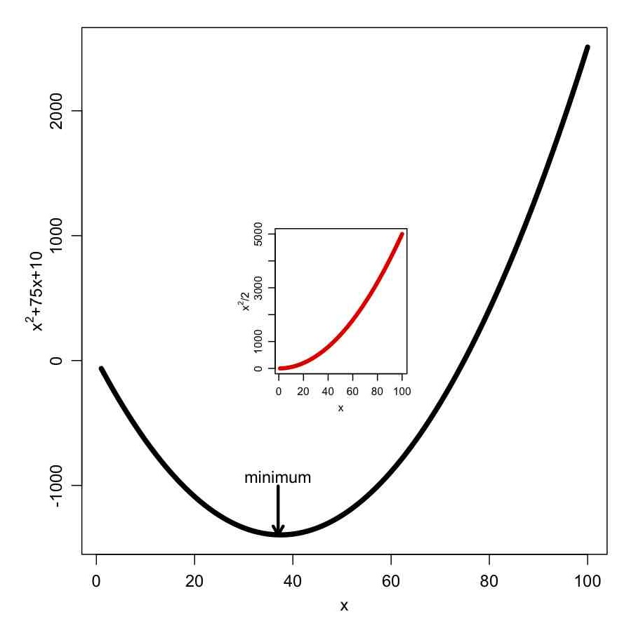
The subplot() function in the R Hmisc library also allows you to put plots within a plot.
The some_plotting_tricks.R script also shows you how to pause an R script between plots, until the user hits the <Enter> key. It also shows you how to overlay two plots with differing Y axes, with one Y axis on the left, and the other on the right, like so: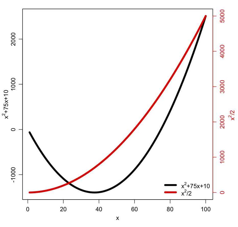
Sideways axis labels
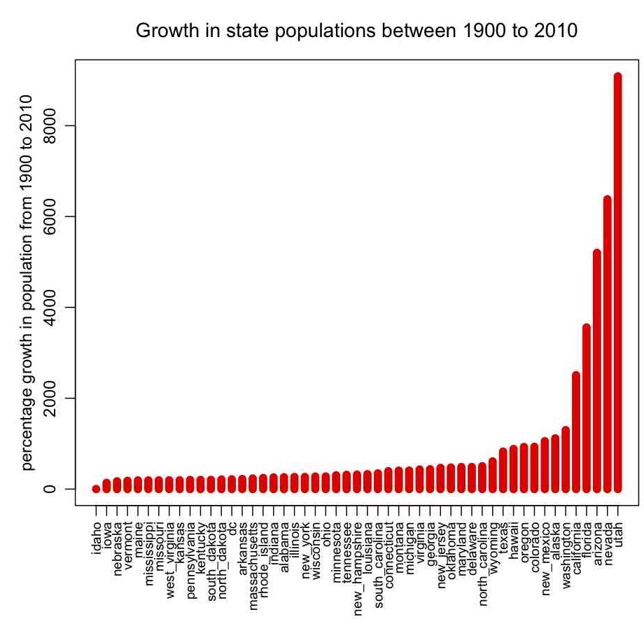
In pop.R I give an example of how to read in data that contains characters as well as numbers (the file it reads in, pop.txt, contains state names, and the population of the states by decade between 1900 to 2010 from the US census bureau… the hhs_region field is the geographic region of the state, as defined by the US Department of Health and Human Services). The script also gives an example of how to sort a data frame by the values in one of its columns, how to change the margins around plots, and how to make axis labels perpendicular to the axis. It produces the following plot:
Examples of bad plots: poor labels, too much white space, and the “exactly what am I looking at???” factor
Now that we’ve talked about what you should do, let’s discuss what you shouldn’t do. Here is an example of a figure (taken from a paper that shall remain un-cited here) that is somewhat poorly produced. Note the inappropriate scale of the y axis, leaving too much white space above and below the data. Also note that the y axis is labelled, but does not show units (is the rate in 1/sec, 1/min, 1/days?).
Here is another plot, with caption slightly edited to protect the identity of the author. Note that the y axis is completely unlabelled, with no units:
Good plotting practices: use of colour
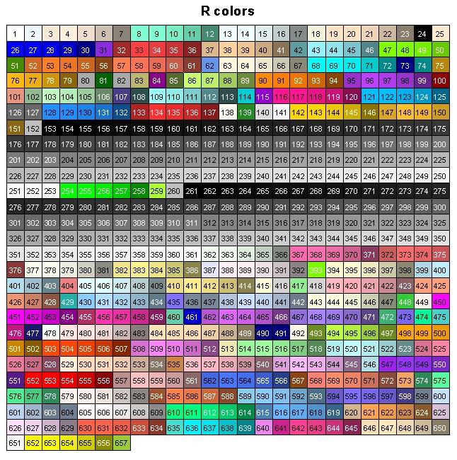
Using harmonious colour-ways can add a great deal of appeal to your plots. R has many in-built colour options available. To see the names of them all, in the R console type
colors()
Here is a figure that shows what each of those numbered colours look like (courtesy of this website):
You can also get nice colour-ways in R using the rainbow(ncol) to fill a vector of length ncol with gradiated colours of the rainbow. There are also other colour palettes in R you can access via functions like heat.colors(ncol), terrain.colors(ncol), etc.
You are not limited to just these colours. You can use any hexadecimal colour in R by simply putting the hex number in quotes, like this (for example):
x=seq(1,10)
plot(x,col="#CB1ECA",cex=3)
There are utilities like “Just Color Picker” on the Mac, and “Instant Eyedropper” on Windows, that allow you to hover your cursor over a colour on your screen and get the hex value of it. One way to develop nice colour schemes is to have a photo of something with many colours that you find pleasing to the eye (like a picture of an intricate rug, or an outdoor scene with many different colours), and use a cursor-hover colour utility like Just Color Picker to determine serveral key colours in the picture. Pick ones that form a set with the good contrast, such that if your plot had to be viewed in black and white there would be a good grey-scale contrast between the colours (because, while online journals like PLoS ONE allow you to have as many colours as you want in your plots, many print journals charge for colour reproduction of figures… note that making some lines dotted or dashed in your figures can also help distinguish between lines). If you have a hex value for a colour, but want a darker or lighter shade to help with the contrast, the website ColorHexa can help with that.
This person makes colour palettes from colours on famous movie images.
Over time I have developed my own colour schemes of colours I think are fairly harmonious. I’ve also started the practice of sometimes putting a background colour in my plots, because I think it helps to make the plot look better when viewed in colour. To do put a background colour on your plot, you first need to plot the data, then you can use
u=par("usr")
to get the coordinates of the corners of the current plotting area. You can then draw a rectangle over the plotting area with the background colour, then overlay your data again over that rectangle.
The R script mycolors_test.R shows an example of how to do this, using a function called mycolors(lcolorway) defined in mycolors.R that allows you to access nine different colour-ways I’ve come up with, using the argument lcolorway=1,…,9. It outputs the colour-way to a dataframe with the names of the colours, and other settings like line widths and point sizes.
Note, that before you can run this script, you need the sfsmisc and extrafont packages installed. If they are not already installed, in the R console type
install.packages("sfsmisc")
install.packages("extrafont")
and choose an R mirror site relative close to your own location.
When ltest=T in the script, it produces the following plot that shows each of the nine colour-ways. Feel free to use the mycolors() colour-ways function to make your own plots if you like, as-is or edited to your own preferences.
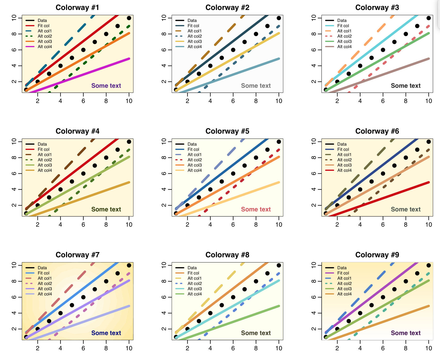
The plot for colorway #7 has a subtle background shading that is lighter in the middle. This involves layering many circles of different shades and different sizes over the center of the plot. The plot for colorway #9 has subtle background shading that is lighter near the bottom. Use of subtle shading can make plots more visually appealing and also can help guide the viewers eye. See the code in the mycolors_test.R script to see how I achieved these types of shading.
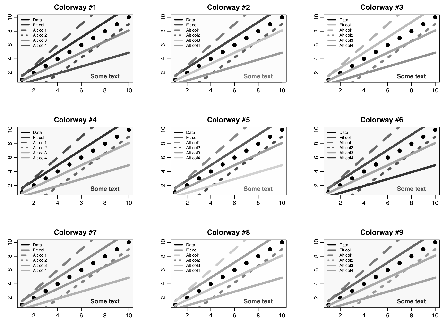
To check whether or not the colour and line type schemes makes for a readable plot in black and white, I used the online app on the convertimage.net website to convert the image to black and white (there are lots of websites that do this, convertimage.net is just one)
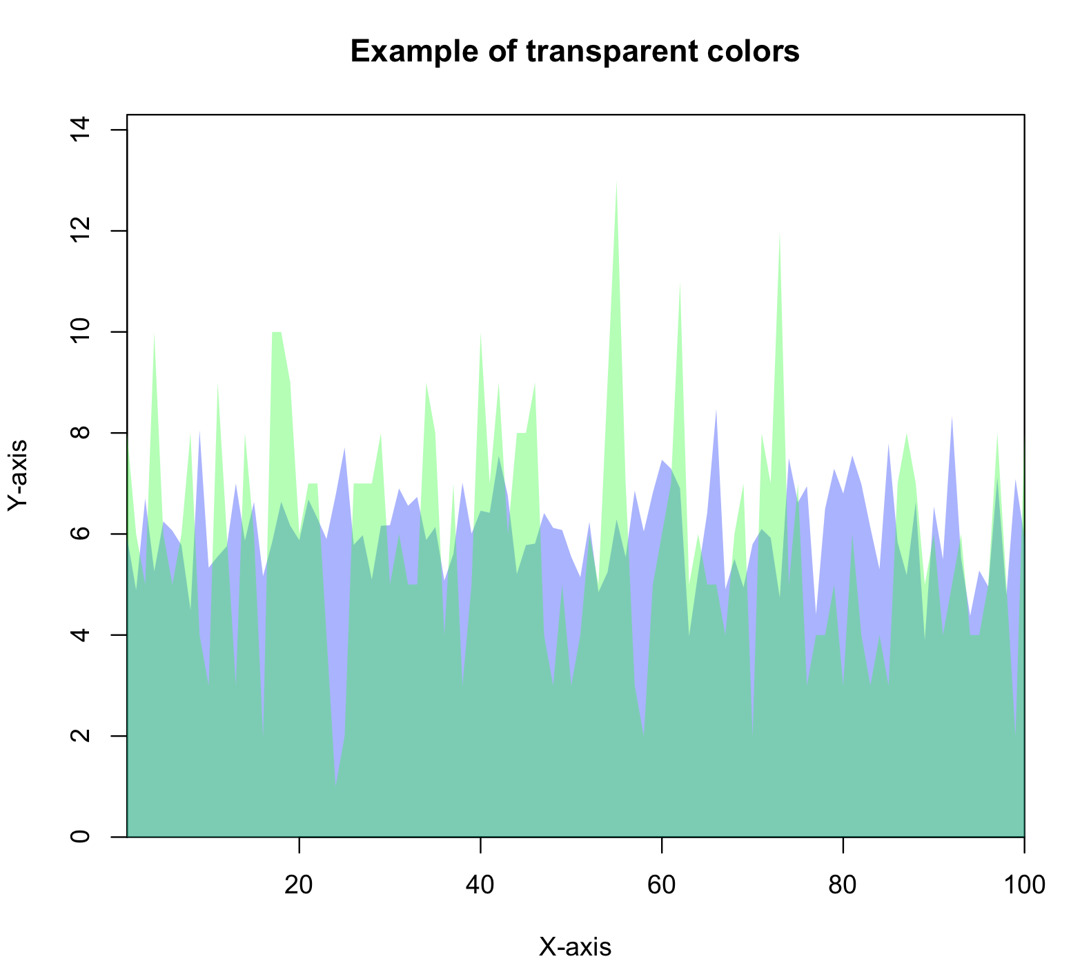
You can also make colours transparent, or semi-transparent in R. The R script mycolors_transparent.R shows an example of how to do this, and outputs the following figure:
Condensing information
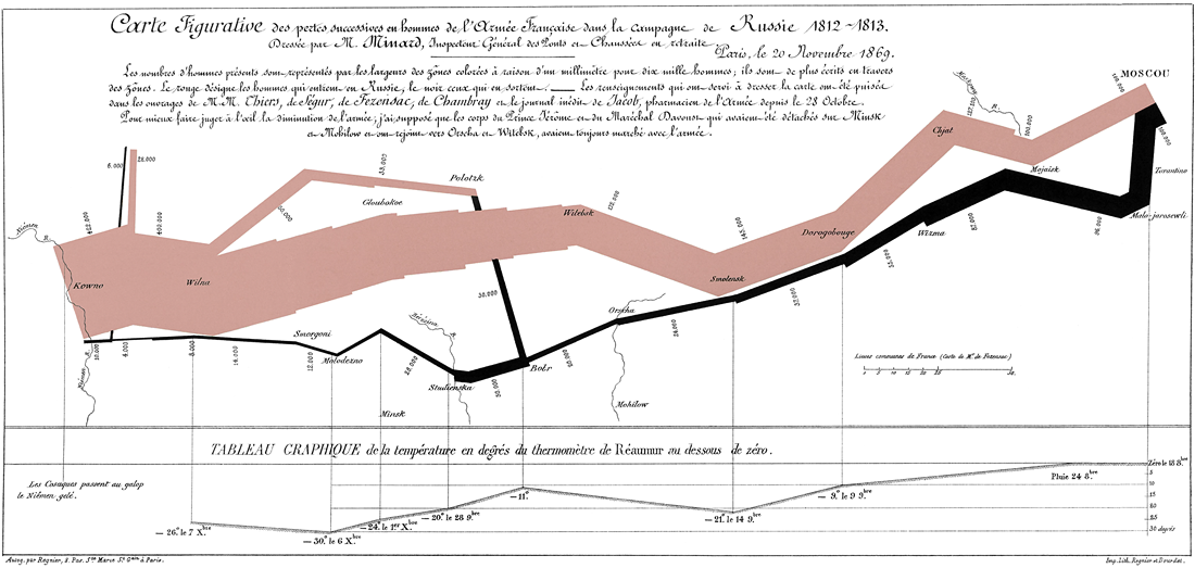
One of the most famous examples of condensed information in a graph is the info-graphic related to Napoleon’s march on, and retreat from, Moscow, created by Charles Joseph Minard, that shows a map with the size of the army as it advanced (orange), and then the size of the army as it retreated (black) along with the temperature at various days during the retreat.
This website gives a cool visual analytics tool that allows you to hover over the graph and see how many people were left in the army at that date and the temperature.
Spend time browsing through online galleries of plots that other people have made to get a sense of how to best condense information into a plot.
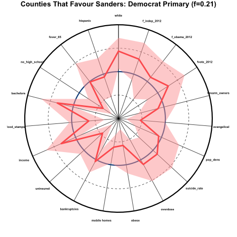
One example of a kind of plot that condenses some types of information pretty well is called a spider-web plot… each spoke represents a different time point or quantity, and the distance from the center of the plot along that radial line represents the magnitude of that quantity. For example, here is a spider-web plot I made of the demographics of counties that favoured Bernie Sanders over Hillary Clinton during the 2016 Democratic primaries. The innermost point represents the 0th percentile and the outermost radius represents the 100th percentile. The mid-point is the national median. Overlaid in red are the results for the counties that favoured Bernie Sanders. The solid red line represents the average percentile (relative to the national) of those counties, and the shaded pink area represents the 95% confidence interval on that average. I probably need to work on my labelling for spider-web plots (sizes and direction) and other aspects of this plot to achieve something more attractive, but all-in-all it collapses a whole bunch of information into just one plot:
Learning how to efficiently condense information into an attractive and readable plot is part art and part science. It comes with practice, and seeking out many examples of other peoples’ efforts.
Outputting plots to EPS format for inclusion in Latex documents
It is easy in R to set things up such that your plot gets output to an Encapsulated Postscript (EPS) file format, that can be included as a figure in a Latex document. In the mycolors.R script, you’ll see that I use a for loop to loop through plotting things twice. The first time the plot goes to the standard R Quartz plotting window, the second time it gets output to an EPS file. I’ve set up the options in the R postscript() function such that the plot should have sufficient resolution, even for journals that are notoriously picky about that kind of thing
(looking in your direction, PLoS ONE, *cough*)
If you run the mycolors.R script and check your working directory, you’ll find a file called mycolors.eps
R also can output plots to many other formats, like jpg, pdf, bitmap, tiff, etc
The R postscript() method can’t process transparent colors. In the mycolors_transparent.R script, I show how you can use the cairo_ps() function in R to get around this.
Creating animated GIFs from a series of plots in R
For inclusion in Powerpoint presentations or online visual analytics applications, animated plots can be quite helpful in conveying information that changes in time and/or space.
This website gives an excellent introduction on how to create animated GIFs from a series of plots in R using the saveGIF() function in the R “animation” library. The function uses methods from the Image Magick software package. You can download Image Magick here. To install the R animation library, in the R console type
install.packages("animation")
The R script agent_grid_hair_gif.R does a stochastic simulation of the spread of hair cells during fetal development, and gives an example of how to create an animated GIF. The hair on our bodies is not randomly distributed; roughly summarized, current prevailing theory has it that during fetal development cells on the skin turn into hair follicle cells, then send chemical signals to try to convince their neighbouring cells to do the same. The neighbouring cells (essentially) have some probability of saying no. So, the hair follicles spread kind of like a rash over the head, but not all cells on the head end up being hair follicles.
The agent_grid_hair_gif.R simulates this process, and uses the saveGIF() function in the animation library to create the following animated GIF:
