Exploratory data analysis essentially is the process of getting to know your data by making plots and perhaps doing some simple statistical hypothesis tests. Getting to know your data is important before starting the process of regression analysis or any kind of more advanced hypothesis testing, because, more often than not, real data will have “issues” that complicate statistical analyses.
For instance, outliers are a common problem; perhaps most of the data look more or less as you would expect them to, but you may have one or two points that exhibit vastly different behaviour. Also, not infrequently, problems with missing data can be discovered by data visualization. Missing data in a large file may be hard to detect otherwise.
In another module we talked about QQ-plots, that allow us to determine if data are consistent wit some probability distribution that we expect to underlie the stochasticity in the data (like the Normal distribution, for instance).
On this page we will give examples of some other types of plots that can be used to visualize data, and a few diagnostic tests that may be useful when initially exploring the data. The methods discussed here are just the tip of the iceberg. For instance, this page discusses many different ways to visualize data.
Plotting time series data
If your data are time series data, one of the first things you might want to do is ensure that the data points have the temporal spacing that you expect. For instance, if the data are supposed to be a continuous series of daily measurements, it is useful to sort the data frame in time, then use the diff() function on the vector of times to ensure that no time stamps are missing. If data turn out to be missing, you need to consider if the missing data will bias your analysis (we will be talking more about this as we proceed in the course to talk about regression methods).
Also, sometimes data are filled with blanks or NA’s. To check if this is the case, subset the data frame, selecting entries with data filled with NA’s using the is.na() function. If this new data frame is empty, then no entries were filled with NA’s.
The next step is to plot the time series data. Do some data points look very different than others? If so, is it something you were expecting? As an example, this is the time series of the number of terrorist attacks in Afghanistan per day. My research question might involve determination if the number of terrorist attacks depends on season. The file afghanistan_terror_attacks_2002_to_2011.csv contains the month day and year of all terrorist attacks that happened in Afghanistan between 2001 to 2011, as listed in the Global Terrorism Database. The R script afghan_terror.R reads in this data and aggregates the number of terror attacks by day. The following is a plot of the number of terrorist attacks per day in Afghanistan between 2003 and 2013 produced by the script:
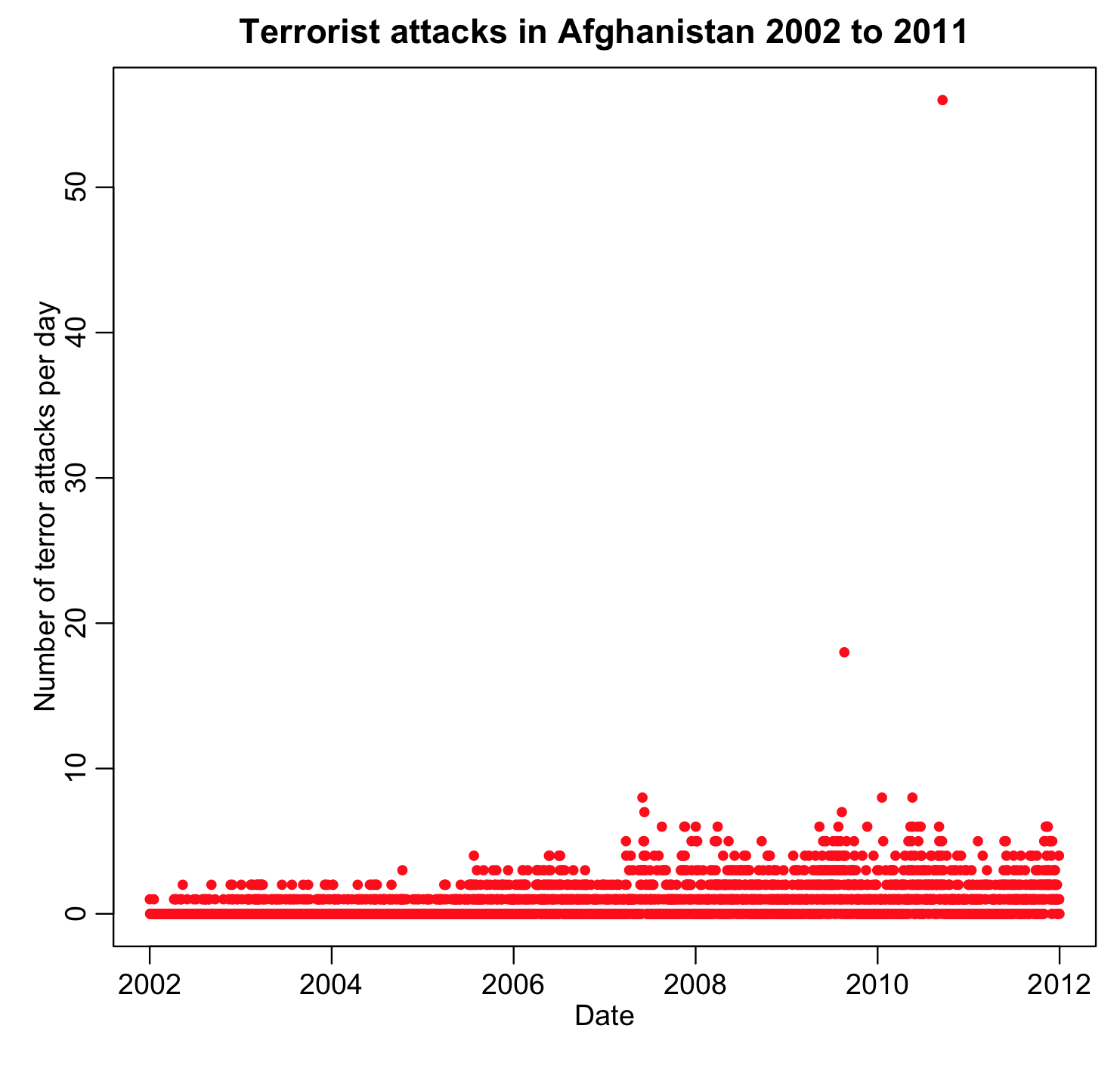
It turns out that there were two very bad days in Afghanistan that coincided with election days; including those points in a seasonality analysis would seriously bias the analysis (because they are extreme excursions in the data that have nothing to do with the season of the year). I would likely conclude that I would have to exclude those points from my seasonality analysis.
By plotting the data time series, you can also determine if there appear to be overall temporal trends in the data that must be taken into account in your analysis (as we’ve already discussed, if we wanted to look at something like determination of the significance of seasonality, we need to first correct the data for long-term trends upwards or downwards).
Histograms
Histogramming data allows us to determine if the data ranges are in-line with what we were expecting, and if the data distribution is more-or-less consistent with what we expected. You can also see if the distribution is truncated at some value (for instance, are there lots of values at zero and just above zero, but no values less than zero?). If the distribution is truncated, this is something you should be aware of when embarking on regression analyses.
Scatter plots
If you posit that some time series Y depends in some way on some other quantity X, then it is useful to begin with scatter plots, where you plot Y vs X using the R plot() function. If you think the relationship is linear, does it look like there is probably some linear dependence? If X and Y are time series and you posit some linear relationship, then the first order time derivative of the time series (which will be proportional to diff(X) and diff(Y)) should also be related. When you plot diff(Y) vs diff(X) do you see evidence of this relationship?
For instance, let’s assume that we hypothesize that air pollution might contribute to peoples’ propensity to commit crimes. The R script chicago_pollution_and_crime.R reads in the Chicago pollution and crime data and plots the daily number of various types of crime vs the daily average ozone. The data files are chicago_pollution.csv, chicago_crime_summary.csv and chicago_weather_summary.csv. In order to run the script, you must have the R chron, ppcor, and sfsmisc libraries installed. To install the packages if you have not done so already, type
install.packages("ppcor")
install.packages("sfsmisc")
install.packages("chron")
Then select a mirror site close to your location for the download.
The script has a number of goodies in it, including an example of how to mesh columns from one data frame into another, and also how to calculate the day_of_year from month/day/year information (for example January 1st is day 1 and December 31st is day 365).
The script produces the following plot:
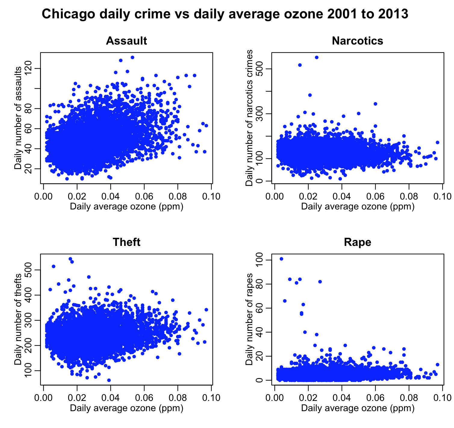
There appears to perhaps be a relationship between assaults and theft on ozone. It is unclear if there is any relationship at all between drug crimes and rapes on ozone (ie; I wouldn’t want to display those two plots on the RHS in a paper as the only evidence that a relationship obviously exists). If there is a linear relationship between assaults and theft on ozone, then the first order time derivative of those time series should also be related. The script chicago_pollution_and_crime.R also produced the following plot:
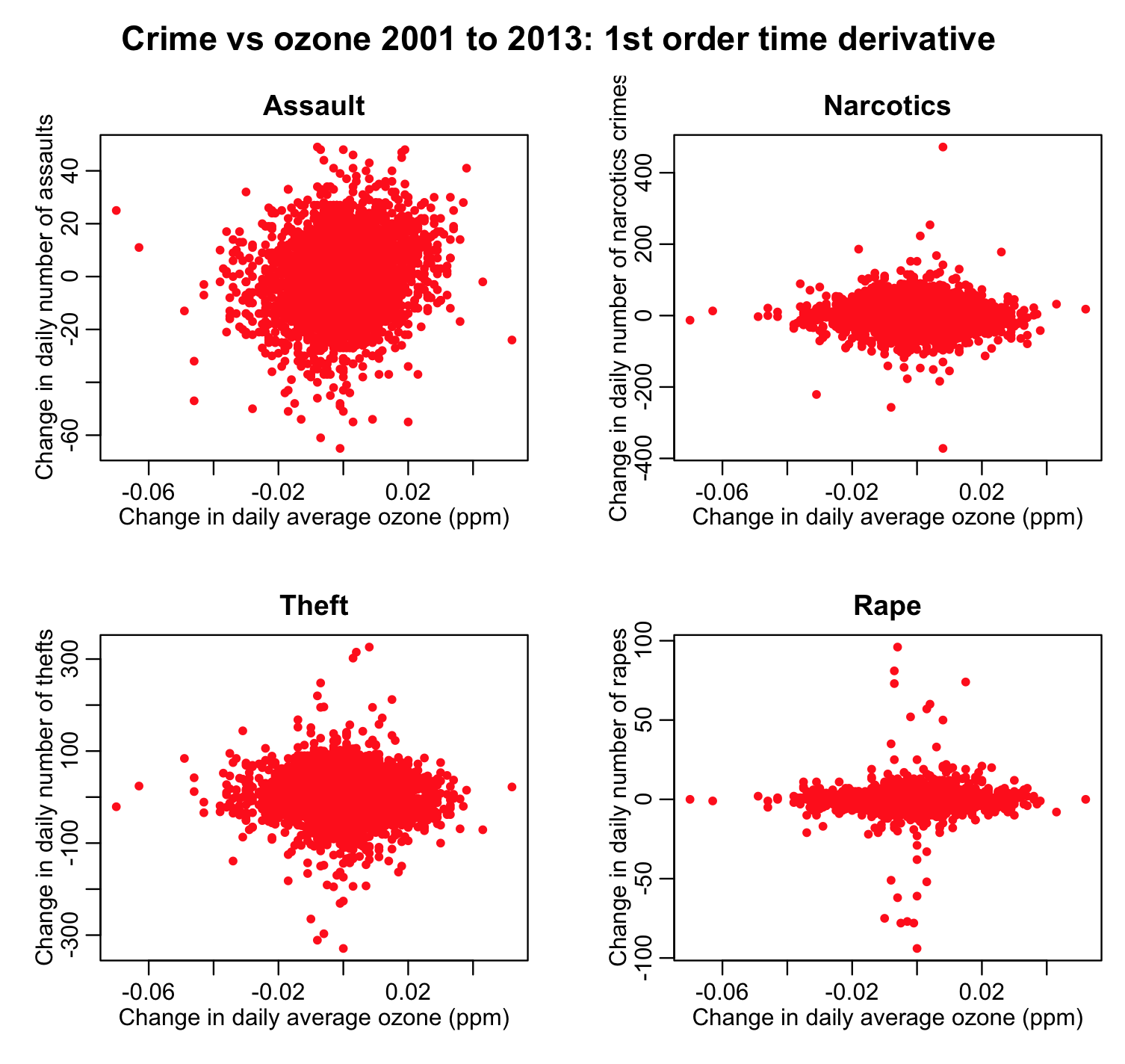
The first order time derivative of assaults and ozone appear to still perhaps show a relationship, but the other three plots lend questionable support to the hypothesis that ozone affects those three types of crime.
Keep in mind, that as we’ve discussed, there may be confounding variables that make X and Y appear to be related, and there may even be confounding variables that make X’ and Y’ appear to be related, but if your hypothesis is that there is some relationship, and when you plot Y vs X and you see no clear visual evidence of a relationship, your hypothesis is likely wrong.
Correlations
If you assume that Y depends on X in some linear way, is this supported by the significance of the correlation coefficient calculated with cor(X,Y)? Is it also supported by the correlation in the first derivatives of the time series?
Also, partial correlations can help determine if there are confounding variables that are making X and Y appear to be related when in fact they are not. For instance, in the Chicago crime/ozone analysis above, we might ask if temperature might be a confounding variable. Or the number of daylight hours. Or weekday patterns in ozone and crime that have nothing to do with each other. For instance, ozone goes up on weekends, as do assaults; the former is probably because of traffic and industrial patterns, whereas the latter is likely due to people spending much more time together (and perhaps annoying each other, potentially exacerbated with the help of alcohol) on weekends.
The script chicago_pollution_and_crime.R script also produces the following plot:
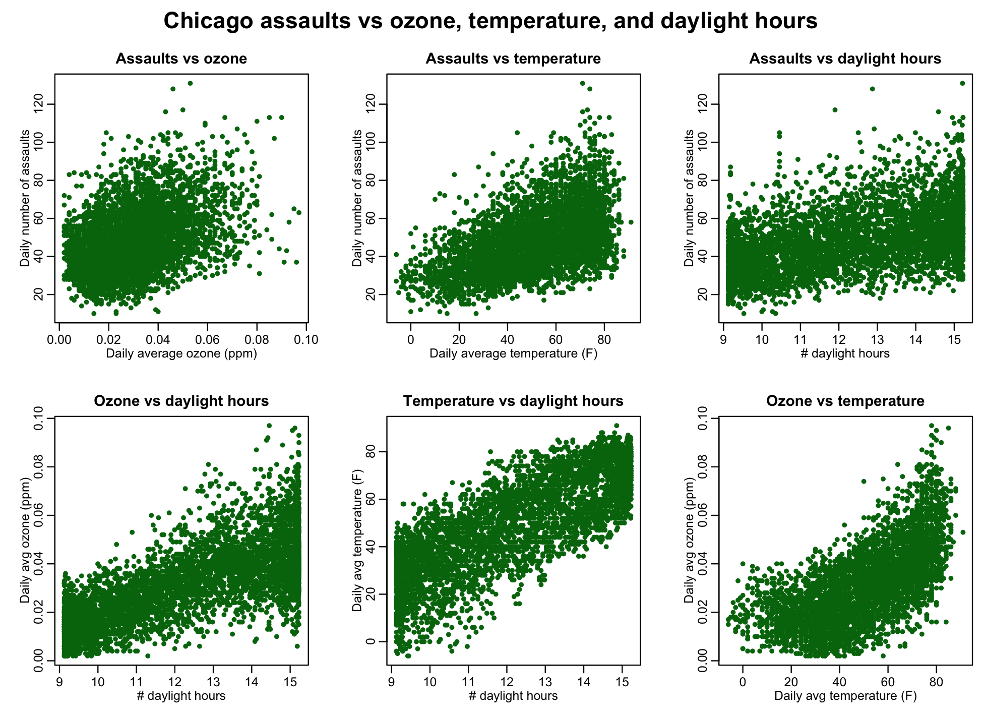
It is clear from the plot that the relationship is not as simple as “ozone causes assaults” or “temperature causes assaults”. Rather, there is potentially a complex interplay between ozone, temperature, daylight hours, and number of assaults.
The chicago_pollution_and_crime.R script also uses the pcor.test() function in the ppcor library to examine the partial correlations between things like assaults and temperature given ozone, and assaults and ozone given temperature. Because the things like number of daylight hours and average daily temperature are not necessarily normally distributed (histogram them and check), the default “pearson” correlation coefficient is not appropriate. Rather, one should use the “spearman” correlation coefficient which first rank transforms the data.
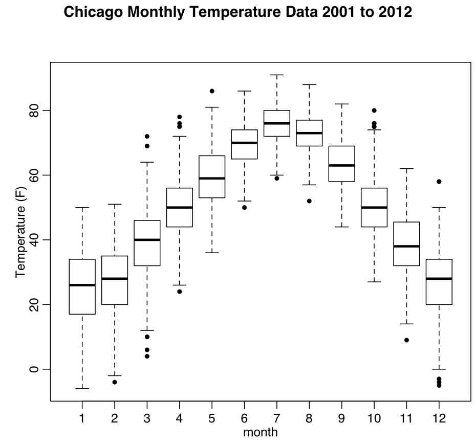
Box and whisker plots
A box and whisker plot is a type of graphical display that can be used to summarize a set of data based on the median of the data, the lower and upper quartiles (25% and 75%) and the minimum and maximum values.
The box and whisker plot is an effective way to investigate the distribution of a set of data. For example, skewness can be identified from the box and whisker if they are not equally above and below the median. The extreme values at either end of the scale are sometimes included on the display to show how far they extend beyond the majority of the data.
The R function boxplot() shows plots of the median, quartile range, the lower ~0.5% and upper ~99.5% range of the data. The R script chicago_boxplot_temperature.R produces the following plot of the Chicago temperatures between 2001 and 2012 by month (the script uses the file chicago_weather_summary.csv):