Sometimes we may want to determine if there are apparent “clusters” in our data (perhaps temporal/geo-spatial clusters, for instance). Clustering analyses form an important aspect of large scale data-mining.
K-means clustering partitions n observations into k clusters, in which all the points are assigned to the cluster with the nearest mean.
If you decide to cluster the data in to k clusters, essentially what the algorithm does is to minimize the within-cluster sum of squared distances of each point to the center of the cluster (does this sound familiar? It is similar to Least Squares).
The algorithm starts by randomly picking k points to be the cluster centers. Then each of the remaining points is assigned to the cluster nearest to it by Euclidian distance. In the next step, the mean centroid of each of the clusters is calculated from the points assigned to the cluster. Then the algorithm re-assigns all points to the their nearest cluster centroid. Then the centroid of each cluster is updated with the new point assignments. And then the points are re-assigned to clusters. And the cluster centroids re-calculated… and so on and so on until you reach a step where none of the points switch clusters. Visually, the algorithm looks like this:

How many clusters are in the data?
You likely want to explore how many distinct clusters appear to be in the data. To do this, you can examine how much of the variance in the data is described by our “model” (which in this case is the clustered data). Just like for a linear least squares statistical model, we can thus calculate an adjusted R-squared from the total variance in the data and the sum of the within group variance. There is also a way to calculate the AIC for a kmeans model.
To see how to implement kmeans clustering in R, examine the following code that generates simulated data in 3 clusters:
require("sfsmisc")
set.seed(375523)
n1 = 1000
x1 = rnorm(n1,100,5)
y1 = rnorm(n1,0,1)
n2 = 750
x2 = rnorm(n2,125,7)
y2 = rnorm(n2,4,0.5)
n3 = 1500
x3 = rnorm(n2,75,10)
y3 = rnorm(n2,-4,1)

x = c(x1,x2,x3)
y = c(y1,y2,y3)
true_clus = c(rep(1,n1),rep(2,n2),rep(3,n3))
pch_clus = c(rep(20,n1),rep(15,n2),rep(17,n3))
mydata = data.frame(x,y)
plot(x,y,col=true_clus,pch=pch_clus)
This produces the following plot: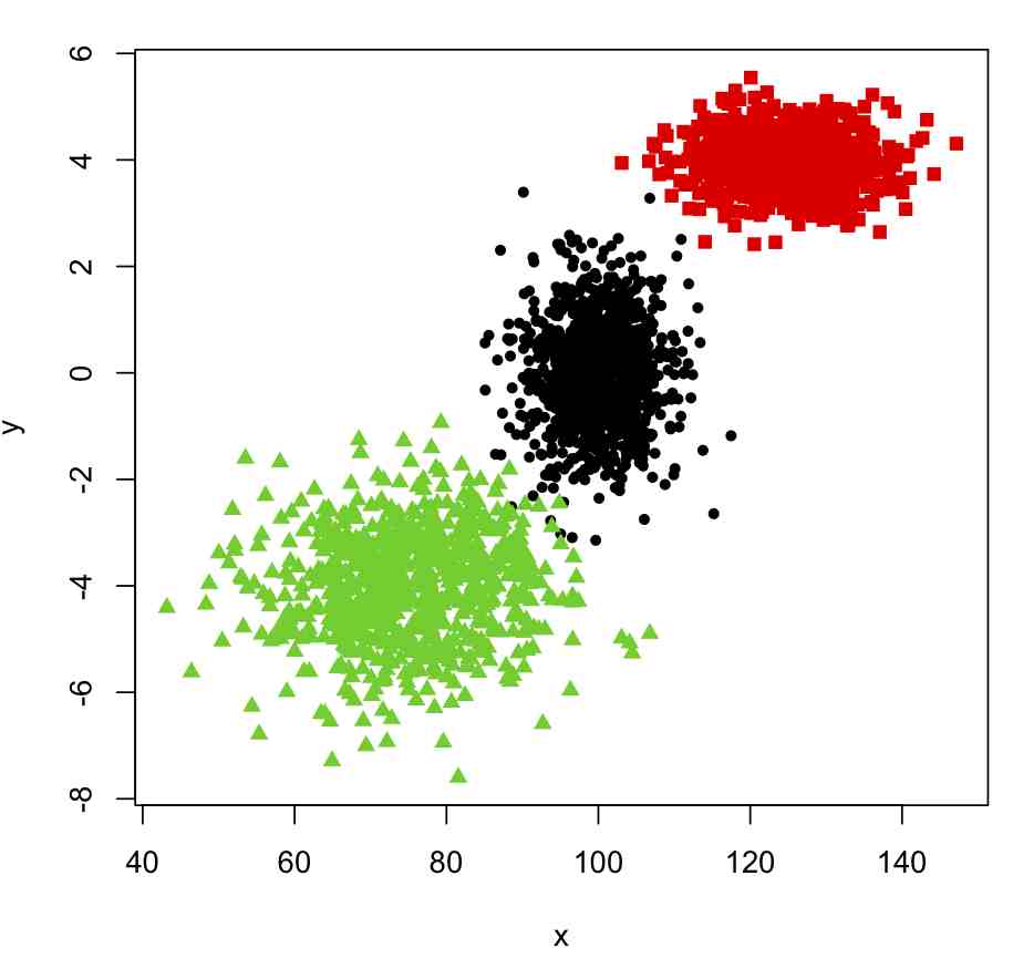
Now, to cluster these into nclus clusters, we can use the kmeans() function in R, like this
mydata_for_clustering=mydata
n = nrow(mydata_for_clustering)
nclus = 3
myclus = kmeans(mydata_for_clustering,centers=nclus)
print(names(myclus))

###################################################################
# plot the data, colored by the clusters
###################################################################
mult.fig(1,main="Simulated data with two clusters")
scol = rainbow(nclus,end=0.8) # select colors from the rainbow
plot(mydata$x,mydata$y,col=scol[myclus$cluster],pch=pch_clus)
Producing this plot: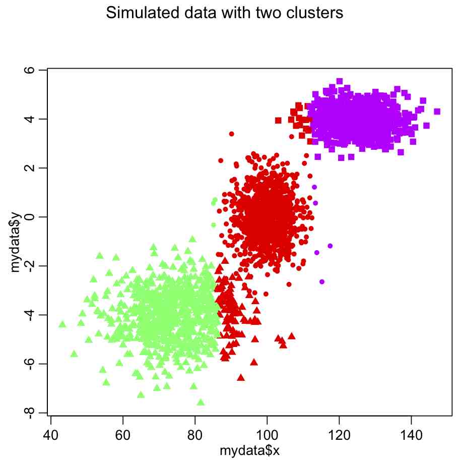
Do you see something wrong here?
The problem is that the x dimension has a much larger range than the y dimension, and so in the calculation of the Euclidean distance it carries far too much weight. The solution is to normalize the space such that all dimensions have the same dimensionality. Try this:
mydata_for_clustering=mydata
mydata_for_clustering$x = (x-mean(x))/sd(x)
mydata_for_clustering$y = (y-mean(y))/sd(y)
nclus = 3

myclus = kmeans(mydata_for_clustering,centers=nclus)
print(names(myclus))

###################################################################
# plot the data, colored by the clusters
###################################################################
mult.fig(1,main="Simulated data with two clusters")
scol = rainbow(nclus,end=0.8) # select colors from the rainbow
plot(mydata$x,mydata$y,col=scol[myclus$cluster],pch=pch_clus)
which yields the following: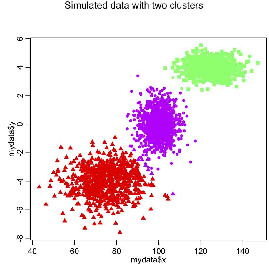
In most cases, however, the number of clusters won’t be so obvious. In which case, we would need to use a figure of merit statistic like adjusted R^2 or (even better) AIC to determine which number of clusters appears to best describe the data.
To calculate the r-squared for a variety of cluster sizes, do this (after making sure your data are normalized!):
####################################################################
# the data frame mydata_for_clustering is ncol=2 dimensional
# and we wish to determine the minimum number of clusters that leads
# to a more-or-less minimum total within group sum of squares
####################################################################
kmax = 15 # the maximum number of clusters we will examine; you can change this
totwss = rep(0,kmax) # will be filled with total sum of within group sum squares
kmfit = list() # create and empty list
for (i in 1:kmax){
kclus = kmeans(mydata_for_clustering,centers=i,iter.max=20)
totwss[i] = kclus$tot.withinss
kmfit[[i]] = kclus
}

####################################################################
# calculate the adjusted R-squared
# and plot it
####################################################################
rsq = 1-(totwss*(n-1))/(totwss[1]*(n-seq(1,kmax)))

mult.fig(1,main="Simulated data with three clusters")
plot(seq(1,kmax),rsq,xlab="Number of clusters",ylab="Adjusted R-squared",pch=20,cex=2)
Producing the following plot: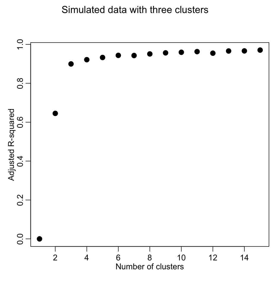
We want to describe as much of the R^2 with the fewest number of clusters. The usual method is to look for the “elbow” in the plot, and that is traditionally done visually. However, we could try to construct a figure-of-merit statistic that identifies the elbow. In the AML610 course, the students and the professor developed a quantitative method to formulate a statistic to identify the elbow point. We call this statistic the COMINGS-elbow statistic (after the first initials of the students who came up with the algorithm); the statistic looks for the (k,aic) point that has the closest euclidean distance to (1,min(aic)). However, we noted that the performance of this statistic in identifying the elbow point was improved if we first normalized the k and aic vectors such that they lay between 0 to 1. Thus, the elbow point is identified by the (k’,aic’) point that is closest to (0,0).
####################################################################
# try to locate the "elbow" point
####################################################################
vrsq = (rsq-min(rsq))/(max(rsq)-min(rsq))
k = seq(1,length(vrsq))
vk = (k - min(k))/(max(k)-min(k))
dsq = (vk)^2 + (vrsq-1)^2

cat("The apparent number of clusters is: ",nclus,"\n")
points(nclus,rsq[nclus],col=2,pch=20,cex=2)
This figure-of-merit for elbow location doesn’t seem to work optimally. Can we think of a better one?
The AIC can be calculated with the following function:
kmeansAIC = function(fit){

m = ncol(fit$centers)
n = length(fit$cluster)
k = nrow(fit$centers)
D = fit$tot.withinss
return(D + 2*m*k)
}

aic=sapply(kmfit,kmeansAIC)
mult.fig(1,main="Simulated data with two clusters")
plot(seq(1,kmax),aic,xlab="Number of clusters",ylab="AIC",pch=20,cex=2)
Again, we are looking for the elbow point in the plot.
####################################################################
# look for the elbow point
####################################################################
v = -diff(aic)
nv = length(v)
fom = v[1:(nv-1)]/v[2:nv]
nclus = which.max(fom)+1
cat("The apparent number of clusters is: ",nclus,"\n")
points(nclus,aic[nclus],col=2,pch=20,cex=2)
This yields: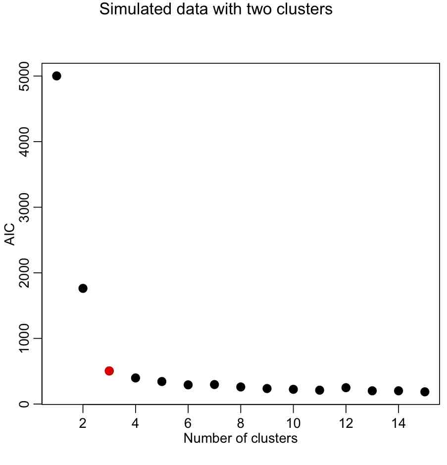
With the AIC, our elbow locator FoM seems to work better (in this case, anyway).
In the file kmeans_example.R, I show the location of terrorist attacks in Afghanistan between 2009 to 2011 from the Global Terrorism Database. The data are in afghanistan_terror_attacks_2009_to_2011.txt