[In this module, students will become familiar with time series analysis methods, including lagged regression methods, Fourier spectral analysis, harmonic linear regression, and Lomb-Scargle spectral analysis]
A “time series” is a sequence of data points recorded at different points in time. Most rigourously speaking, a time series is data recorded at uniform time intervals. Most of the R built-in functions for time series analysis assume that the data are uniformly distributed in time. However, in biological population or epidemic data, quite often there are missing time points, but there are things you can do in order to perform spectral and autoregression analysis on such “missing data” time series, and we’ll talk about that in this module.
One of the simplest examples of a time series is white noise, which is a sequence of independent and identically distributed random variables. Another, just slightly more complicated, example is a random walk process, which at the t^th time point is the sum of t independent and identically distributed random variables

Try the following code:
set.seed(17452)
par(mfrow=c(1,1))
n = 1000
e = rnorm(n)
y = cumsum(e)
plot(y,xlab="time",ylab="Random Walk",lwd=4,col=2,type="l")
x = seq(1,n)
b=lm(y~x)
lines(b$fitted.values,col=4,lwd=5)
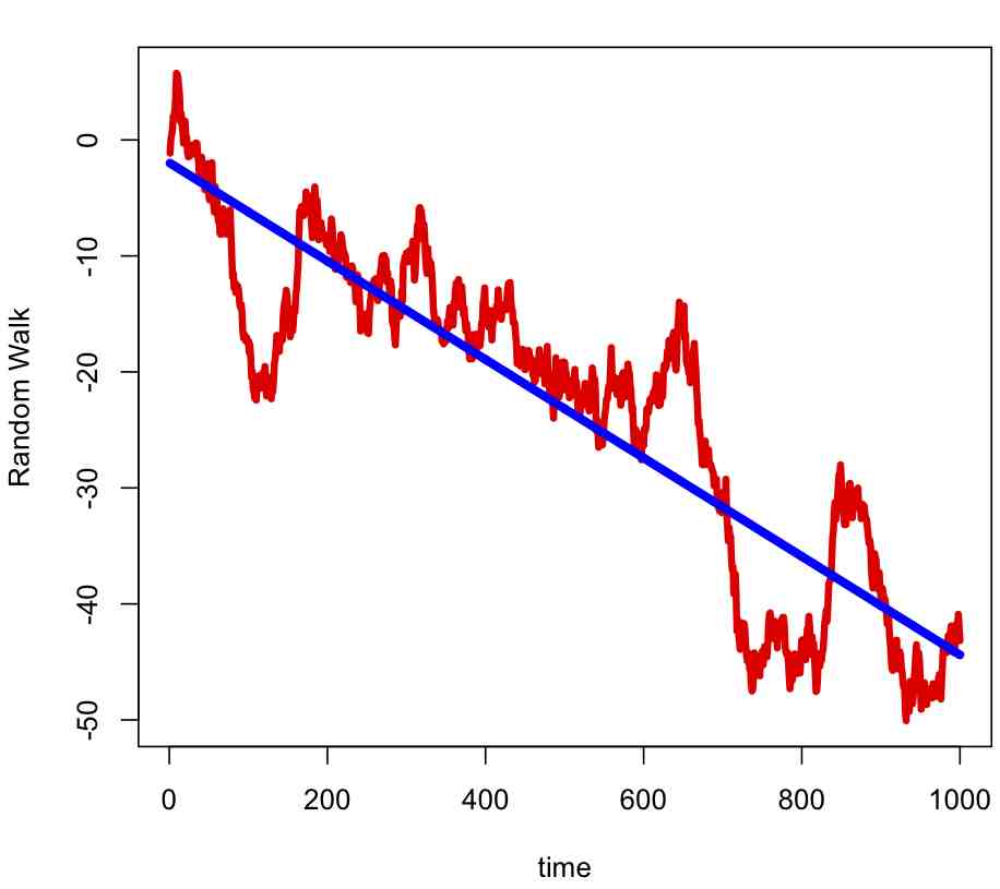 Notice that the data appear to have temporal trend that is approximately linear. But the model that generated the time series does not explicitly contain a linear time trend term. This page gives a nice description of how to tell the difference between data that is has true trend, and data that is instead a random walk, which has implications for climate science… are the patterns we see in the apparent rise in temperature a time series with trend, or just a random walk? What do you think is the best indication that recent climate changes are not due to a random walk?
In general, time series can exhibit trend, periodicity, and/or may depend on past values (ie; are “autocorrelated” to past values… more on that in a moment). Often, aims in time series analysis are to separate the components of the series into trend, seasonality (or other periodicity), and/or autocorrelation to past values. The resulting time series can be used to forecast future events, but sometimes what you are most interested in answering are things like “is there significant trend?” or “is there significant periodicity in my data?”, and if so, “what is the phase and period of the periodicity?” . In its purest form, time series models include terms based on functions in time and/or terms that include previous values in the time series. However, more generally, time series analysis can also include explanatory variables in the model.
Important tools in time series analysis are the autocorrelation and partial autocorrelation statistics. “Autocorrelation” is the cross correlation of the time series with itself. The lag m autocorrelation of a time series Y of length N is thus
where sigma is the std-deviation of Y. The acf() function in R calculates the autocorrelation of a series. Before using it, however, you must ensure that the time series data you have are not missing data. If there are missing data, you need to insert NA’s into the missing places (this is under the assumption that the reason the data are missing are just by random chance, and if they had been present would have been statistically indistinguishable from the other data… this is called ‘ignorable’ missing data… ‘non-ignorable’ missing data is beyond the scope of this course).
An example of autocorrelated data is the daily average wind speed time series for a particular location. The wind speed one day is obviously likely somewhat correlated to the wind speed the day before, but less correlated to the wind speed the day before that, and even less correlated to the wind speed the day before that. Download the file chicago_crime_summary_c.txt and use the following code to determine if there are days with missing wind data, and, if there are, fill in the missing data with NA’s. I’ve put a function called create_continuous_time_series() in the fall_course_libs.R library. The first step you should do in any time series analysis is to a) ensure there are no duplicated or missing time stamps, and b) plot the time series to ensure it looks more or less as you expected.
cdat=read.table("chicago_crime_summary_c.txt",header=T)
names(cdat)
#########################################
# first get rid of duplicated days (if they
# exist)
#########################################
cdat = cdat[!duplicated(cdat$jul),]
#########################################
# now check to see if there are missing data
#########################################
source("fall_course_libs.R")
if (max(diff(cdat$jul))>1){
 cat("There are missing data!\n")
 t_expect = seq(min(cdat$jul),max(cdat$jul))
 a=create_continuous_time_series(t_expect,cdat$jul,cdat$wind)
 t = a$t
 y = a$y
}else{
 t = cdat$jul
 y = cdat$wind
}
par(mfrow=c(1,1))
plot(t,y,xlab="Time in Julian days",ylab="daily average wind speed (mph)",main="Chicago daily avg wind speed 2001 to 2012",lwd=2,type="l",col=2)
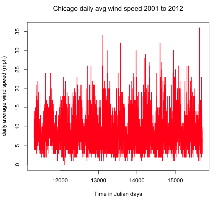 Take a look at the plot. Is it more or less what you expect? As an aside, do you think once we get to analysis of seasonality, we will find statistically significant evidence of a yearly period?
Now modify the code to plot the precipitation time series. Does it look like what you expect? If not, what is wrong and how would you fix it?
Now let’s take a look at whether or not the wind time series is autocorrelated to lags of itself. One way we could check to see if the time series is correlated to itself lag 1 is to specifically use the R cor() function, like this (make sure before running this code you’ve filled the y vector with the wind data):
n = length(y)
cat("The length of the y vector is ",n,"\n")
cat("The correlation between y and y lag 1 is ",cor(y[2:n],y[1:(n-1)],use="complete"),"\n")
Recall that above we filled the missing values of the wind time series with NA’s, and that is why we need to use the use=”complete” option in the cor() function.
Are the data significantly correlated to the lag 1 data?
The R acf() function makes it easy to examine time series autocorrelations over several lags. R type ?acf to access the help page for the acf() function. What optional argument takes into account missing data that are filled with NA’s?
Type in the following code:
par(mfrow=c(2,2))
plot(t,y,xlab="Time in Julian days",ylab="daily average wind speed (mph)",main="Chicago daily avg wind spd 2001-2012",lwd=2,type="l")
acf(y,na.action=na.pass,main="Chicago daily avg wind speed")
acf(y,lag=600,na.action=na.pass,main="Chicago daily avg wind speed")
Producing the plot:
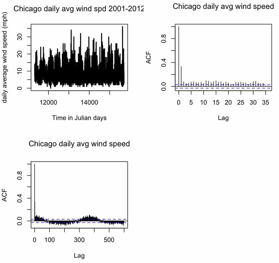
Note that the acf() function returns output that begins at lag=0 (which is the correlation of the data to itself). From the first plot, does it appear that the wind data are significantly correlated to the data the day before? If so, is it a positive or negative correlation, and is it in agreement with the result that we got from just using the cor() function above? How about correlation to the day before that, and the day before that? From the second plot (which is just an expanded view of the first) are the wind data significantly correlated to the data six months before? How about a year before?
The clearly visible sine-like up and down behaviour in the second plot is a hallmark of periodicity in the data. It is a sign that a good model for describing this data should very likely include a periodic component. In this data there is very clear periodicity, but in some other data it is not necessarily so obviously clear from the acf() plot that there is statistically significant periodicity (particularly if the time series is relatively short or has a large amount of stochasticity). We will be talking more about including periodicity in a time series model later on in this module. One thing to note about long-term periodicity is that it can result in significant short-term autocorrelations that are actually due to the long-term behaviour (this is because on average days in winter are windy, so there are apparent correlations even to many lags to the average daily wind speed in days before… the short-term autocorrelations will generally be much more significant than the autocorrelations due to the seasonality).
An autoregressive time series model (or a “lagged regression” or “AR” model) regresses the time series on previous values in the time series. It is appropriate to use an AR model if you have evidence or prior belief that what happens in a particular time step is somewhat correlated to what happened the time step before. In the case of the daily average wind in Chicago, it appears from the acf() plot above that it is significantly correlated to the average wind speed the day before. Note that there does not appear to be a time trend in average wind speed. We could thus write the regression model as:
n = nrow(cdat)
y = cdat$wind[2:n]
y_lag1 = cdat$wind[1:(n-1)]
myfit = lm(y~y_lag1)
print(summary(myfit))
Because we only include the lag 1 term in the model, this is known as an AR(1) model. If we wanted to include a time trend in the model, we would write
myfitb = lm(y~seq(1,length(y))+y_lag1)
Which model, myfit or myfitb, has the lowest AIC?
Now, how many lags should we include in an AR model? An idea of how many lags to consider can be obtained from the partial autocorrelation plot. The partial autocorrelation lag m is the autocorrelation of the lagged data, taking into account the autocorrelations from lags 1 to m-1. In essence, it tells you how autocorrelated the data are to just the data at lag m, *independent* of the data at other lags. The pacf() function in R calculates partial autocorrelations. Note, that unlike the acf() function, which displays the autocorrelations starting at lag=0, the pacf() function starts at lag=1. For data with an underlying AR(k) model, typically the pacf displays a cutoff after k lags, but the acf decays more slowly. Try the following code for the wind time series:
par(mfrow=c(2,2))
acf(y,na.action=na.pass,main="Chicago daily avg wind")
pacf(y,na.action=na.pass,main="Chicago daily avg wind")
plot(myfit$residuals,col=2,type="l",lwd=2)
acf(myfit$residuals)
Which produces the following plot: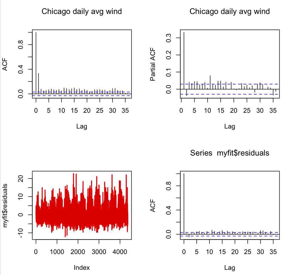
From the second plot, it appears that the partially auto-correlated lags are only really notably significant to lag=1, which means that the AR(1) model we used in myfit is probably reasonable.
Many time series models, whether they include trend, dependence on past values, and/or dependence on explanatory variables, will exhibit a property called “stationarity”, which means that there is no trend in the residuals, and the variance of the residuals does not change in time (in “strict stationarity” the probability distribution underlying the residuals does not change in time). In addition, stationarity implies that the autocorrelation between the residuals is statistically consistent with zero for all time lags. Trends, periodic cycles, and random walk effects can cause data to be non-stationary. In the third plot in the figure above, we show the time series of the residuals of that model, and in the fourth plot the autocorrelation of the residuals. Do you think the residuals of the model satisfy stationarity?

is stationary if the roots of the polynomial

lie within the unit circle (ie; abs(z_i)<1).
Let’s have a look at what example data generated with an AR() model looks like. The R function arima.sim() makes generating a random AR(p) time series easy. All you need to do is give it the vector of coefficients of length p (where the coefficients satisfy the stationarity constraint above). Let’s try an AR(1) model:
set.seed(879133)
y=arima.sim(100,model=list(ar=c(0.1)))
par(mfrow=c(2,2))
plot(y,type="l",lwd=2,col=2,main="AR(1) time series")
acf(y,lag=25)
pacf(y,lag=25)
Producing the plot: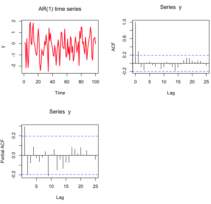
The arima() function in R can be used to fit an AR model to a time series. Try this
arima(y,order=c(1,0,0))
(the first element of the order vector is the order of the AR model… set the other two elements to zero for now).
This yields the output:
Call:
arima(x = y, order = c(1, 0, 0))

Coefficients:
         ar1  intercept
      0.2906    -0.2017
s.e.  0.0951     0.1321

sigma^2 estimated as 0.8857:  log likelihood = -135.87,  aic = 277.74
Are the model parameters consistent with those of the true model? Examine the AIC of this model. Now fit an AR(2) model by typing
arima(y,order=c(2,0,0))
Does this have a smaller or larger AIC? Explain the difference you see in this AIC compared to the AIC of the AR(1) model fit.
Things to try: increase the length of the time series. What happens to the uncertainties on the estimates of the model parameters?
Cross-correlations in time series
We can use the R ccf() function to examine correlations between two time series of the same length, with lags. If we have two time series, y1 and y2 of length n, and use ccf(y1,y2), the correlation shown at lag -1 in the resulting plot (for instance) is the correlation of y1[1:(n-1)] with y2[2:n]. The correlation shown at lag 0 in the plot is just cor(y1,y2), and the correlation shown at lag +1 is the correlation of y1[2:n] with y2[1:(n-1)]. You might want to bookmark this page for future reference, because it can be easy to get confused as to what the negative lag correlations mean relative to the positive lag correlations.
Let’s examine the lagged correlations of the Chicago assaults with the temperature. Let’s first read in the file chicago_crime_summary_c.txt and then make sure we fill in any missing data with NA’s (so that we have a continuous time series):
cdat=read.table("chicago_crime_summary_c.txt",header=T)
#########################################
# now create a dataframe that has no missing days
# fill the missing info with NA's
#########################################
vjul = seq(min(cdat$jul),max(cdat$jul))
bmat = matrix(NA,ncol=ncol(cdat),nrow=length(vjul))
bdat=as.data.frame(bmat)
names(bdat)=names(cdat)
bdat$jul = vjul
for (icol in 1:ncol(bdat)){
  if (names(bdat)[icol]!="jul"){
    bdat[vjul%in%cdat$jul,icol] = cdat[,icol]
  }
}
Now let’s try the ccf() function on the temperature and assault data (x4). We have to use the na.action=na.pass option because the time series has NA’s for the missing data:
ccf(bdat$temperature,bdat$x4,na.action=na.pass,lag=5)
Producing the following plot: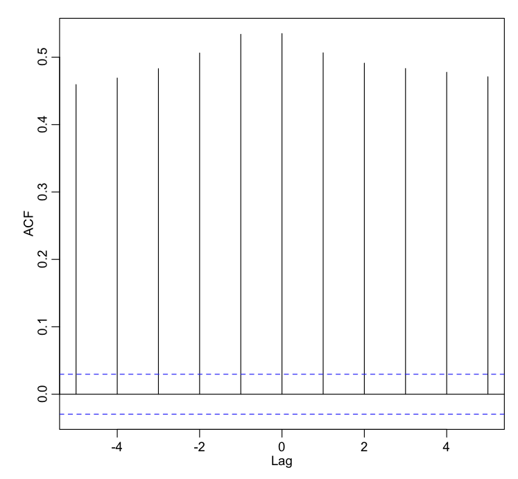
Notice that the temperature the day before is almost as correlated to the number of assaults as the temperature the day of the assault. But the number of assaults is also highly correlated to the temperature after. What’s going on with that? Well, it is mostly due to the seasonality of the time series. Two periodic time series with nearly the same phase and period will be highly correlated to each other even if the underlying cause is unrelated. You need to be aware of this when examining time series with underlying seasonality! There may be a confounding factor (like number of daylight hours for instance) that is causing the seasonality in both the temperature and the number of assaults, making it appear the time series are related, even when slightly lagged.
How can we disentangle this? Well, in this case, if we assume that unusually high temperatures *cause* assaults because people get irritable in the heat, we should also probably see that upward fluctuations the day before are significantly correlated to upward fluctuations in assaults the next day (because it probably takes several hours to a day or so to really get annoyed by the heat). Ditto downward fluctuations. Check out if this appears to be the case by doing the ccf of diff(bdat$temperature) and diff(bdat$x4). What do you see?
Granger Causality
This brings us to the interesting topic of Granger Causality. Granger was a Nobel Prize winning economist, who posited that if one event causes another, it must necessarily precede the latter. To examine if there is evidence of Granger causality, you first fit a lagged regression model with just lagged terms of the time series itself, with the number of lagged terms as suggested by the pacf() plot (as we discussed above). Then add in the lag -1 term of the time series of the explanatory that you believe is causal of the variations in your data. If it truly is causal (in a statistically significant way), this new model will have a lower AIC than the one with just the lagged terms of the time series itself.
To try this idea out on the Chicago assaults and temperature data, first detrend the time series data of the assaults, and do a pacf() plot of the residual partial autocorrelations:
t = bdat$jul
t2 = bdat$jul^2
t3 = bdat$jul^3
b = lm(bdat$x4~t+t2+t3)
pacf(b$residuals)
Yielding the plot:
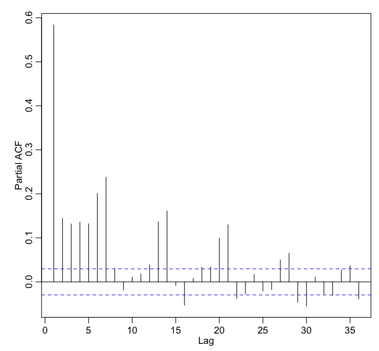 It looks like we need 7 lagged terms in the lagged regression. Let’s do this by hand with lm():
y = b$residuals+mean(bdat$x4,na.rm=T) # detrended assaults
n = length(y)
y0 = y[8:n]
y1 = y[7:(n-1)]
y2 = y[6:(n-2)]
y3 = y[5:(n-3)]
y4 = y[4:(n-4)]
y5 = y[3:(n-5)]
y6 = y[2:(n-6)]
y7 = y[1:(n-7)]
myfit = lm(y0~y1+y2+y3+y4+y5+y6+y7)
print(summary(myfit))
print(AIC(myfit))
Now lets put the temperature the day before in the fit and compare the AIC:
x = bdat$temperature
x1 = x[7:(n-1)]
myfitb = lm(y0~y1+y2+y3+y4+y5+y6+y7+x1)
print(summary(myfitb))
print(AIC(myfitb))
plot(y0,xlab="Time, in days",ylab="\043 daily assaults, corrected for trend")
lines(myfitb$fitted.values,col=2,lwd=3)
Yielding the plot: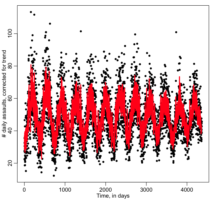
Is the AIC better with the temperature the day before in there? Is temperature positively associated with crime?
If we assume that the cause and effect is nearly simultaneous, then regressing the first order time derivatives of the two time series is a good way to check for consistency with the hypothesis of causality. High temperatures may be both cumulatively causal of violent crime over 24 hours, but also perhaps causal after just several hours of extreme heat during the day… our data are binned in units of one day, and we thus a lag of just a few hours in causality would look like an immediate cause and effect in the data.
Periodicity in data: Fourier analysis methods
Not infrequently, the data we encounter in epidemiological, biological, or social systems display some kind of periodicity like seasonality, or dependence upon day of week (for instance).
In your undergraduate mathematics courses, you were likely exposed to Fourier series analysis methods, whereby any periodic time series with period P can be expressed as a (potentially infinite) sum of sine terms with linearly decreasing periods and different phases, phi_n:
 Eqn (1)
Note that N is the number of sine terms needed to express the periodicity time series, not the number of data points in the time series itself.
As an aside: note that, to first order, any periodic series with period P can be expressed as a constant term plus a sine term with a phase with period P. Thus, if you believe, for instance, that some periodicity underlies a parameter in a mathematical or computational model but you are unsure of the functional form of the periodicity (ie; is it a simple harmonic, a saw tooth, a step function, etc), a defensible wimp out is to assume a first order approximation with a simple sine wave.
Note that because sin(theta+phi)=sin(phi)*cos(theta)+cos(phi)*sin(theta) Eqn(1) above can be re-expressed as
where your data s_N(x) is the approximation of s(x) on the interval [x0,x0+P]. ***In reality, the data are discrete, not continuous, so getting the estimates of the Fourier coefficients is a bit more complicated than the simple integrals above, but you get the idea.
Is it clear that the sum in quadrature of the Fourier coefficients a_n^2 + b_n^2 is equal to A_n^2? A_n is known as the power, and A_n vs n/P is known as the “power spectrum”. Methods to obtain the power spectrum are known as spectral analysis methods. More on this in a minute.
Note that Eqn(1) above does not include any kind of trend terms. This means that spectral analysis methods assume that you have de-trended the time series. If you want to do spectral analysis of a time series that might potentially have trend with Fourier methods, you *always* need to first fit a trend line to the time series, then do the spectral analysis on the residuals.
The R function spec.pgram() calculates the power spectrum of a time series, with the underlying assumption that the time points in the time series are equally spaced. Try the following code:
set.seed(12345)
x = seq(1,100)
y = 2*cos(2*pi*x/7)+rnorm(length(x))
par(mfrow=c(2,2))
plot(x,y,xlab="time",ylab="y=2cos(2pi*t/7)",type="l",lwd=3,col=2)
a=spec.pgram(y)
cat("The maximum power is at period = ",1/a$freq[which.max(a$spec)],"\n")
plot(1/a$freq,a$spec,type="l",col=4,lwd=3,xlab="Period (in units of delta_t)",ylab="Power")
Producing the plot: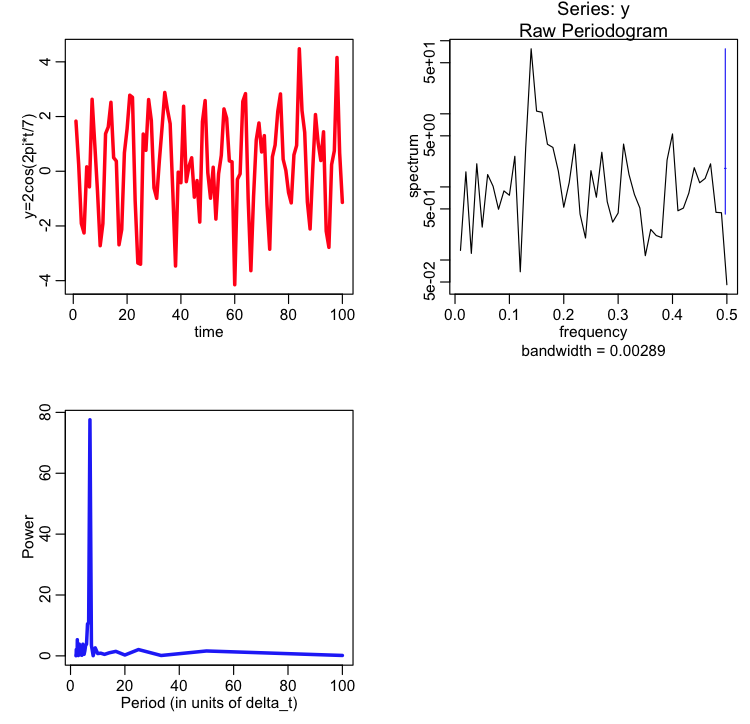
The maximum period that will be examined in spec.pgram is approximately the number of points in the time series, M, (can you guess why? hint: would the data span a full period?) and the minimum period that will be examined is 2*delta_t (or very close to 2*delta_t).
Can you guess why the lowest limit on the periods examined is 2? hint: if the period is 1.5 days what would the power spectrum look like? try it out by looking at the following code:
set.seed(12345)
par(mfrow=c(3,1))
x = seq(1,20)
y = 2*cos(2*pi*x/1.5)+rnorm(length(x))
ypred = 2*cos(2*pi*x/1.5)
ypredb = 2*cos(2*pi*x/3)
plot(x,y,xlab="time",ylab="y=2cos(2pi*t/1.5)",type="l",lwd=3,col=1,ylim=c(-3,6))
points(x,y,cex=2)
lines(x,ypred,col=2,lwd=5)
lines(x,ypredb,col=4,lwd=2)
legend("topleft",legend=c("T=1.5 evaluated at same time points as data","T=3 evaluated at same time points as data"),col=c(2,4),lwd=3,bty="n")
a=spec.pgram(y,plot=F)
cat("The maximum power is at period = ",1/a$freq[which.max(a$spec)],"\n")
plot(1/a$freq,a$spec,type="l",col=4,lwd=3,xlab="Period (in units of delta_t)",ylab="Power")

x_fine = seq(1,20,0.01)
ypred_fine = 2*cos(2*pi*x_fine/1.5)
ypredb_fine = 2*cos(2*pi*x_fine/3)
plot(x,y,xlab="time",ylab="y=2cos(2pi*t/1.5)",type="l",lwd=3,col=1,ylim=c(-3,6))
points(x,y,cex=2)
lines(x_fine,ypred_fine,col=2,lwd=5)
lines(x_fine,ypredb_fine,col=4,lwd=2)
legend("topleft",legend=c("T=1.5","T=3"),col=c(2,4),lwd=3,bty="n")
Producing the plot: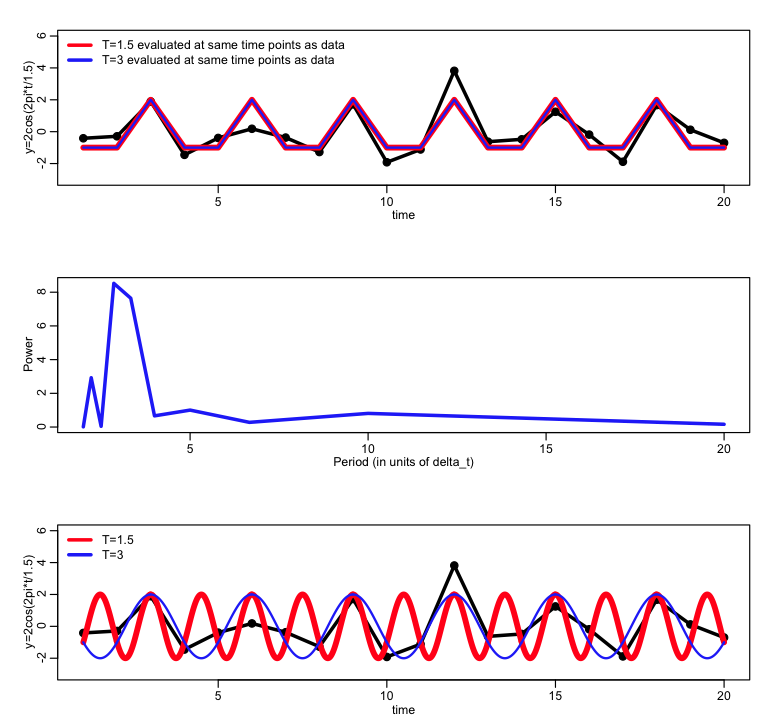
Having two frequencies look alike when sampled with some time difference (for instance, just above a harmonic with period=1.5 days looks the same as a harmonic with period 3 days if sampled once a day) is a phenomenon known as aliasing.
Moving on… if the data are spaced in something other than one unit of time, you can convert the data to a time series object before calling the spec.pgram spectral analysis method. For instance:
set.seed(12345)
delta_t = 2
x = seq(1,100,by=delta_t)
y = 2*cos(2*pi*x/7)+rnorm(length(x))
y_ts = ts(y,deltat=delta_t)
par(mfrow=c(2,2))
plot(x,y,xlab="time",ylab="y=2cos(2pi*t/7)",type="l",lwd=3,col=2)
a=spec.pgram(y_ts)
cat("The maximum power is at period = ",1/a$freq[which.max(a$spec)],"\n")
plot(1/a$freq,a$spec,type="l",col=4,lwd=3,xlab="Period (in units of delta_t)",ylab="Power")
Take a look at the period at which the power is maximal for the example above: is it exactly 7 days? Try changing the length of the y vector in the code above to 10. How close do you get to testing a period of 7 days? How about if the length of the y vector is 1,000? 10,000? How close do the examined periods get to a period of 30 days for the differing lengths of y? What can you conclude about how the length of the data time series affects how closely you can determine the actual periods that would produce strong spectral components?
The disadvantages of relying solely upon Fourier analysis methods to determine if there is periodicity in the data is that the data must be evenly spaced in time. In addition, you can (usually) only get an approximate idea of the exact periods at which the data are resonant. Also, determination of the significance of the peaks in the power spectrum is difficult.
Periodic data: Harmonic linear regression
If you have underlying reason to believe that your data might have harmonic periodicity with a specific period (say, one week, or one year), you can test that hypothesis using a method called harmonic linear regression. Assuming the data have no trend, the harmonic linear regression fits a model of the form

where P is the period.
Now, just like above, we note that a sine wave with a phase phi can be expressed as sin(theta+phi)=sin(phi)*cos(theta)+cos(phi)*sin(theta)
We thus can express our model in Eqn(2) as

With

Thus, if we have our data, y, recorded at time points t, we can define two new variables xa=cos(2pi*t/P) and xb=sin(2pi*t/P) and then regress y on xa and xb (this assumes y has no trend… if it has trend, simply include the trend terms in the regression). Once we obtain the regression coefficient, beta_1, for xa and the regression coefficient beta_2 for xb, we can obtain phi and A_1 from:

One of the nice things about harmonic linear regression is that it is possible to test the null hypothesis that A_1=0. To do this, we need to do propagation of errors in order to determine the uncertainty on A_1. If the covariance matrix of the model parameter estimates is V, then the approximate variance of a parameter that is a function of the beta, f(beta_0,beta_1,beta_2) is
 Eqn(3)
where

When f is a linear function of beta, the expression in Eqn(3) for the variance of f is exact.
For f(beta_0,beta_1,beta_2)=A_1 we have that

Note that f is a non-linear function of the beta. Thus Eqn (3) is just an approximation of the variance of f (getting exact expressions of the variance of non-linear functions can get quite complicated). To test the null hypothesis that A_1=0, assuming that we have a large number of data points, we can, to a good approximation, use the chi-square test with 2 degrees of freedom and Q=(A_1/sigma_A)^2. I determined this test statistic for this null hypothesis via extensive simulation studies. We will see below when we compare this p-value to the one obtained from the Lomb-Scargle method that it is an excellent approximation.
To see how this works in practice, let’s fit a harmonic linear regression to the Chicago temperature data in the file chicago_weather_summary.txt:
require("chron")
wdat=read.table("chicago_weather_summary.txt",header=T)

t_test=365.25
# make day 0 Jan 1st 2001 (so we will measure
# the phase shift wrt to Jan 1st
wdat$jul=wdat$jul-julian(1,1,2001)
xa = cos(2*pi*wdat$jul/t_test)
xb = sin(2*pi*wdat$jul/t_test)

b=lm(wdat$temperature~xa+xb)
print(summary(b))
V = vcov(b)
beta1 = b$coefficients[2]
beta2 = b$coefficients[3]

A1 = sqrt(beta1^2+beta2^2)
fpartial = c(0,beta1/A1,beta2/A1)

sigmaA = sqrt(t(fpartial)%*%V%*%(fpartial))
TestStatistic = (A1/sigmaA)^2
p=1-pchisq(TestStatistic,2)
cat("The probability that the null hypothesis A1=0 is true is",p,"\n")
You can also estimate the phase-shift, phi (the time, relative to time t=0 at which the harmonic is maximal):
#####################################################
# the model is A1*sin(2*pi*(t+phi)/T)
# phi is the day of the year (relative to
# Jan 1st) at which the harmonic is at a maximum
#####################################################
phi = atan2(beta1,beta2)
fpartial = c(0,-beta1/A1^2,+beta2/A1^2)
sigma_phi = sqrt(t(fpartial)%*%V%*%(fpartial))
sigma_phi = sigma_phi*sqrt(2*pi) # due to non-linearities, this factor is needed
#####################################################
# phi and sigma_phi are in radians, transform to days
#####################################################
phi = phi*t_test/(2*pi)
sigma_phi = sigma_phi*t_test/(2*pi)
Q = (phi/sigma_phi)^2
p=1-pchisq(Q,1)
cat("The estimate and 1std dev uncertainty on phi is = ",phi,sigma_phi,"\n")
cat("The probability that the null hypothesis phi=0 is true is ",p,"\n")

par(mfrow=c(1,1))
plot(wdat$jul,wdat$temperature,xlab="Time, in days",ylab="Temperature")
ypred = mean(wdat$temperature)+A1*sin(2*pi*(wdat$jul+phi)/t_test)
lines(wdat$jul,ypred,col=2,lwd=3)
lines(wdat$jul,b$fitted.values,col=4,lwd=3)
The advantages of using harmonic linear regression are that the data do not need to be evenly spaced in time. Also, you can test the null hypothesis that the amplitude of the harmonic of period T is zero, and you also get an estimate of the phase of the harmonic. You can also include trend terms in the regression. You can also use all the methods we’ve talked about before for model validation. The disadvantage is that it can get a bit more complicated to test multiple periods simultaneously in the same fit (but it certainly isn’t impossible).
Spectral analysis with Lomb Scargle Periodograms
The Lomb-Scargle method is a least squares spectral analysis method that kind of takes the best from both worlds of Fourier analysis methods and harmonic linear regression; it effectively involves least squares fits of orthogonal sinusoids to the data samples (for instance, a cosine and a sine of the same frequency are orthogonal, and cos(m*pi*t/P) is orthogonal to cos(n*pi*t/P) when n!=m, and sin(m*pi*t/P) is orthogonal to sin(n*pi*t/P) when n!=m)
If you suspect that least squares spectral analysis methods are essentially similar to estimating Fourier coefficients with least squares fitting, you’d be right.
Lomb and Scargle took this idea a bit further by noting that pairs of sine waves that are not too close in frequency aren’t very correlated, so as long as the frequencies we examine in the periodogram are “far enough apart”, we can break free of the constraint of Fourier methods that require the data to be equally spaced in time. What does “far enough apart” mean? Well, recall above that we mentioned that Fourier analysis methods examine the power spectrum of a series of length M at frequencies spaced at delta_f=1/M. If you are missing data in your time series and want to use Lomb Scargle methods to examine the power spectrum at different frequencies, and get independent significance tests of the power spectrum at each of the frequencies, you need to make sure that the frequencies you examine are spaced by at least delta_f=1/M. If you examine frequencies more closely spaced than this you need to realize that the p-values at the different frequencies will be correlated, which makes interpretation of the results not straightforward.
What do I mean by independent tests of the significance of the harmonic amplitude at different frequencies? Well, say there is an underlying harmonic of period 365 days in some time series like, for instance, daily average temperature measurements. We could use harmonic linear regression to estimate the amplitude and phase of a harmonic with period of 365 days. But is it obvious to you that fitting instead a harmonic with period of 366 days would yield virtually the same results for the amplitude and phase? The results from the two different fits when the periods (frequencies) are very close together are highly correlated. However, if we examined a harmonic with, say, period 153 days, which is far from a period of 365 days, the amplitude and phase estimated for that harmonic will be quite different from the amplitude and phase of the 365 day harmonic. The results of the two fits are independent.
One of the nice things about using the Lomb-Scargle method is that you can choose the exact test frequencies of the sinusoids that you want to fit to the time series. So, if you think that the data are harmonic with a period of exactly one week, you can test a period of exactly one week. Do you think there is an additional harmonic underlying your data with period of one year? You can independently test that at the same time (as long as 1/7-1/365>1/M, and the data span at least a year).
There is no library in the R repository for Lomb-Scargle methods. However, the Stowers Institute for Medical Research (no relation) has code available off of their website for Lomb-Scargle spectral analysis.
I’ve added functions, based on this code, to the fall_course_libs.R file. You don’t need to download the code from the Stowers website; the code in the fall_course_libs.R file includes all the necessary methods from Stowers, and is stand-alone.
In particular, based on the Stowers code, I have created a function called lomb(t,y,TestPeriods), where the t is the vector of time stamps, y is the data, and TestPeriods are the periods at which you would like to test the significance of the power spectrum. The output is a plot of the 1-p where p is the probability of observing a power at least as high as that observed at that period if the data were just a time series of white noise with the same variance as the data. This probability is the same as the p-value returned by the harmonic linear regression schema described above. To see how lomb() works, try the following code, which generates a simulated sample with harmonics of period 10, 63, and 75, then uses the Lomb-Scargle method to plot the amplitude=0 null hypothesis p-value vs various test periods:
################################################
################################################
source("fall_course_libs.R")
set.seed(785591)
################################################
# generate a simulated time series of length 200
# with three different harmonics
################################################
t = seq(1,200)
y = 10*sin(2*pi*t/10) + 3.5*sin(2*pi*t/63) + 17*cos(2*pi*t/75) + rnorm(length(t))
M = length(y)
################################################
# The maximum period we can examine is the time span of the
# time series
# The minimum period we can examine is 2.
# The minimum difference in frequencies we can examine is 1/M
################################################
TestFrequencies = seq(1/max(t),1/2,1/M)
TestPeriods=1/TestFrequencies
par(mfrow=c(1,1))
a = lomb(t,y,TestPeriods)
cat("The significant periods are ",a$T[a$vsignificant],"\n")
Producing the plot: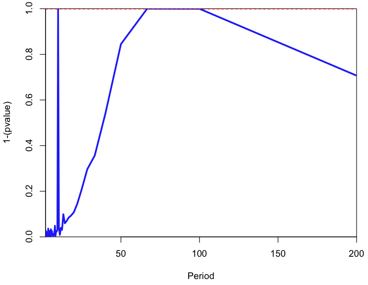
Was a period close to T=75 tested?
Now let’s compare the A=0 null hypothesis p-values from the Lomb-Scargle method to those obtained from the harmonic linear regression method:
################################################
# now do the harmonic linear regression for the
# same time periods as used above
################################################
wp = numeric(0)
for (period in TestPeriods){
  b = harmonic_regression(t,y,period,plot=F)
  wp = append(wp,b$pamplitude)
}
par(mfrow=c(1,1))
plot(wp,a$pamplitude,xlab="Amplitude p-value from harmonic linear regression",ylab="Amplitude p-value from Lomb-Scargle",pch=20,col=4,cex=3)
Producing the plot: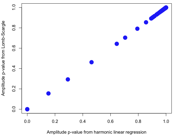
In the lomb() method, I correct the alpha value used to test the null hypothesis to reflect the number of hypothesis tests, k, done. For instance, when alpha=0.05 and the data truly are just white noise and you test 100 different test periods, on average 5 of them will have pvalue>alpha (ie; 5% of the time you will reject the null hypothesis, when it is actually true… a type I error). The Bonferroni correction reduces the value of alpha by the number of hypothesis tests done to reduce the probability of a type I error. That is to say, alpha’=alpha/k.
On the output plot of the lomb() method, the dotted red line is the cut-off for significance alpha=0.05, Bonferroni corrected for the number of tests. Note that the p-value you get from the Lomb-Scargle method does not depend on the number of test periods, but the alpha you use to test significance does.
In our field we are usually not interested in “fishing for harmonics” of arbitrary periods in our data. Usually with biological or sociological data, there are specific periods that we have an underlying reason to believe underlie patterns in our data… like periods of 24 hours, one week, one lunar month, one year, or perhaps even 11 years (in the case of the solar cycle). Thus, because of the Bonferroni correction to alpha, we’d be better off for hypothesis testing purposes if we just tested the few periods that we believe to potentially underlie the temporal patterns in the data, rather than just willy-nilly trying out all kinds of different periods with no good motivation (just like you should never put anything on the RHS of a regression model that you don’t have good motivation for believing should be there). If you try out arbitrary frequencies, you may find that a frequency will appear to have a significant amplitude, only because it is close to a frequency that truly underlies the pattern in the data.
The only requirements for using the Lomb-Scargle method is that the data have no trend (correct for trend before using the method), and that the test frequencies you try be separated by at least 1/M, and the minimum frequency is one over the time span of the series, and the maximum frequency is 1/2.
Modify the code above to get the p-values for the test periods 10, 63, and 75. Are the tests of significance at T=63 and T=75 independent? Note that just because two different harmonics actually underly the data doesn’t mean you can independently test for their amplitude significance if the time series isn’t long enough to allow for it. Change the code above to make the series of length 400. Now can you test for the significance of the amplitude for periods 63 and 75?
Note that plotting the Lomb-Scargle p-values vs the test periods instead of the test frequencies is my own personal preference; I’ve always found it confusing to try to have to back-calculate frequencies in a power spectrum to the corresponding period. If you prefer to work with frequencies instead, I’ve made a function called lomb_freq(t,y,TestFrequencies).
The advantages of using Lomb-Scargle are that you can get a plot of the p-values vs period (or frequency) that tests the null hypothesis that the amplitude at each of those values is equal to zero, and that (unlike Fourier analysis methods) it doesn’t require that the time points be evenly spaced. The disadvantage is that, unlike harmonic linear regression, it doesn’t provide a phase. Also, data must have no trend in order to use the Lomb-Scargle method. In general, I prefer harmonic linear regression.
Cancelling seasonal effects from a time series
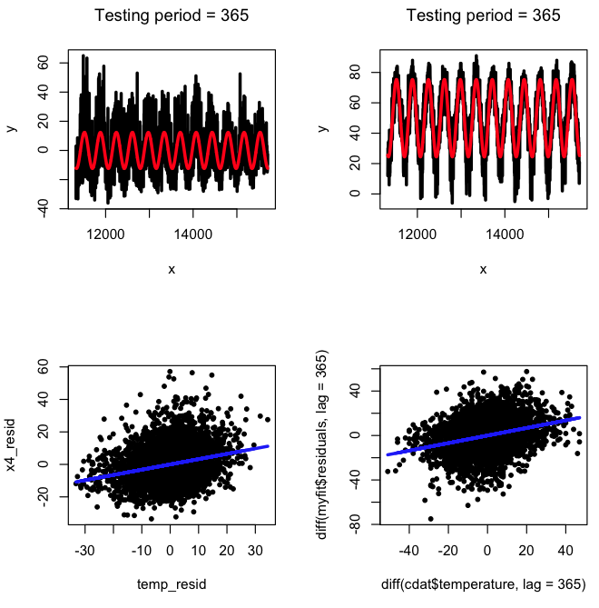
To examine whether or not a particularly hot day is associated with a particularly high rate of violent crime (for instance), it would be nice to first cancel out the seasonal effects that result in both crime and temperature being on average higher in the summer than in the winter. To cancel out seasonal effects in a case like this, we can do harmonic linear regressions with a harmonic with period of one year to both the temperature and the violent crime data. Then we could examine the temporal behaviour of the residuals of the two fits; if indeed particularly hot days result in the particularly high levels of crime (and unusually cold days result in low levels of crime), the time series of the residuals of the two fits should be positively correlated. Let’s try it out on the temperature and assault data in the file chicago_crime_summary_c.txt:
cdat = read.table("chicago_crime_summary_c.txt",header=T)
source("fall_course_libs.R")

par(mfrow=c(2,2))
# first correct the trend in the number of assaults
t = cdat$jul
t2 = t^2
t3 = t^3
myfit = lm(cdat$x4~t+t2+t3)
# now do the harmonic linear regression
a = harmonic_regression(cdat$jul,myfit$residuals,365)
b = harmonic_regression(cdat$jul,cdat$temperature,365)

x4_resid = (a$fit)$residuals
temp_resid = (b$fit)$residuals

acor = cor(x4_resid,temp_resid)
plot(x4_resid,temp_resid)
cat("The length of the time series is = ",nrow(cdat),"\n")
cat("The correlation between the seasonally corrected residuals is = ",acor,"\n")
Producing the plot: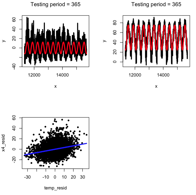
As an aside, look at the phases from the harmonic fits to the temperature and to the number of assaults; are they statistically consistent? What is the phase of the sine wave describing the number of daylight hours (hint: it peaks June 21st). Is the phase of the assaults more consistent with the phase of the temperature, or more consistent with the phase of the number of daylight hours?
Seasonal differencing is a somewhat cruder method that allows us to cancel seasonal effects in time series such that we only examine patterns in the data that are not related to the seasonality. It is, quite simply, the difference between a data point and the data point exactly a year earlier. If the data are perfectly harmonic with period one year, this would exactly cancel out all the seasonal variation. Try the following:
bcor = cor(diff(myfit$residuals,lag=365),diff(cdat$temperature,lag=365))
cat("The correlation between the seasonally lagged residuals is = ",bcor,"\n")

plot(diff(cdat$temperature,lag=365),diff(myfit$residuals,lag=365),pch=20)
myfitc = lm(diff(myfit$residuals,lag=365)~diff(cdat$temperature,lag=365))
lines(diff(cdat$temperature,lag=365),myfitc$fitted.values,col=4,lwd=3)
print(summary(myfitc))
Producing the plot: