
Connecting mathematical models to predicting reality usually involves comparing your model to data, and finding model parameters that make the model most closely match observations in data. And of course statistical models are wholly developed using sources of data.
Becoming adept at finding sources of data relevant to a model you are studying is a learned skill, but unfortunately one that isn’t taught in any textbook!
One thing to keep in mind is that any data that appears in a journal publication is fair game to use, even if it appears in graphical format only. If the data is in graphical format, there are free programs, such as DataThief, that can be used to extract the data into a numerical file.
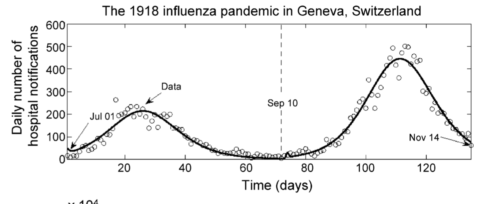
Let’s take an example: in the paper “Comparative estimation of the reproduction number for pandemic influenza from daily case notification data” by Chowell et al, there is a figure (Figure 1) that shows daily case notification data of Spanish Flu hospitalizations in 1918 in San Francisco:
To extract the data from this graph, first download DataThief to your laptop from the DataThief website. Then download the jpeg for the figure from the html of the paper (or, alternatively, take a screen shot of the figure in the paper).
Now start up DataThief. And click on File->Open and from the file browser select the figure file. You should now see the figure in the DataThief control window, with three colored points (red green and blue) that look like a circle with an X through them (there is another blue point that looks like a circle with a + through it… ignore that one for now). Drag one of the circles to the intersection of the x and y axes. Drag another one to the upper value on the x axis, and the third one to the upper value on the y axis. At the top left hand of the control window you will see Ref 0 in red, Ref 1 in blue, and Ref 2 in green. Here is where you enter the x,y coordinates in the coordinate system of the figure for each of the three datum points that you just placed. Those three points define the coordinate system of the figure, and now if you move that blue point with the + through it around the figure, it will tell you where it is placed in the coordinate system of the figure.
We would like to extract the line in the figure. To do so, first click on the icon at the top middle of the control window that looks like a line graph. You will notice that a green and red circle appear with a + through them. Drag the green circle to the beginning of your line, and point its little arm in the direction the line is going. Drag the red circle to the end of the line. Make sure the blue circle with the + is on the line… from the color under that circle DataThief determines the color of the line.
Now we are ready to trace the line, but first we must make sure that our trace is a different color than the line (the default color of the DataThief trace line is black, which unfortunately is the color of the line we are trying to trace here). To change the color of the trace line, click on Edit->Preferences->General->Trace and chose a nice contrasting color.
Now click on the icon just to the left of the line graph at the top middle of the control window (the icon with the * * * in it). This will make DataThief attempt to trace the line.
Now, I don’t know about your computer, but on my computer, DataThief gives me an error message “Trace did not reach end point, too many doubles”. This usually means the line had portions that were too pointy or that it was perhaps a bit too blurry in places for the algorithms underlying the DataThief program to follow it. When I click OK after the error message, I find that DataThief got hung up at the peak of the plot.
When this happens, you have to give DataThief a hand to help it to determine which direction the line goes. To do this, you need to use the Dump option. Click on Settings->Show dump, and a grey icon wil appear in the control window.
Click on the circle in the icon and drag your mouse. A little circle with an arm will come out of it. Place that circle on the line in your Figure just before (but not on) the trace failed, and point its arm in the direction the line goes and drag its tip to where the trace failed. Drag out another little circle, and place it where the trace failed and put its arm in the direction of the line to perhaps where the line makes its next zig (or zag). Hit the Trace (the * * *) icon again. This time, for me, the trace got quite a bit further, but didn’t quite make it to the end. So I added a couple of more helping datum points from the Dump.
If you accidentally remove too many points from the Dump, you can always put them back in the Dump by dragging them there.
Finally, after a couple of iterations of giving DataThief hints, the trace was successful! Now we need to export the data. To do this, first save your DataThief file by clicking File->Save As (then give it a descriptive name so you can find it later). Now click on File->Export Data and save the output text file with a descriptive name (I called mine flu_1918_sf.out)
Take a look at that file… there is a bit of a problem in that DataThief doesn’t recognize that the points along the x axis are in integer units. You can do one of two things; read the file into Matlab and R and take the average of the y within each day, *or* you can use DataThief in points mode, and extract the data point by point (for Figures that consist only of points, and not a line, you have to use DataThief in points mode). To aggregate the data by day in R, you can use the file aggregate.R, which produces the file flu_1918_sf_aggregated.out Note that the aggregated y values by day are not integers (even though they should be because this is count data). This is because there is slight uncertainty in the actual value due to your inability to perfectly place the axis datum points, and also due to the fact that the line in the Figure is not infinitely thin. To double check how sensitive your results are to these issues, repeat the process (starting with the placement of the axis datum points) and see how much the values in the file change… the amount of the change gives you an idea of your uncertainty on the data points. Ideally, this uncertainty will be small enough that it does not affect the conclusions of your model analysis.
To change DataThief to points mode, click on Settings->Points Mode. If you were just using DataThief in line mode and did a track a whole bunch of points will show up(!). To get rid of them, click Data->Clear Data.
Now, drag points from the Dump (notice, they no longer have directional arms!) and place them along the line at the integer values of X. Patiently place your datum points along the lines to get a point for each day. Now, click on File->Export and save the data to a file with a descriptive file name.
Online resources: WebPlotDigitizer
WebPlotDigitizer is an online data extraction tool. It has some advantages over DataThief, particularly for axes that do not conveniently meet at a well defined point. Unlike DataThief, which asks you for the coordinates of three points on the plot, WebPlotDigitizer asks you to locate two points on the X axis, and two points on the Y axis. It also has the ability to extract data from bar charts, and polar charts.
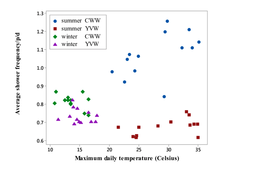
DataThief can trace lines, but does not have the ability to pick out points in a point graph without the user specifically pointing to where the points are. For points, WebPlotDigitizer has the “blob detection” algorithm that can locate the centroid of blobs of colour, indicated by the colour option. You can also manually delete or add points. This is an example of a plot that is well-suited to WebPlotDigitizer’s capabilities for data extraction:
To extract the points, first hit the “Filter Colors” button on the left to obtain the colours shown on the plot. Then using the Foreground Color tool, select the color of point you wish to extract. Then use the “Blob Detector” algorithm. If too many points are selected (particularly of the wrong color), try setting the Filter Colors distance to a smaller value. You can also play with the Min and Max Diameter values in the Blob Detection algorithm to optimise the performance of the algorithm for your particular plot if you find it is erroneously detecting too many or too few points. You can manually delete points using the Manual Extraction->Delete Points tool. You can also manually add points. Or manually move a point by clicking on it and using the arrow keys to move it.
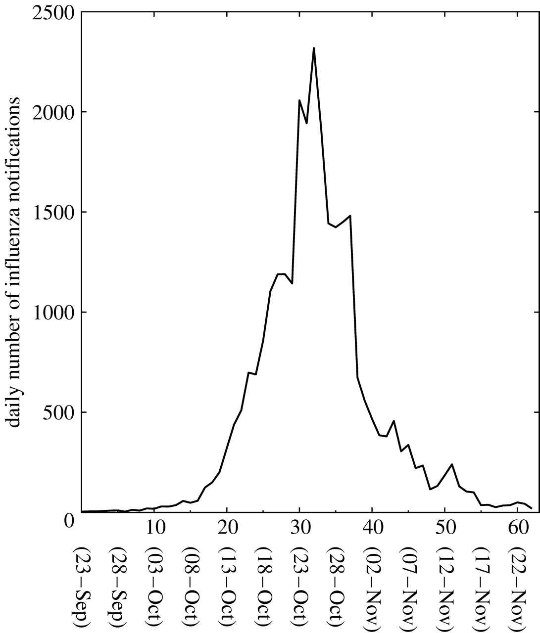
In addition, the WebPlotDigitizer x-step w/ interpolation method can be used to trace a line of colour specified by the colour option. However, for lines that are the same colour as the axis lines and labels, I’ve noticed WebPlotDigtizer does significantly worse than DataThief at tracing the lines. This is because DataThief allows the user to put “hints” for the program as to where the line is, and the user specifically tells DataThief where the line starts and ends. This is an example of a plot that is probably better extracted in DataThief rather than WebPlotDigitizer:
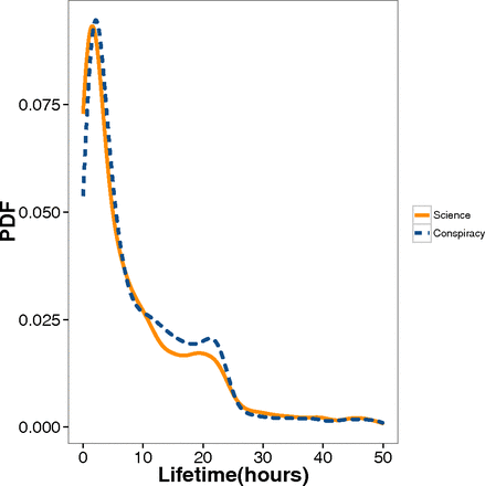
However, for lines that are not the same colour as the axis lines, WebPlotDigitizer appears to out-perform DataThief in successfully tracing the line. This is an example of a plot that WebPlotDigitizer has an easier time with compared to DataThief (the blue dashed lines are hard for DataThief to interpolate without a lot of user hints):
An example of a plot that would be really challenging for both applications is the following:
Data thief would likely have little trouble extracting the smooth curve (especially with the help of hints from the user), but the fact that the points are the same colour as the line, and everything else in the plot means that WebPlotDigitizer will have an exceedingly difficult time picking both the line and the individual points. With both packages, you would likely have the tedious task of placing points by hand as precisely as you can.
Estimating uncertainties in digitized data, and the effect they have on your analysis
The process of digitizing data from a graph has uncertainties associated with it, in part due to the resolution of the graph itself, in part due to the ability of the user to precisely locate values on the axes to set up the coordinate system, and in part due to the precision of the digitizing algorithm. You need to assess these uncertainties, and make sure that they are small enough that they don’t adversely impact the robustness of your analysis (ie; if you were to take into account these uncertainties, the numerical results of your analysis might change a little bit, but the conclusions of your analysis won’t change).
To assess these uncertainties, what I do is I repeat the digitization process ten times (including the assessment of the axes points). For each of the data points, I then assess the overall average of its (x,y) position, and the uncertainty on those positions from the one standard deviation spread in the 10 measurements.
One way to assess the effect this uncertainty has on an analysis is to repeat the analysis using the 10 different sets separately, and obtain the analysis results for each set. Any variation in the numerical analysis results that arise from the variation in the points is known as “systematic” variation, and needs to be included in your analysis uncertainties, added in quadrature with the statistical uncertainty from other aspects of the analysis. This web page discusses the difference between statistical and systematic uncertainties.
To check if using one of your data extractions is equally equivalent to using one of the others as far as robustness of your analysis conclusions go, it is relatively straightforward to set up your analysis code to just as easily use one data set over another. Ensure that when you write your code you make it easy to change to some other data set.