In this past module, we talked about the “fmin+1/2” method that can be used to easily estimate one standard deviation confidence intervals on parameter estimates when using the graphical Monte Carlo method to fit our model parameters to data by minimizing a negative log likelihood goodness of fit statistic. In this module, we will discuss an alternate method to the fmin+1/2 method for estimating parameter uncertainties, the works for many cases, and also provides an estimate of the covariance matrix of the parameter estimates (something that is very difficult to do with the fmin+1/2 method).
Computational and statistical methods for mathematical biologists and epidemiologists.
Objectives:
This course is meant to provide students in applied mathematics with the broad skill-set needed to optimize model parameters to relevant biological or epidemic data. The course will almost entirely be based on material posted on this website.Continue reading →
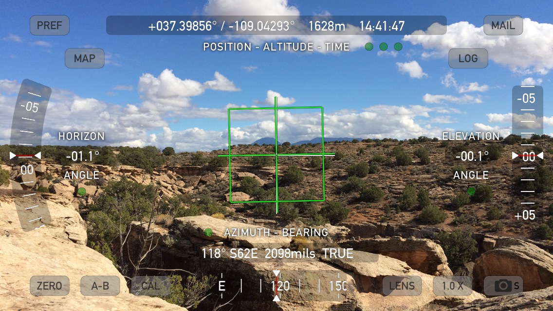
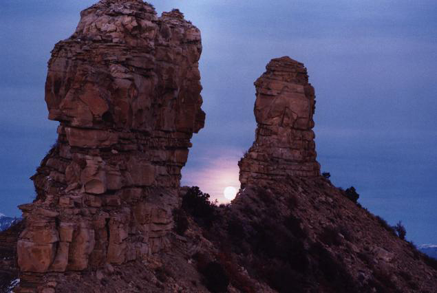
However, the location may have been used for winter solstice sun rise observations as well. On the horizon, immediately above the rock on which the petroglyphs are carved, the tip of Sleeping Ute mountain is clearly visible (note that the bearing displayed by the app is only approximate):
To obtain a much more precise bearing, using my GPS, I recorded the position of the site to be 37.39856N, 109.042946 W. The tip of Ute Mountain is located at 37.2842N, 108.7787W, at a bearing of 118.5 degrees.
Thus, the site was very likely used as a sun watching station not just at the summer solstice, but also at the winter solstice, tied into a broader ritual landscape.
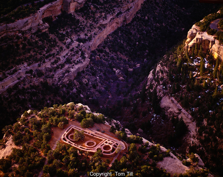
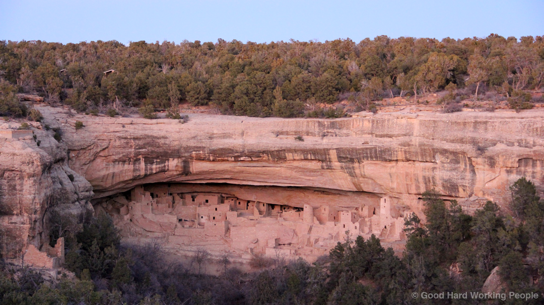
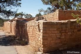
The Sun Temple is a Pueblo III site at Mesa Verde National Park, Colorado, prominently located atop a mesa, with a commanding view of the surrounding area:
Largely based on construction patterns and proximity to the Cliff Palace site (which has dendrochronology dates associated with the site), the Sun Temple site is thought to have been constructed circa 1200 AD, shortly before the ancestral Pueblo peoples largely abandoned the area around 1300 AD.
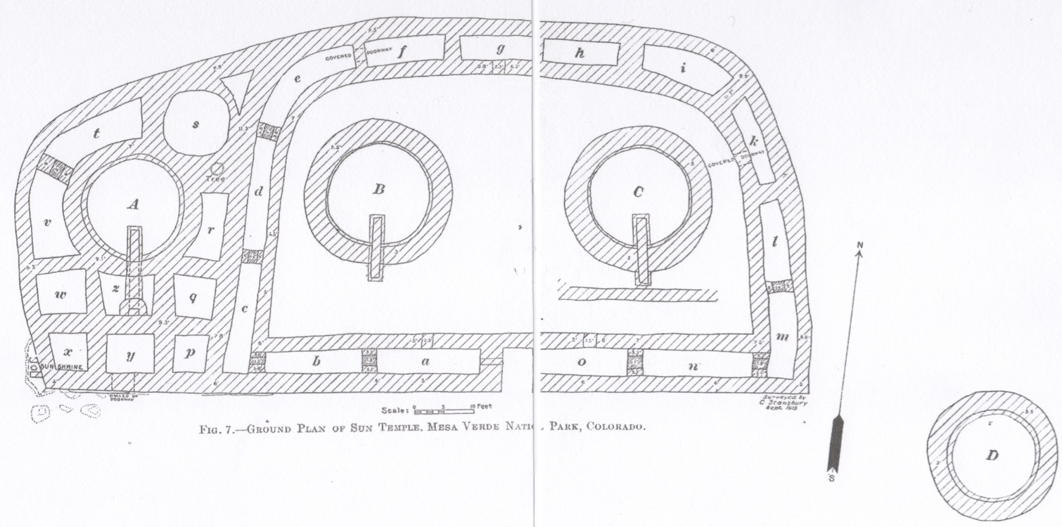
The four tower-like round structures were referred to by Fewkes as “kivas”, which are ceremonial structures in ancestral Pueblo architecture (but in the case of Sun Temple the round features do not have all the usual kiva features).
The entire site is walled in; you cannot access the interior without a ladder. The walls were several meters high (today they stand between ~2 to 12 feet).
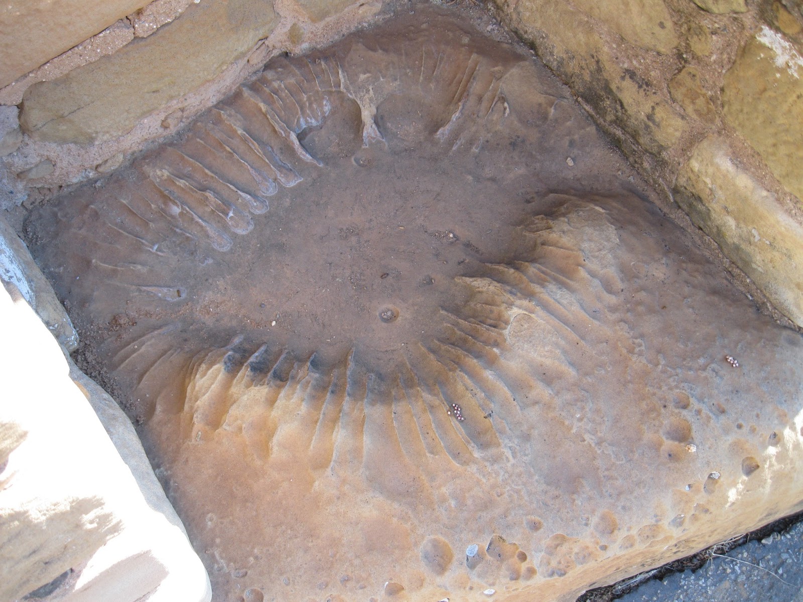
On the outside southwest corner, there is an eroded basin feature, less than half a meter across, called the “Sun Shrine”, that has small knee-walls encasing it.
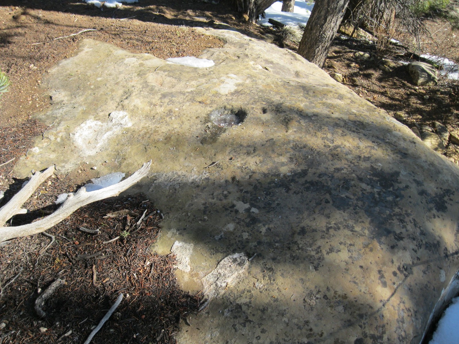
A few meters to the north of the site there is a small pecked basin. Such basins have been hypothesized to be calendrical watching stations (Malville and Putnam(1998))
Archaeoastronomical significance of the site
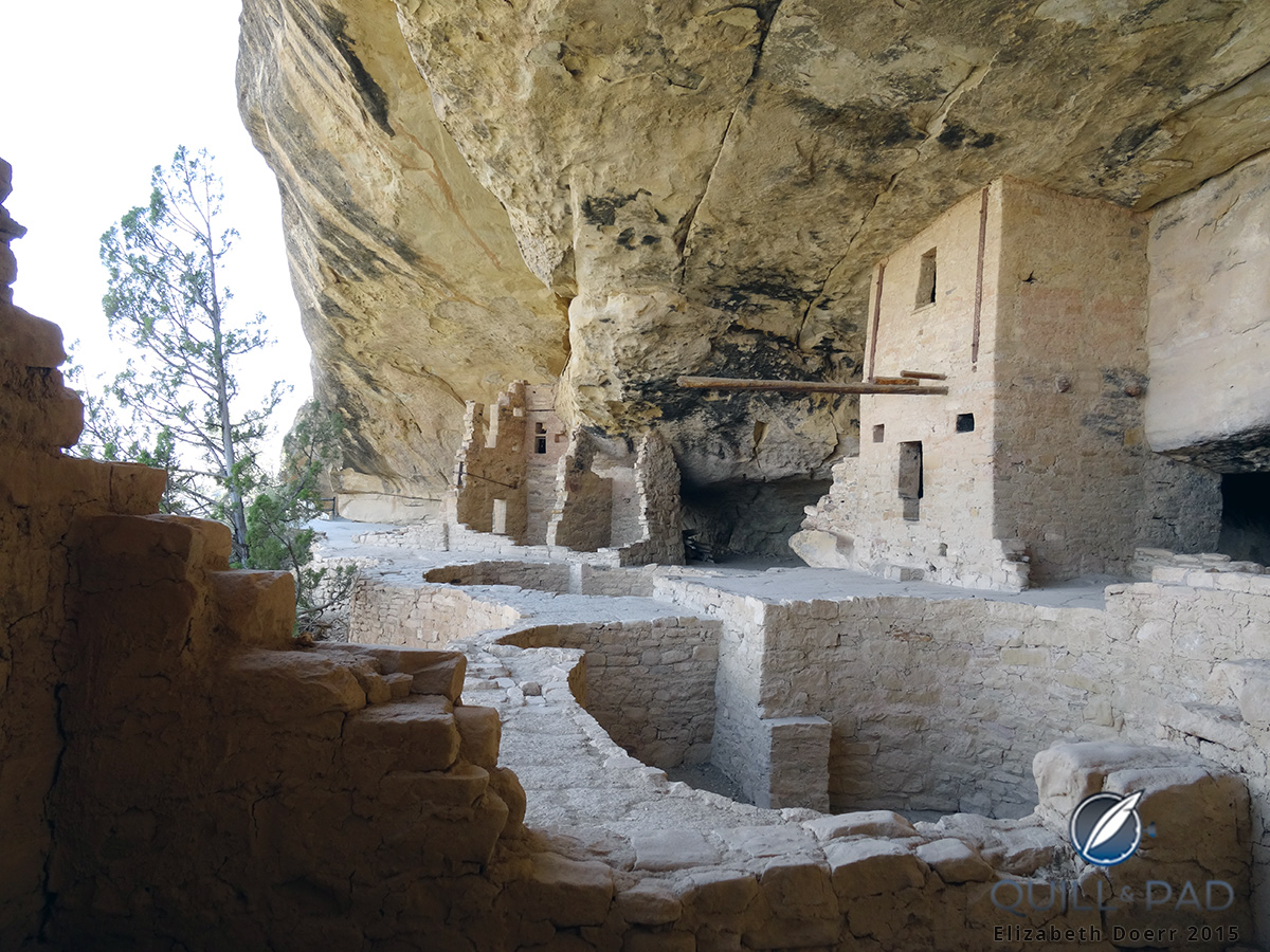
Many other Pueblo ruins are in the immediate vicinity of Sun Temple, including Balcony House, another ceremonial cliff dwelling. Balcony House is a known solar solstice observatory (on the summer solstice, the sun, when viewed from Balcony House, rises directly behind the La Plata mountains to the east… in fact, Balcony House is one of the few cliff dwellings that faces east, instead of south, and the position of the structure appears to be specifically related to solstice observations).
However, alignments to the rise/set of celestial bodes had not hitherto been considered within the Sun Temple site itself.
Using aerial imagery to perform site surveys
My research interests involve using aerial imagery of sites visible from the air to assess the possibility of astronomical alignments. A full description of the methodologies I use can be found on these web pages, including all the computer programs I have developed for such studies.
My interest in Sun Temple was sparked by a vacation visit to Mesa Verde in summer 2012. My paper describing my archaeoastronomical study of the site can be found here and is also available here.
I use the free Google Earth Pro software program to obtain aerial images of archaeological sites. If you download the Google Earth virtual globe program to your computer and start it up, in the search bar on the upper left hand side you can search for locations.
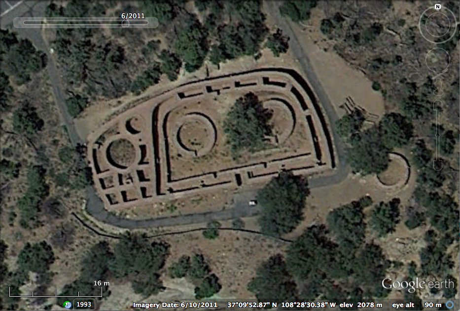
For instance, you can type “Sun Temple Mesa Verde” and it will take you to the aerial view of the site:
Often there are many aerial images available that have been taken in the past of a site, and some are better quality than others. Google Earth allows you to easily access these past images. At the top menu bar of Google Earth, you’ll see a little clock with an arrow going counterclockwise. If you click on it, you’ll get a menu of past aerial images for the area. This can be very useful, since some aerial images give clearer views of the site than others due to atmospheric conditions, or time of day, or resolution of the camera.
Using CAD software for ground feature measurements
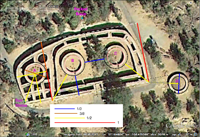
Here is a screen shot of an aerial view of Sun Temple that I obtained from Google Earth:
Whenever I obtain a aerial image of a site from Google Earth, I ensure that I include the distance scale (at the lower left hand corner) in the screen shot. I also use the Google Earth line measure tool to determine and record the ground width across the field of view of the image. In this way, I can later use the image in a CAD software package, and determine distances between features in the image.
Once I have the screen shot of a aerial image of a site, I read that in to the free Xfig CAD software package and place datum points on key features of the site, and determine the distances between the datum points. Repeated measures are used to assess statistical uncertainty on the measurements.
The Pixelstick application for the Mac is also extraordinarily helpful for these kinds of studies.
Avoiding “unanchored geometries”
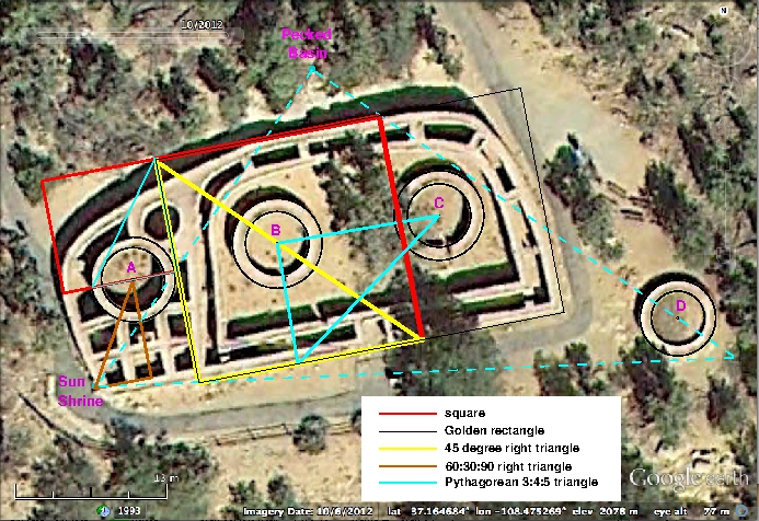
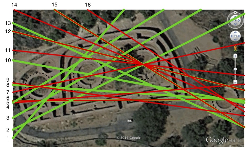
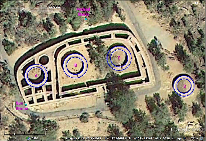
In my studies of the Sun Temple site, archaeoastronomical and otherwise, I only focus on measurements associated with key site features. For example, the length and width of the outer D, and the sizes of the four Kivas, and their respective positions relative to each other, and the SE and SW corners of the outer D. I only consider geometrical constructs associated with either the sizes of the features, or with at least two vertices anchored on the features.
This helps to avoid “unanchored geometries”, which are unfortunately prevalent in a lot of woo related to archaeological sites like these.
A serendipitous discovery
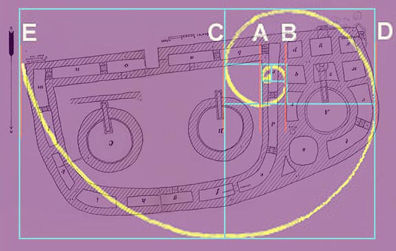
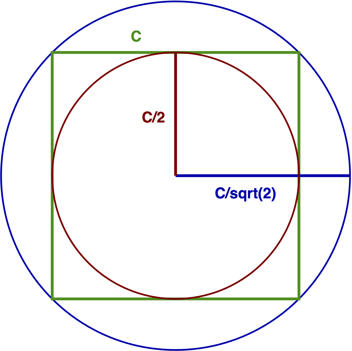
When using Xfig to examine the radii of the Kivas, I accidentally hit “÷” instead of “-” on my calculator when trying to determine the thickness of the wall of Kiva B, and obtained 1.42, which is to within 1% of the square root of 2.
A quick check showed the same was true for Kivas C and D. Constructing these Kiva walls could easily be achieved by inscribing and circumscribing two circles on a square with side length=c:
Another serendipitous discovery
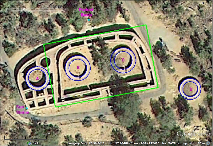
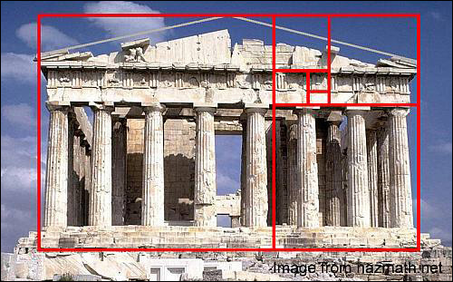
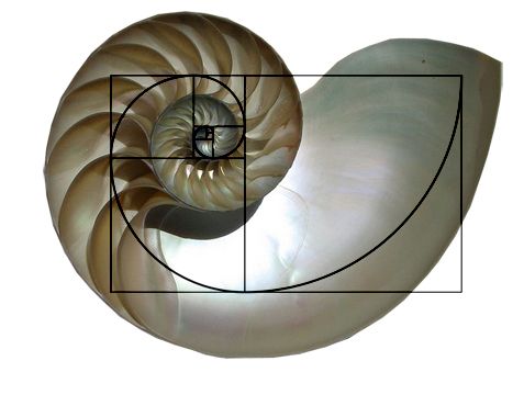
When I measured the length of the D, its ratio to the width of the complex was within approximately 1% of the golden ratio, φ=(1+√5)/2≈1.618
The golden rectangle is seen in architecture and art throughout the ancient world, including the Greek Parthenon:
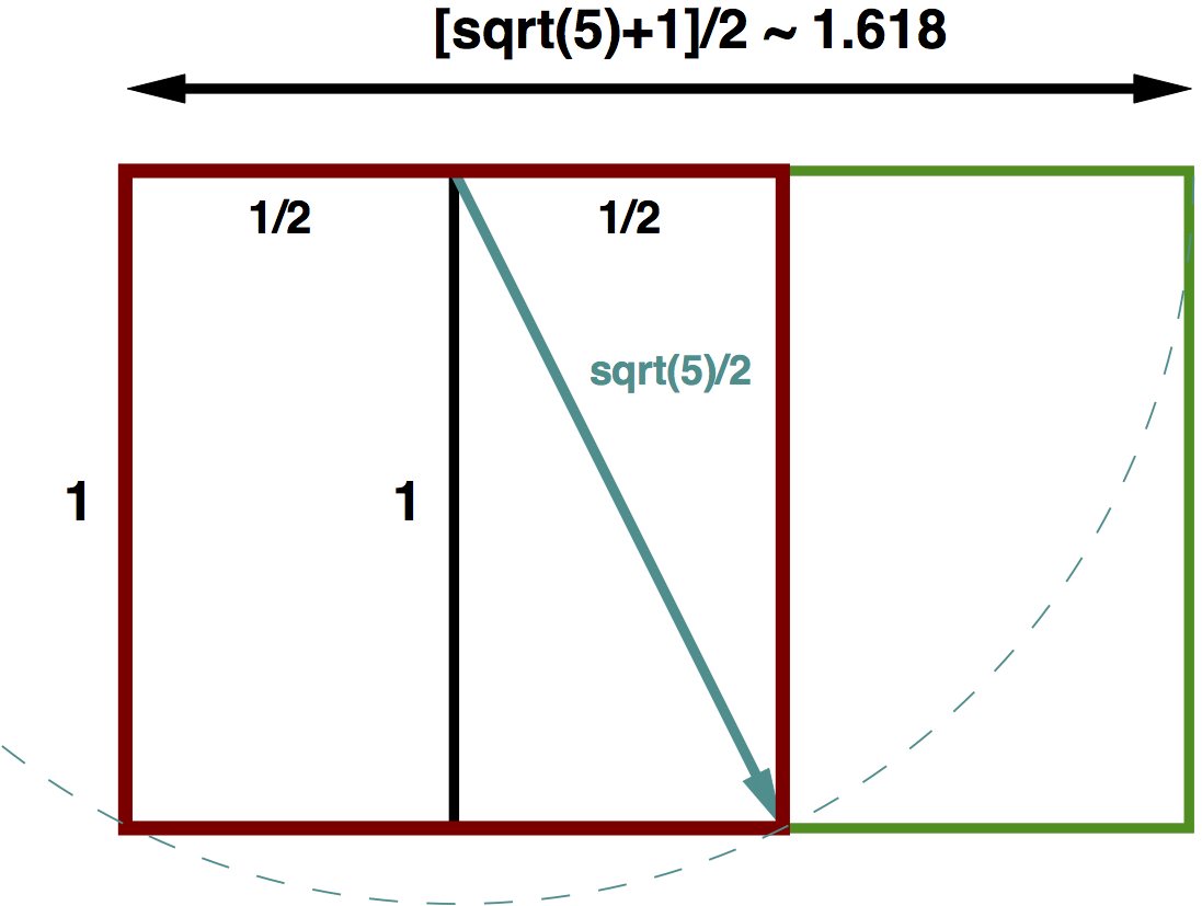
Golden rectangles are straightforward to construct with a straightedge and cord (or compass):
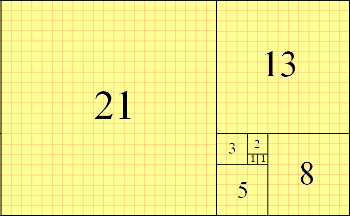
The golden ratio is related to the Fibonacci series, where each number in the series is the sum of the two before; 1, 1, 2, 3, 5, 8, 13, 21, 34, 55, 89, 144, …
As the series progresses, the ratio of adjacent numbers approaches the golden ratio. The golden rectangle can be constructed in a spiral formation using the Fibonacci numbers:
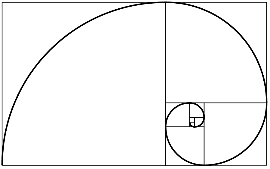
Drawing arcs in each of the squares with radius equal to the square length yields a Fibonacci spiral:
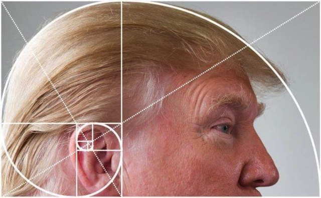
The golden ratio and spiral is found throughout nature
Other geometrical constructs
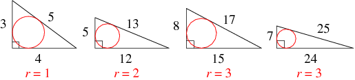
When we use Xfig and/or the pixelstick app to examine site features associated with the Sun Shrine, the positions and radii of the Kivas, and the position of the outer D, there is evidence of Pythagorean 3:4:5 triangles, squares, and equilateral triangles (triangles with all three sides equal).
Pythagorean 3:4:5 triangles are the simplest of the Pythagorean triple triangles, where the sides, a, b, and c are of some integer multiple of the unit length, the triangle is a right triangle (one angle equal to 90 degrees), and the square of the hypotenuse, c, is c^2=a^2+b^2.
Note that the equilateral triangle with one vertex at the Sun Shrine is actually probably more likely to be a 30°:60°:90° right triangle (a triangle with base length equal to one unit, and hypotenuse of two units). The vertical edge of the right triangle goes through the ventilator shaft to the south of Kiva A.
The outer diameter of Kiva A appears to be constructed from the base of a 3:4:5 Pythagorean triangle, with height equal to the yellow lines. The inner radius is statistically consistent with being 3/4 of this.
Ground Truthing
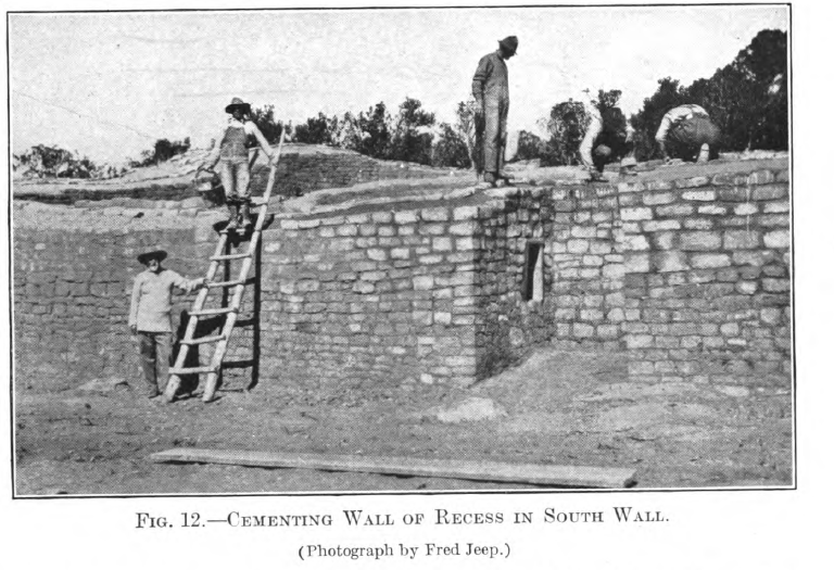
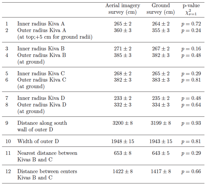
In Summer 2014, I obtained a research permit from the NPS to access the site and perform a ground survey to verify the measurements obtained from aerial imagery, using tape, theodolite, and GPS measurements.
Ground truthing revealed that the the walls of Kiva A, which are much higher than the remaining walls of Kivas B and C, slope gently inwards with slope approximately 5cm/4000cm. The inner radius at the ground of the walls of Kiva A was statistically consistent with the ground inner radii of Kivas B and C.
Was there a common unit of measurement?
In this figure, all of the yellow lines are of exactly the same length in the CAD drawing, and the red lines are exactly twice the length of the yellow (which is the width of the Golden rectangle encasing the D). The blue lines are exactly 1/3 the length of the red.
Based on this, it is apparent that the red, yellow, and dark blue lines likely represent integer multiples of some base unit of measurement.
A common unit of measurement is also evidenced by the fact that the inner radii of Kivas A, B, and C (measured at the ground level) are all statistically consistent with being equal.
Additionally, the outer radius of Kiva A is statistically consistent with being 4/3 the inner radius.
Assessing the common unit of measurement
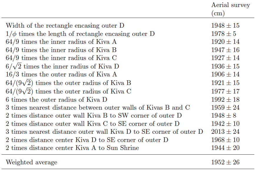
We can assess the average unit of measurement, based on the commonalities we see in the dimensions of the site features, and apparent geometrical constructs
Let X be the width of the outer D, which is statistically consistent with our average in the table. It appears that the inner radius of Kiva A (which is statistically consistent with the inner radii of Kivas B and C) is constructed from a Pythagorean 3:4:5 triangle such that the radius is 9X/64. If X is some integer multiple of a base unit, and the inner radii of Kivas A, B and C are also an integer multiple of that base unit, this implies that the base unit is, at most, L=X/64~30cm.
However, there is also evidence that this unit is perhaps also divisible by three, based on the distance between Kivas B and C, and the distance of Kiva D from the SE wall. This implies that the base unit is likely X/192~10 cm. This is very similar to the “hand” unit found in other ancient societies, which is the width of a clenched fist.
Other notable geometric features
The location of the pecked basin to the north of the site is not visible on aerial imagery. However its location on the CAD drawing was derived from ground survey measurements. As described in Munson, Nordby, and Bates (2010) the pecked basin and the SW and SE corners of the D form, to within about 5% to 10%, an equilateral triangle.
A nearly perfect Pythagorean 3:4:5 triangle (to within 1%) also runs from the Sun Shrine to the pecked basin, and goes through the center of Kiva D. The edges of the triangle also intersect several other key points.
The pecked basin may therefore have been a datum point, supporting this assertion in Munson, Nordby, and Bates (2010).
Summary
Using aerial imagery, we surveyed the Sun Temple site, and a ground survey was performed to verify the aerial image survey. Note that the aerial survey analysis is reproducible by any interested party using aerial imagery from Google Earth.
We find evidence of Golden rectangles, Pythagorean triangles, and equilateral triangles in the Sun Temple complex (note that there may be other geometrical constructs present, not revealed by this particular analysis). This is the first evidence of knowledge of Pythagorean and equilateral triangles anywhere in the New World. Golden rectangles have been potentially noted in Mayan ceremonial architecture, but the evidence of how precise these rectangles were is somewhat unclear:
The layout of the Sun Temple site appears to use the Sun Shrine as one of the primary datum points, with geometrical constructs used to layout the site perhaps starting from there. Even with the multiple geometrical constructs, it should be noted that there is still a wide degree of latitude in the exact placement of the site elements, such as the angle of the south wall, and the positions of Kivas B and C relative to the south wall and to Kiva A.
The ancestral Pueblo peoples appear to have laid out the Sun Temple site with remarkable care, and with a sophisticated knowledge of geometrical constructs. A feat made even more remarkable by the lack of a written language!
The site is of exceptional importance as an exemplar of Pueblo ceremonial construction, and deserves more recognition as such.[ref] Now, can we cut down that tree in the middle of the site that’s destroying the walls of Kiva C?[/ref]
[In this set of lectures, we will discuss various methods for fitting the parameters of mathematical models to data. There are at least two issues that need to be understood:
Choosing an appropriate statistic to assess goodness-of-fit of the model to the data
Choosing an appropriate method to find the model parameters that optimise the goodness-of-fit statistic
The first point depends only on the data. The second involves picking an optimisation method appropriate for the type of model being used. Mathematical models that are often used in population biology, epidemiology, etc, are usually non-linear, and can only be solved numerically. As we will see, the computational overhead involved in numerically solving a model considerably narrows the range in choices of appropriate optimisation methods.
Due to limited time, we will only discuss methods for finding the best-fit solution, not how to assess uncertainties on the best-fit solution]
[Here we examine how various demographics might be related to voting patterns in the Republican and Democratic primaries that have taken place so far, and whether one or more candidates has broad popular appeal across demographics.]
(Spoiler alert: as of mid-April, 2016, Clinton appears to have the broadest appeal across many demographics. However, I do not mean this analysis to advocate one candidate or political party over another, I simply represent the data as it is.)
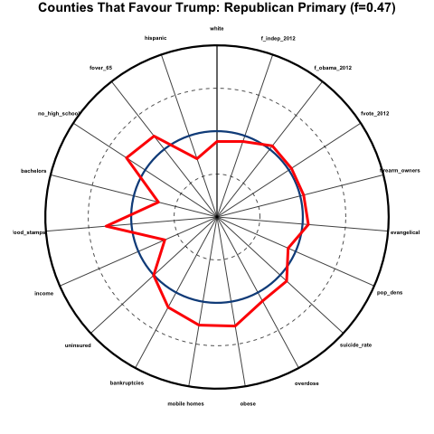
Based on the counties that have had primaries so far at the time of this writing in mid-April, 2016, we expressed the demographics of a particular county as a percentile related to all the other counties that have voted, and visualized the results in a format sometimes called a “spider-web graph”; the spokes of the circular graph correspond to various demographics and social indicators, and if a point lies on a spoke far from the center, it indicates that it lies at a higher percentile for the demographic that corresponds to that spoke.
So, for instance, if one of the spokes is “income”, the closer towards the center of the circle on that spoke, the lower the average household income compared to other counties, and the closer to the perimeter of the circle, the higher the average income. Here is what these spokes might look like for a bunch of different demographics and variables:
There is a lot of information on display all at once in the above plot! Let’s break it down a step at a time. The variables corresponding to each spoke are:
fwhite: fraction of non-hispanic whites in the population
fover_65: fraction of the population over the age of 65
no_high_school: fraction of the population 25 years and over without a high school diploma
bachelors: fraction of the population 25 years and over with at least a bachelors degree
food stamps: fraction of family households receiving food stamp assistance
uninsured: fraction of the population without health insurance
bankruptcies: per-capita bankruptcy rates
mobile homes: fraction of households that consist of mobile homes
obese: fraction of the population that is obese
overdose: per-capita death rates by drug overdoses
evangelical: fraction of population regularly attending an evangelical church
firearm_owners: fraction of households that own firearms
fvote_2012: fraction of adult population that voted in 2012 election
f_obama_2012: fraction of votes that went to Obama
f_independent_2012: fraction of votes that went to an independent candidate
The blue circle on the plot represents the median values for each of the demographics and variables for all counties that have voted in the primaries so far. The outer black circle represents the 100th percentile (basically, the county that has the highest value of that particular indicator along a spoke). The inner dashed line is the 25th percentile, and the outer dashed line is the 75th percentile.
Now, for a particular sub-group of counties (in the case in the figure, counties that favoured Trump over any other candidate by at least 5 points in the primary), we can show, with the red line, how the demographics in those counties compare to those of all other counties. You can see that, for example, the average median household income in counties that favoured Trump is much lower than that for all counties, because the red line dips sharply towards the center of the circle along the “income” spoke. And there is an unusually large fraction of people in those counties who do not have a high school diploma, because the red line deviates outwards along the “no_high_school” spoke.
Let’s look at this further, in more detail…
Demographics of counties that heavily favour Trump in the Republican primaries
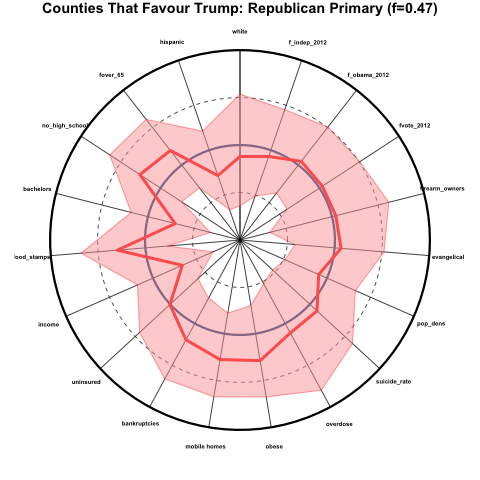
Here we examine the average percentiles of counties that favoured Trump over any other candidate by at least 5 percentage points in the Republican primaries, which was 47% of all counties. This is what the demographics of those counties look like, where I have added a pink band to the plot above show the 25th to 75th percentiles for those counties:
The counties that favour Trump over other candidates skew older and less hispanic, are more poorly educated, have a high fraction of families receiving food stamps, low income, a relatively large fraction of people living in mobile homes, and are generally in poorer health than average. These counties were about average in voter participation, the percentage that voted for Obama in 2012, and the percentage that voted for an independent presidential candidate in 2012.
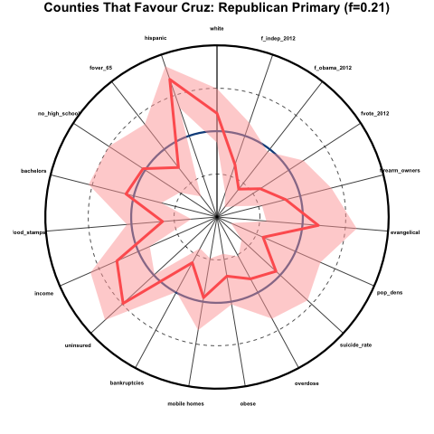
Demographics of counties that heavily favour Cruz in the Republican primaries
Now let’s look at the same plot for counties that favoured Cruz by at least 5 percentage points in the Republican primaries. This was 21% of counties:
These counties skew far more hispanic, more white, somewhat younger, higher income, and generally have better health than average, despite the very high average of people without health insurance. The counties also skew very rural (low population density), had generally very low voter participation in 2012, and skewed very Republican in the 2012 election.
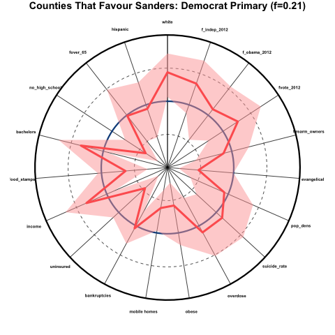
Demographics of counties that heavily favour Sanders in the Democratic primaries
Now let’s look at the counties that favoured Sanders over Clinton by at least 5 percentage points in the Democratic primaries that have occurred so far (21% of counties):
These counties skew very white, very educated, much less evangelical, high income, low percentage of uninsured, and good health (except for overdose and suicide rates, which are about average). There was a high degree of voter participation in these counties in 2012, and they skewed Democrat and heavily Independent rather than Republican.
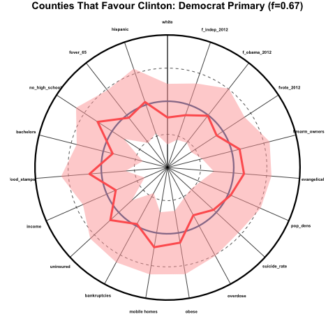
Demographics of counties that heavily favour Clinton in the Democratic primaries
Now let’s look at the counties that favoured Clinton over Sanders by at least 5 percentage points so far (67% of counties):
These counties skew perhaps somewhat less white than average, but for the most part are quite close the average for all other counties.
Which candidate has the broadest appeal?
As I discussed above, the candidate with the broadest appeal would be favoured by counties that are representative of the national averages in the various demographics. It would appear that, as of mid-April 2016, neither Trump nor Cruz achieves this, although Trump so far comes closer than Cruz to broader appeal; however Trump support appears to skew poorer, unhealthier, and less educated, and Cruz support appears to skew heavily rural, and evangelical.
Clinton appears to so far have far broader appeal over a wide array of demographics than Sanders (and indeed, over any other candidate).
Sources of data
The Politico website makes available the county level election results for most of the primaries that have taken place. They are missing the county level results for Iowa and Alaska, and Kansas and Minnesota have results by district, not counties.
All cause and cardiovascular death rates from 2010 to 2014 from the CDC.
Household firearm ownership is estimated using the fraction of suicides that are committed by firearm; the suicide data by cause from 2010 to 2014 is obtained from the CDC.
Education, racial and age demographics, household living arrangements, percentage without health insurance, and income are obtained from the 2014 Census Bureau American Community Survey 5 year averages.
In statistical analyses, the term “bootstrapping” refers to methodology that involves randomly sampling a population with replacement. In this module, we’ll discuss some examples of bootstrapping and other stochastic sampling methods I frequently apply in my own analyses.
[This module presents Monte Carlo stochastic methods that can be used to assess uncertainty in model estimates due to uncertainty in one or more parameters]
[In the Spring AML612 course at ASU, we have discussed stochastic modelling methods, including Markov Chain Monte Carlo, Stochastic Differential Equations, and agent based models. Here we discuss how random sampling can contribute stochasticity to observed data]